Use IFs (Download): Economy
Development Profile
The Development Profile display can be reached from the Display option of the Main Menu, Specialized Display sub-option and Development Profile sub-sub-option. It is also located under the Main Menu Map options.
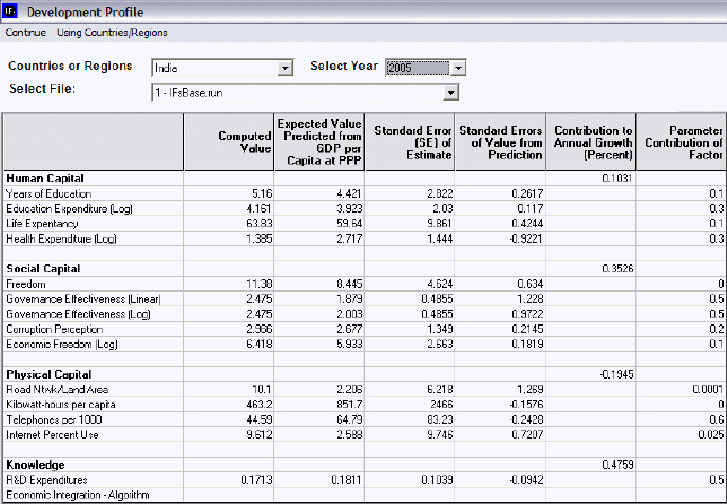
The purpose of the Development Profile display feature is to track how Human Capital, Social Capital, Physical Capital and Knowledge contribute to the annual growth of a country/region or a group. For purposes of development, it is helpful to understand what aspects of a country/region or group are helping or harming the growth of a country/region or group.
The left column represents different variables calculated by IFs organized into categories. The Computed Value column represents the actual numbers calculated for the year your have selected (top right scroll-down list). These values are then used to calculate the Expected Value Predicted from GDP (Gross Domestic Product) Per Capita at PPP (Purchasing Power Parity). A Standard Error is then displayed, followed by a Standard Error of the Value from the Prediction. The final two values display how the categories Contributed to Annual Growth (displayed as a percentage) and how their contribution can be displayed as a parameter.
There are three scroll-down lists at the top of the Development Profile screen. You can choose between regions (if that has been chosen from the Main Menu) or global groups (if that has been chosen from the Main Menu). Scroll down to India in order to learn more about how to use this feature of IFs. To the right of the country/region or group scroll-down list, you can choose what year you would like display. You can then choose which Run-Result-File you would like to see displayed.
If you left-click on any of the variables displayed on the left, you will be presented with the option to graph the variable. Click on Graph and you will be presented with a graph that shows the Computed Value of that variable for the year you have selected, as well as a logarithmic graph of GDP at PPP compared to the variable you are interested in.
Select one variable that you would like to see forecast over time. Click on the number displayed in the Computed Value column. Choose Show Over Time and a chart will appear that displays this variable for each year computed in your version of IFs and for each Run-Result-File that you are using. At the top of this chart you have a number of options for displaying this information. You may visually represent this information through a line graph or a bar graph, save the information, toggle between whole number representation or representation as a percentage of the base year, toggle between displaying results as cumulative totals, turn the interval average on or off, add or design a filter or set the time horizon for your information.
Social Accounting Matrix
The Social Accounting Matrix sub-sub-option can be reached from the Display option on the Main Menu, the Specialized Display sub-option and then the Social Accounting Matrix sub-sub-option. It is also located under the Main Menu Map options.
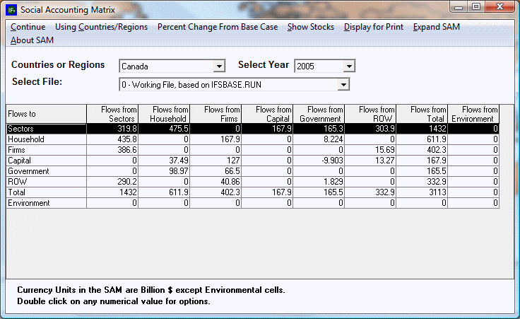
A social accounting matrix (SAM) is an extension of an input-output table that economists use to show the inter-sectoral flows of goods and services within an economy (see the upper left-hand cell of the SAM). The SAM more generally displays flows among actor-classes in the socio-economic system. For instance, the cell in the government column and household row shows flows from the government to households (such as pension payments). The cell in the firms' column and government row similarly shows flows from firms to the government (such as tax payments). You can double-click on certain numbers on the SAM table and this will bring up a small window. From this window you can expand the numbers, show them over time—thus presenting them in a table—or expand the cell’s contents.
You can move across countries/regions or groupings and across years with the drop-down boxes. Clicking in cells of the SAM will, when appropriate, provide options for (1) expanding the cell to show sub-elements of it, (2) showing values across time, and (3) providing some explanation of the cell’s contents.
Note: When toggling between stocks and flows, users may note that some of the stocks are not present. This is because this feature of IFs is currently under development.
Infrastructure Profile
Infrastructure Profile is a sub-sub option, located under Specialized Display, which in turn is a sub-option of the Display option on the main menu of IFs. Infrastructure Profile is also located under the Main Menu Map options.
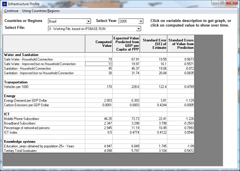
Clicking on Infrastructure Profile allows the user to view multiple components of the infrastructure for a country/region or group, including: Water and Sanitation, Transportation, Energy, Information-Communications Technology (ICT), and Knowledge Systems. Most of these components are a composite of different variables. The value of each of these variables is displayed in four ways: Computed Value, Expected Value Predicted from GDP per Capita at Purchasing Power Parity (PPP), Standard Error of Estimate, and Standard Errors of Value from Prediction. The user can change the year displayed in the Infrastructure Profile up to 2100 by clicking on the ‘Select Year’ dropdown box at the top-center of the screen
The user can display the computed values for the variables over time in a table by clicking on a desired value. The table that appears displays the computed values over time according to several different scenarios. The user can also view a variable displayed in a graph by clicking on a given variable. After viewing the graph, the user can return to the Infrastructure Profile by clicking on continue.
Financial Profile
The Financial Profile sub-sub-option can be reached from the Display option on the Main Menu, the Specialized Display sub-option and the Financial Profile sub-sub-option. It is also located under the Main Menu Map options.
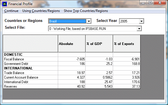
When you select the Financial Profile from the Specialized Display menu, you are presented with a chart that divides financial information for any given country/region or group into Domestic and International data. The chart then organizes this data into absolute numbers, percentages of GDP and percentages of exports.
Experiment with the Financial Profile. Assume you would like to know what trends you can see in global reserves held by all countries except for the United States. From the top of the Financial Profile menu first click on the Using Countries/Regions - Using Groups toggle. Scroll down the groups until you find the option for World Except USA.
Choose a cell that you would like to explore more fully. If you would like to look at the total global reserves held by all countries except for the USA, click no the table where the Reserves row intersects with the Absolute column. This will bring up a prompt called Show Over Time. If you select this option, a table will open showing this value forecast using different Run-Result-Files.
Another Financial Profile option is the Show Top Countries/Regions. Selecting this will bring up a new screen called the Financial Profile Filter. This feature of IFs allows users to quickly access countries who have the highest levels of certain financial data filtered as absolute numbers, percentages of GDP or percentages of exports. Selecting any one of the filters located at the top of the Financial Profile Filter page will organize the table into the 5 countries with the highest value for the selected filter. Click Continue to return to the Financial Profile menu.
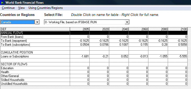
World Bank Financial Flows
The World Bank Financial Flows sub-sub-option can be reached from the Display option on the Main Menu, the Specialized Display sub-option and then the World Bank Financial Flows sub-sub-option. It is also located under the Main Menu Map options.
A double-click on any variable name/data point will call up a table of data for that variable. The menu options of the table provide for the creation of a graph and also for printing of the result.
Use the drop-down boxes to change country/regions or the file. The Use Groups option toggles to a list of groups of countries/regions and becomes Use Countries/Regions so as to allow a toggle back.
See if you can create a graph that will forecast Mexico’s payment to the World Bank over a number of years in the future. Your results will depend heavily on what version of IFs you are using. Click on whatever variable you choose and then click on Show Over Time. This will present you with a table that will allow you to display the information in a number of different ways.
