Use IFs (Download) Data Analysis: Difference between revisions
(work in progress) |
(Still in progress) |
||
| Line 35: | Line 35: | ||
* '''Show Variable Name Subset''': Choose the variable category like '''Health''' or '''International Politics''' to refine the search. | * '''Show Variable Name Subset''': Choose the variable category like '''Health''' or '''International Politics''' to refine the search. | ||
* '''Other Filters''': Choose '''Used for Initialization''' to only select variables that are used in the model preprocessor, choose variables with '''At least 10 Data Points''', choose variables with data '''At least through 2020''', or choose '''All''' to display all variables. | * '''Other Filters''': Choose '''Used for Initialization''' to only select variables that are used in the model preprocessor, choose variables with '''At least 10 Data Points''', choose variables with data '''At least through 2020''', or choose '''All''' to display all variables. | ||
* '''Analysis''': | * '''Analysis''': Choose to '''Use All Years (In Statistics)''', '''Use All Years and Time (In Statistics)''', or '''None''' to only choose one year. | ||
* Plot: Create a plot of the chosen variables. IFs will only plot the relationship between up to three variables. The plot option is | * '''Plot''': Create a plot of the chosen variables. IFs will only plot the relationship between up to three variables. The plot option is explained further below. | ||
* Statistics: | * '''Statistics''': Generate statistics for the chosen variables relationships. | ||
* [[Repeated Features#General%20Display%20Options|'''Continue''']]: Go back to the previous menu or to the Main Menu of IFs. | * [[Repeated Features#General%20Display%20Options|'''Continue''']]: Go back to the previous menu or to the Main Menu of IFs. | ||
* Computations: | * '''Computations''': Create a computation for a new variable list to use for data analysis. Follow the steps from the COMPUTATIOLNS PAGe except choose a year when prompted. | ||
* Search: | * '''Search''': Open a search page to search and choose variables from. | ||
* '''Help''': Open the corresponding page in the [[Main Page|Pardee Wiki]] with the current feature or display they are using. | * '''Help''': Open the corresponding page in the [[Main Page|Pardee Wiki]] with the current feature or display they are using. | ||
Plot options | Plot options | ||
Statistics Options | |||
Search Options | |||
| Line 126: | Line 131: | ||
Another feature of this section of IFs is the [[Computations]] button. | Another feature of this section of IFs is the [[Computations]] button. | ||
Exploration of maps, cross-sectional and longitudinal relationships, and relationships computed for IFs can give you much information about the apparent relationships among a wide range of global development indicators. Even if you never used IFs for forecasting, this data analysis capacity could significantly enhance your understanding of the world.<span style="font-size:xx-large;">World Map Movie outdated</span>The '''World Map Movie''' is accessible in two locations in IFs. The first is under the '''Data Analysis''' heading on the main IFs screen. The second is under Specialized Display, which is a sub-heading of the Display heading on the Main Menu. The World Map Movie found under the Data Analysis heading deals with historic data, while the World Map Movie found under the Specialized Display heading deals with forecasted data. Selecting the World Map Movie allows the user to display on a map of the world the changes in selected variables over time in all of the countries for which IFs has data. This section describes how to use the various options to tailor the movie to the userpreferences. | Exploration of maps, cross-sectional and longitudinal relationships, and relationships computed for IFs can give you much information about the apparent relationships among a wide range of global development indicators. Even if you never used IFs for forecasting, this data analysis capacity could significantly enhance your understanding of the world. | ||
== <span style="font-size:xx-large;">World Map Movie outdated</span> == | |||
The '''World Map Movie''' is accessible in two locations in IFs. The first is under the '''Data Analysis''' heading on the main IFs screen. The second is under Specialized Display, which is a sub-heading of the Display heading on the Main Menu. The World Map Movie found under the Data Analysis heading deals with historic data, while the World Map Movie found under the Specialized Display heading deals with forecasted data. Selecting the World Map Movie allows the user to display on a map of the world the changes in selected variables over time in all of the countries for which IFs has data. This section describes how to use the various options to tailor the movie to the userpreferences. | |||
After selecting World Map Movie, the dialog box pictured below appears on the userscreen. | After selecting World Map Movie, the dialog box pictured below appears on the userscreen. | ||
Revision as of 16:59, 3 September 2025
World Map: Historic Data
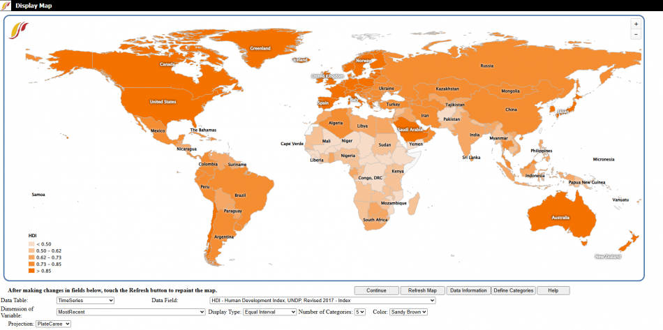
Use the World Map option to compare historical data for variables across countries. To open the World Map from the Main Menu choose Data Analysis then click World Map.
This option displays variable data in a given year as shades of color that correspond to different levels of that variable or list. On the left side of the map there is a legend that shows the current variable being displayed and the shades with their corresponding levels of the variable.
There are a number of options and features that adjust the map:
- Continue: Go back to the previous menu or to the Main Menu of IFs.
- Refresh Map: After making changes to the display option fields, click this to update those changes in the map.
- Data Information: Open information on the data source and availability of the data in different years.
- Define Categories: Open a screen to adjust the cutoffs for the display categories.
- Help: Open the corresponding page in the Pardee Wiki with the current feature or display they are using.
Display option fields:
- Data Table: Choose the data table or category to get variables from.
- Data Field: Choose the variable to display.
- Dimension of Variable: Choose the year to display. When displaying from the time series Data Table this option is available.
- Display Type: Select one of the two sub options:
- Equal Interval: Set the display categories to have the same range of variables (ex. 0 to 400 and 400 to 800).
- Equal Count: Set the display categories to each hold the same count of countries.
- Number of Categories: Change the number of display categories using this drop down from 2 to 7.
- Color: Choose the display color of the map from this dropdown: sandy brown, green, blue, red, or gray.
- Projection: Change the type of map projection from the dropdown.
Analyze Across Countries (Cross-Sectional Analysis)
This option can be accessed from the Main Menu: choose Data Analysis then click Analyze Across Countries (Cross-Sectional Analysis).
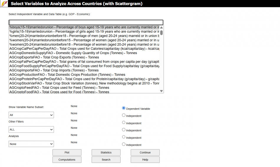
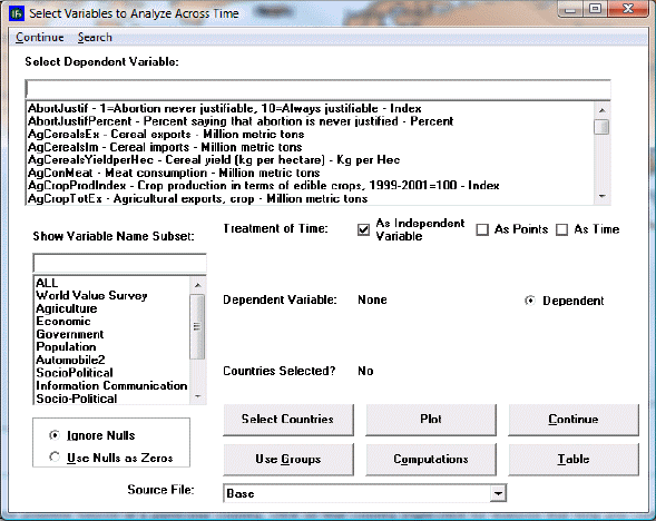
Use this option to analyze variables across countries at a given point in time. Explore the relationships between two or more variables by selecting the variables of interest from the drop down. First click the bubble below the drop down to select for either the Dependent Variable or an Independent variable for the analysis, then choose the desired variable from the drop down. Type into the search bar above the variable dropdown to quickly find a variable. Then use the options and features described below to plot and further explore relationships between variables.
These options and features include:
- Show Variable Name Subset: Choose the variable category like Health or International Politics to refine the search.
- Other Filters: Choose Used for Initialization to only select variables that are used in the model preprocessor, choose variables with At least 10 Data Points, choose variables with data At least through 2020, or choose All to display all variables.
- Analysis: Choose to Use All Years (In Statistics), Use All Years and Time (In Statistics), or None to only choose one year.
- Plot: Create a plot of the chosen variables. IFs will only plot the relationship between up to three variables. The plot option is explained further below.
- Statistics: Generate statistics for the chosen variables relationships.
- Continue: Go back to the previous menu or to the Main Menu of IFs.
- Computations: Create a computation for a new variable list to use for data analysis. Follow the steps from the COMPUTATIOLNS PAGe except choose a year when prompted.
- Search: Open a search page to search and choose variables from.
- Help: Open the corresponding page in the Pardee Wiki with the current feature or display they are using.
Plot options
Statistics Options
Search Options
The menu of Analyze Across Countries is dominated by the Select Variable and Data Table. From this list, users are able to select from all of the data tables that underpin the functioning of IFs.
Note that the Select Variable and Data Table list box includes many variables that do not exist, or do not have the same names, in the IFs model. These are from the data base. When possible, data were gathered for many historic years, in order to provide the ability to analyze across time (longitudinal analysis, described later) as well as across countries at a given point in time (cross-sectional analysis). When you select a variable name for which data from more than one year is available, you will be asked to specify a year.
To do a cross-sectional analysis, specify a dependent variable (a variable you want to understand causes of) and one or more independent variables (the possible causes of change in the dependent variable). For instance, pick life expectancy (LifExp – SocioPolitical (Life expectancy at birth) - years) as the dependent variable. Many relationships in IFs treat Gross Domestic Product (GDP) per capita at purchasing power parity as an independent variable (GDP2000PCPPP – Economic (GDP per capita (PPP)) – 2000 PPP$). Click GDP2000PCPPP in the Select Variable list box. You will then have to choose a year. For this example, choose the year 2000. Notice that GDP2000PCPPP(2000) is then shown as the Independent 1 Variable. Click the Plot button to access the display of these variables.
An additional feature of the Cross-Sectional Analysis is the ability to look more closely at the data set in which a user might be interested. Left-click on any variable and a small window with two options will appear: Select and Data Information. Click Select to choose that variable. Click Data Information in order to access detailed information as to the scope, availability and properties of the data set in question.
At the bottom of the dialogue box is a drop-down menu with the title Source File. Choosing different source files allows the user to view and experiment with data for a small number of countries at the provincial level.
Cross-Sectional Analysis Extended Features
These features can be accessed through Cross-Sectional Analysis from Data Analysis on the Main Menu of IFs.
Extended Option. When you use the input line for independent or dependent variable selection, it is also possible to compute a variable as a simple function of two or more other variables (e.g. as the sum, difference, quotient, or product of two other variables).
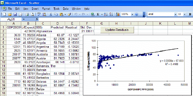
Now touch the Plot button to create a scatter plot showing the relationship between the two selected variables for as many countries as exist in the data set. You will see that life expectancy increases rapidly as GDP per capita rises. The scatter plot may be sufficient for many users of IFs. You can print the scatter plot or save it for other analysis or for use in other applications.
Some users, however, will want to proceed further and to describe the relationship between the two variables with an equation. If you have Microsoft Excel available on your computer, you can do this by touching the Excel button from the Scatter plot. That button actually creates a link with Excel and carries the scatter plot (with supporting data) to Excel for further analysis.
Excel opens up many additional features for your use that can be described in more detail using Excel’s Help menu. But let’s walk through the process of fitting a line and associated equation to the data (important for the next Lesson). First, maximize the Excel screen by using the maximize button in the upper right hand corner of the window (the icon of a single large window).
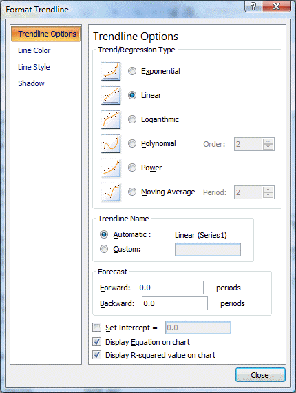
Then click anywhere on the graph to activate it. That allows you then to right-click on various components of the graph in order to edit those components. For example, right-click on the straight line that Excel has fit to the data. You will see a small pop-up menu with a couple of options. Select the Format Trendline option and you will see the following window.
Choose the Type tab and select the logarithmic trend/regression type for a better fit.
Then choose the Options tab for additional choices including checking boxes for "Display Equation on Chart" and "Display R-Squared Value on Chart." Although both options are checked, the equation and R-Squared are sometimes not initially visible on the chart because they are not placed properly when you open Excel (it depends on the variables you plot). If they are not visible, turn the options both off, close the Format Trendline window, right-click on the line, select again the Format Trendline option, and again select the Options folder. Turn the Display Equation and Display R-Squared options back on and exit from the Format Trendline window again. You should now see the equation and r-squared someplace on the graph and can drag them to a better location, nearer the intersection of the two axis.
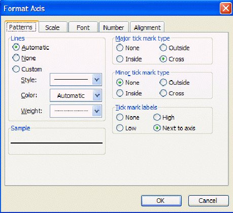
If you now right-click on the dependent or y-axis, you will see a small pop-up menu with several options. Choose the format axis option and the following window will appear:
Under the Scale tab you will find maximum value, minimum value, and other settings. Often you will find it very useful to reset maximum or minimum values. Try, for example, setting the minimum on the y-axis to 0 and the maximum to 100.
There is much more that you can do with Excel, including copying the figure you have just created and incorporating it into a word processing file. Experiment.
Exit from Excel (no need to save the file unless you want to), and click on Continue to move from the Scatterplot back to the Select Variables to Analyze Across Countries window (reproduced near the top of this lesson).
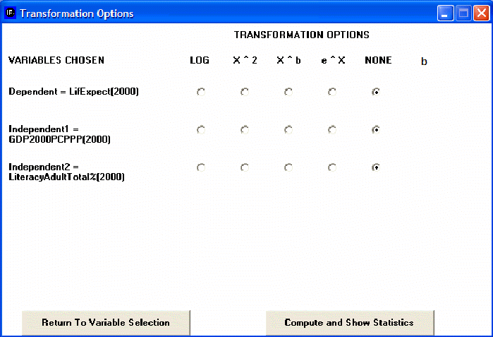
Although the introduction of a control variable works helps in looking at relationships involving up to three variables (dependent, independent, and control), it is possible to examine relationships involving as many as five independent variables (see again the IFs window shown earlier on analyzing variables across countries). The key to this is selection of the Statistics option that you can see at the bottom of that window (next to the Plot button). After selecting a dependent variable and as many as 5 independent variables, touch the Statistics button. That will display the set of transformation options.
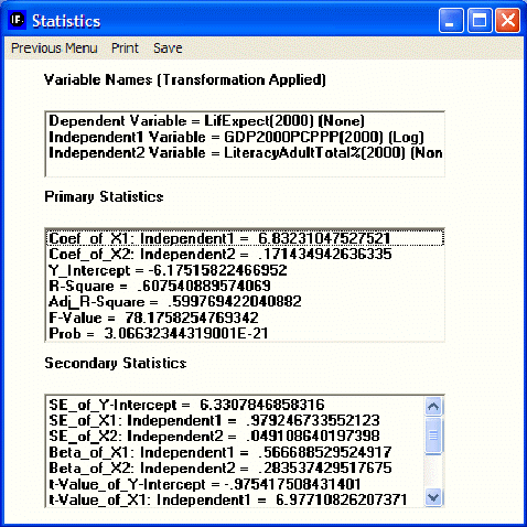
The transformation options allow you to apply transformations to your dependent and/or independent variables, just as you saw earlier in Excel that a logarithmic transformation of GDP per capita helped explain life expectancy better. Choose here again the logarithmic transformation of GDP per capita and then select the button Compute and Show Statistics. That will produce the following window showing statistics about the relationships among these three variables. These statistics will not be explained here – please see a standard statistics textbook.
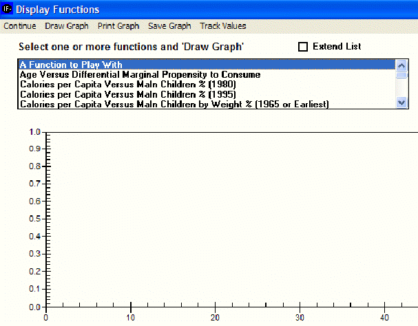
Computed Functions. Click on the sub-option for computed functions to obtain the following window.
Many two-variable relationships have been computed within IFs using the cross-sectional analysis capabilities described earlier. For instance, relationships have often been computed for the same two variables at different points in time to gain insight about how the cross-sectional relationships have changed over time.
Click the Extend List box in the window above to see the list of computed functions more clearly. Then scroll down until you see GDP/Capita (PPP) Versus Life Expectancy (1962). Because of data availability this was the earliest relationship computed between the two variables. Notice that other relationships have been computed at intervals. Holding the control (Ctrl) button down click on the relationships between those two variables for 1962, 1980, and 1995. All three should be high-lighted and therefore selected. Now click on the Draw Graph option to create a graph that contains all three.
Note that at low levels of GDP per capita at PPP (in constant dollars over time) the life expectancy has generally gone up. In other words, countries have succeeded in raising life expectancy even at low levels of GDP per capita. Why? It could be some combination of improved medical technology and of improved health policy. In any case, the shift in the relationship over time suggests the value of multi-variate analysis of the relationship, not just bi-variate.
Another feature of this section of IFs is the Computations button.
Analyze Across Countries (Scattergram)
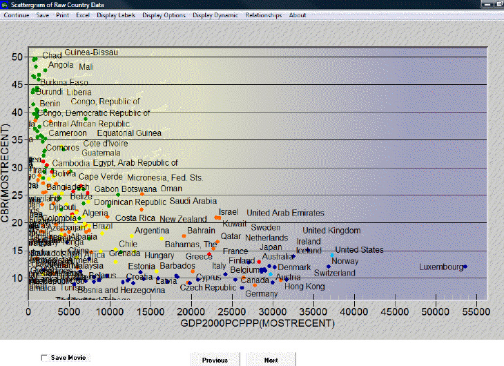
This section describes how to use the various features on the Scattergram, which appears after clicking the Plot button in the Analyze Across Countries (Cross-Sectional) option. The descriptions begin with the features found in the upper left-hand corner of the screen and ends with the features on the right of the screen.
Clicking on Continue returns the user to the previous menu, while clicking on Save provides options to save the data as a graph or as values.
The Excel option will export this data to an Excel spreadsheet.
The Display Labels feature allows the user to change the labels on the graph. The user can choose to display the full names of the countries or the abbreviations of the names. The user can change the labels of the x- and y-axes, the title, and the subtitle of the graph. The user can also choose to display certain data points and labels and not others by clicking on the Select Points and Labels option. After clicking on Select Points and Labels, a dialogue box appears with a list of all data points and corresponding labels. Next, after choosing which data and labels to display, click Save. The graph should now only display the selected labels and data points.
The Display Options feature allows the user to access various third dimension display options. One of these options is the Bubble Display feature, which displays the ’ of a given countrypopulation or Gross Domestic Product and facilitates comparison with other countries. This feature can be used to display either the dependent or one of the independent variables. Additionally, the user can change the geographic units that are displayed from Countries to Groups or Geographic Lists. Notice, however, that even when countries are displayed, they are colored according to regions. Click on Define Colors for G-Lists for a key to the various color-groupings. To change the color-grouping method, select a new region from the drop-down menu in the Define Colors option. Then click on Initialize Colors. The colors should now change according to the new grouping method.
The Display Dynamic option allows the user to create a movie of the interaction of these variables over time. There are two types of movies that the user can view: the first type traces the data points or the dots’ over time, while the second type simply shows the location of the various data points at a given point in time. To view a movie, first click on Display Dynamic and then select the Tracing Mode option. To label only certain or all years, click on Label Years. Click again on Display Dynamic, and then Show Movie, either with tracing on or off. Additionally, the user can display change through time by clicking on the Previous and Next buttons at the bottom of this display. Check Save Movie at the bottom of the screen to review the movie in the future. The movie will be saved under Stored Map Movie, which is located under Specialized Display.
The Relationships option allows the user to fit a line to the graph. To remove the line, click on No Regression.
Analyze Across Time (Longitudinal Analysis)
This option can be accessed from the Data Analysis option on IFs Main Menu.
This screen looks much like others you have seen. One difference is that you must select a single or a small set of countries for your longitudinal analysis. You can look at a variable over time (using time as the independent variable), or you can treat time as points on the graph and look at the relationship between two variables.
Pick a variable such as AIDDon%GNI (aid donations as a percent of Gross National Income, the successor concept to Gross National Product). Using the screen that comes up when you touch Select Countries, pick the United States as a donor country. Then Exit back to the screen for analysis over time and Plot the result. You will see the decline in U.S. aid commitment over time.
On this particular plot, and dependent on the version of the model you are using, you may see values for Earliest and MostRecent. These values have been entered into the data file so that users can have available; for example, the most recent value of a variable for all countries, regardless of whether that value comes from 2000, 2001, or 2005. Most recent (and earliest) values are especially useful for cross-sectional analysis and you may or may not want them on your longitudinal graph.
Another feature of this section of IFs is the Computations button.
Exploration of maps, cross-sectional and longitudinal relationships, and relationships computed for IFs can give you much information about the apparent relationships among a wide range of global development indicators. Even if you never used IFs for forecasting, this data analysis capacity could significantly enhance your understanding of the world.
World Map Movie outdated
The World Map Movie is accessible in two locations in IFs. The first is under the Data Analysis heading on the main IFs screen. The second is under Specialized Display, which is a sub-heading of the Display heading on the Main Menu. The World Map Movie found under the Data Analysis heading deals with historic data, while the World Map Movie found under the Specialized Display heading deals with forecasted data. Selecting the World Map Movie allows the user to display on a map of the world the changes in selected variables over time in all of the countries for which IFs has data. This section describes how to use the various options to tailor the movie to the userpreferences.
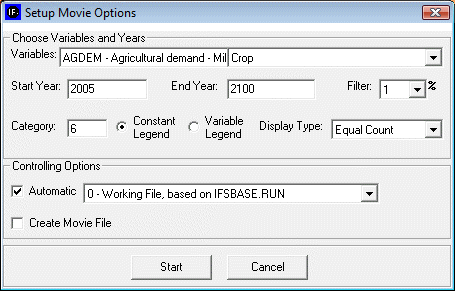
After selecting World Map Movie, the dialog box pictured below appears on the userscreen.
Choose Variables and Years
- Variables: allows user to select from the entire database of variables in IFs for the Historic World Map Movie. The forecasted World Map Movie includes a more limited database of variables from which to choose.
- Start Year: Enter the year from which the movie will begin.
- End Year: Enter in the year with which the movie will end.
- Filter: User can set the filter from 1% to 100%. This feature sets a minimum value for a portion of the data to be displayed in a given year.
- Category: Can be set from 1 to 16. Determines the number of categories to divide the values into.
- Constant/Variable Legend: Selecting the constant function will keep the numbers and measurements in the individual categories constant. The numbers and measurements will change over time if the variable legend is selected.
- Display Type: When Constant Legend is selected, two options will appear under display type: equal interval and equal count. The equal interval function divides the values equally between categories, with the interval calculated by the equation (highest value-lowest value/number of categories= interval width). The equal count function distributes the number of countries equally between the selected of number of categories. When Variable Legend is selected, a third option becomes available: equal match. If equal match is selected, legend values are assigned to each value uniquely. If there are not enough categories to represent each value, the countries that do not have the selected values are represented as blank.
Controlling Options
- Automatic: When deselected, the user scrolls through the years of the movie manually. When selected, the movie will automatically play the start year to the end year.
- World/Country: This toggle switch is available only under the Historic World Map Movie. It allows the user to view a movie of changes of the selected variable across the world or, when country is selected, to view a movie of the change in a variable across regions in a country. Three countries are available to the user to select: China, India, and Mexico.
- Create Movie file: This toggle switch allows the user to save the movie created. When the playing of the movie is complete, a prompt appears which allows the user to name and save the movie file. The saved movie file is available in Stored Map Movie.
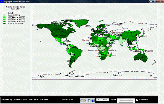
After selecting Start, the dialogue box will close, and the World Map as pictured below (or similar to it) will appear. This section describes what the user is viewing, and how to manipulate the functions at the bottom of the screen.
Playing Movie for Historic Data
The upper left portion of the screen lists whether the movie is showing a variable or constant legend and across which period of time. Underneath this information is the number of categories and the corresponding color for each category, and the numerical range for each category.
The main portion of the screen is the world map, divided into all countries for which IFs has data. The various shadings of the countries correspond to the various shading of the categories listed in the map legend. By right-clicking on the world map, the user is able to copy the map, zoom in on a particular location of the map, zoom out, or to reset the map to its original point of view.
The bottom section of the screen, from left to right, lists the variable displayed by the map, with the start year shown and the level of the filter. Next is the selected display type. The four buttons to the right of the display type allow the user to zoom in, zoom out, pan, and show the full extent of the world map. The first two buttons allow the user to zoom in on or zoom out from the area under which the cursor is located, while the full extent option resets the view of the world to the original perspective. The pan button allows the user to pan across the world by clicking on different parts of the map, which effectively pans across the world by re-centering the map on the area selected, after having zoomed in or zoomed, without zooming in or out any further. The next set of buttons allows the user to play or pause the movie, and to adjust the speed at which the movie will play. Next is a toggle switch which, when selected, makes the movie play automatically; when the switch is not selected, the user is able to advance the year displayed on the map or to go over previous years.
If the user selected “Create Movie File” during the setup phase, a dialogue box will appear after the movie is finished playing that prompts the user to provide a name and a place to save the movie file. The program will alert the user if the .avi file is successfully created and saved. To review the saved movie file, go to Stored Map Movie.
