General Display Options: Difference between revisions
CamrynDreyer (talk | contribs) No edit summary |
CamrynDreyer (talk | contribs) No edit summary |
||
| Line 51: | Line 51: | ||
This general topic will go over the possibilities available to users when they access a graph. | This general topic will go over the possibilities available to users when they access a graph. | ||
There are several types of graphs available on IFs. These include Line Graphs, Bar Graphs, Pie Charts, Scatter Plots, and Radial Graphs. The use of Radial Graphs is discussed as [ | There are several types of graphs available on IFs. These include Line Graphs, Bar Graphs, Pie Charts, Scatter Plots, and Radial Graphs. The use of Radial Graphs is discussed as [[#Radial_Graph|another topic]]. Depending on whether you are accessing graphs to display historic data or forecast data, different options will be available. | ||
Below is a general Line-Graph presented by IFs: | Below is a general Line-Graph presented by IFs: | ||
Revision as of 15:51, 25 July 2017
Table Use
This help topic will go over possibilities available to users when they access a table while using IFs.
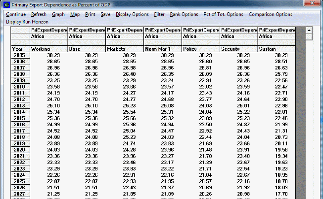
The format for tables used in IFs is displayed below:
Users can access tables from many different aspects of IFs. A typical table is organized into rows and columns with the rows representing different years and the columns representing different data series (depending on how the table is accessed, the columns could be one variable shown across different Run-Result-Files or data from different countries).
Some users will want to save these tables to .xls files that can then be used for further analysis. IFs provides many save options and users will be interested in the transpose and decompose save features detailed below. Other users will be interested in highlighting values that are above or below a certain specified range. For example, users may want to look at GDP growth data that is higher than 5%. Scroll down this help topic to the Filter section to learn how to do this.
Continue: Use this option to go back to the previous menu.
Refresh: If you have made any changes away from the default settings of the table, clicking on Refresh will bring about the default table settings.
Graph: Click on this and you will be able to create a line or a bar graph.
Save: This option offers IFs users flexibility in saving their work.
- It is possible to save your table as an Excel file, a CSV file or an Excel Report by selecting the File Type option after you have selected Save. The CSV, or comma separated variable, is a type of file that can be used with Excel or other spreadsheet programs. Additionally, by accessing the File Type sub-option, you can also access additional Excel formatting options. You can change or clear background formatting, add grids or add color options.
- By selecting First Year to Save, you can determine at what year your saved file will begin.
- By selecting Save Normal View, you will be prompted with a screen that allows you to save your file in an Excel format.
- By selecting Save and Transpose, you are then able to decide whether you would like to save the table as all of the years, every 5 years or every 10 years. Transposing your data switches the columns and rows so that the years are across the rows on the top of the table and the country data is located along the rows on the left hand.
- By choosing Save, Transpose and Decompose, users are able to save their data, move the year data to the top columns, the country data to the left hand rows and separate group information into individual member countries. This is a very helpful feature of IFs for those who choose to display data for a group or Glist and who would then like that information broken down into individual members upon saving.
Display Options
- Percent/Whole Toggle: By toggling between these two options, you can display data as either a percent deviation from the base year or as whole numbers.
- Cumulative Toggle: You can choose to display your results as cumulatively building or as select numbers for each year.
- Interval Average Toggle: This feature allows the user to smooth the forecast so that the trends are more clearly shown. Although it is available in every table, this feature is usable only through Self-Managed Display, because only this feature allows the user to set the display interval. To set the display interval, first select Set Title, Display Interval, or Year from the Display Format option on the Display Menu. Then enter the display interval at the desired level. Click on Exit, and then click on Table. Finally, click on the Interval Average toggle switch, located under Display Options on the heading of the Table Display. The average is computed by using the value for the previous years and the value for a given year. For example, the value for 2010 is calculated by using the value for the previous years, even though they are not displayed- that is, the value for 2010 is calculated by adding the values for the years 2006-2010 and dividing the total value by 5. The value for the year 2015 is calculated by adding the values for the years 2011-2015 and dividing that number by 5, and so on. This example had the display interval set at 5 years, but the process for calculating the interval average is the same when the display interval is set at other levels.
- Moving Average Toggle: Similar to the previous feature, this option allows the user to smooth the forecast by “averaging out” the values of the forecast. However, this feature allows the user to adjust the number of years used to compute the average, while the previous feature does not. The moving average is “moving” because the recomputed values take into account values for previous years that have already been recalculated. Take the moving average for the population of the USA as an example, with the number of years included in the moving average set at 5. The value for the year 2007 with the moving average turned off is 302.5 million people. With the moving average turned on, the value for the year 2007 becomes 303.5. The moving average for 2007 is calculated by adding the moving averages for the years 2005 and 2006, as well as the unaltered values for the years 2007-2009, and dividing the total number by 5. The moving averages for the years 2006 and 2005 are calculated similarly, although with fewer years due to the lack of years prior to 2005. The moving average for the year 2005 is calculated by adding the values for years 2005-2007 and dividing by 3. The moving average for 2006 is calculated by adding the moving average for 2005 to the values for the years 2006-2008 and dividing the total by 4, and so on. The user is able to change the number of years included in the moving average from the default number of years, which is 5.
Filter: This feature allows users to highlight certain variables that exceed or fall below a flexible threshold.
- Set Filter Parameters allows users to customize what minimum, maximum, range and rate thresholds they would like IFs to highlight. For example, if you are displaying Youth Bulge information for all countries, set the minimum filter level at 0.5.
- Users are then able to click on either Apply Min Level Filter, Apply Max Level Filter, Apply Range Level Filter or Apply Rate Level Filter. After selecting what filter the user would like to highlight, IFs will change the font of those selected variables to bold. For our Youth Bulge example, click on Apply Min Level Filter and all countries with a youth bulge higher than 50% will be highlighted in bold.
Rank Options: This feature allows the user to set a year by which to rank the forecast in ascending or descending order for multiple countries or groups.
Percent of Total Options: This feature shows the distribution of a given variable between two or more countries, groups, or regions as a percentage out of one hundred.
Comparison Options: This feature allows the user to divide or subtract two or more variables from one another. Will this feature is most likely to be used to compare forecasts of the same variable(s), it can be used for comparisons between different variables as well. For example, the user can subtract the demand for meat in Argentina from total meat imports to see the extent to which imports are exceeding or failing to meet demand. A single table will result. If the user wants to compare four variables, such as demand for crops with total imported crops and meat demand with total meat imports, two tables will result after the user selects a method of comparison. The use of the feature requires the selection of an even number of variables.
Display Run Horizon: This allows users to choose how far into the future their table will forecast their selected variables.
Additional Table Features: If you double-click on any of the variables in the table display, you will be presented with a small menu with four options.
Graph Use
Line Graph, Bar Graph, Scatter, Etc.
This general topic will go over the possibilities available to users when they access a graph.
There are several types of graphs available on IFs. These include Line Graphs, Bar Graphs, Pie Charts, Scatter Plots, and Radial Graphs. The use of Radial Graphs is discussed as another topic. Depending on whether you are accessing graphs to display historic data or forecast data, different options will be available.
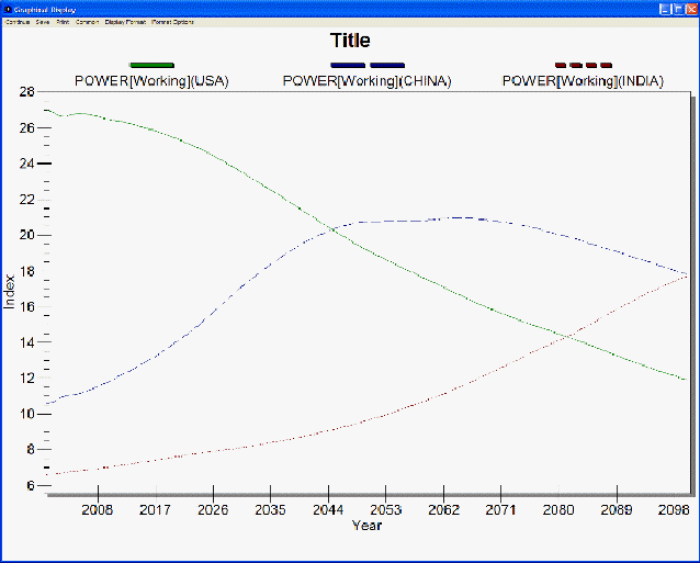
Below is a general Line-Graph presented by IFs:
The display options at the top of the chart are typical for most graphs.
The Continue button: Use this to exit out of the graph and return to the previous screen.
The Save Option: This will save the image you have created as one of a variety of files. The image can also be exported to the clipboard for pasting in other applications. This option also allows users to specify the size of the file that they will be creating.
The Print option: Select this option, choose what printer you will send the file to and then OK.
The Common/Scaled toggle: The scaled option displays a traditional graph. The common function displays the data points as moving from zero to one, typically the top left or bottom right, and then moving towards the opposite corner of the graph. This option is useful for those who are displaying data that either vary greatly and thus trends and patterns can not be easily distinguished.
The Display Format Option: This allows users to change the names in the legends, the titles of the graphs and generally customize the image for export.
There may be other options on the top of your graph. Some displays, like Pie Charts, have an Advance and Regress option at the top of the Main Menu. These options will allow users to move their pie chart through time in 5 year intervals.
By double-clicking on the body of the graph, users are presented with a number of other display options. Users can change labels, colors, styles and much more through this option. This new window that is displayed by double-clicking on the body of the graph has its own help system that can be accessed by clicking on the Help button located at the bottom of the window.
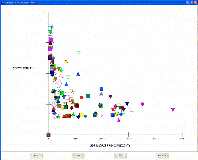
Scatter Plots have different options that are located at the bottom of the plot. Below is an image taken from IFs of a scatter plot:
The Print option is similar to the print option discussed above.
The Excel option allows users to export the data and the chart into Excel for further manipulation.
The Save option allows users to save their image.
The Continue option allows users to exit.
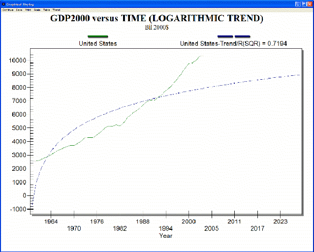
If you have accessed historic data and are taking a longitudinal analysis (found by selecting Data Analysis from the Main Menu and Analyze Across Time), there is the ability to extrapolate historic trends into the future.
By selecting the Trend option from the Main Menu of this feature, users are able to fit Linear, Polynomial, Logarithmic, Exponential or S-Shaped curves to historic data sets. One example is displayed below:
Radial Graph
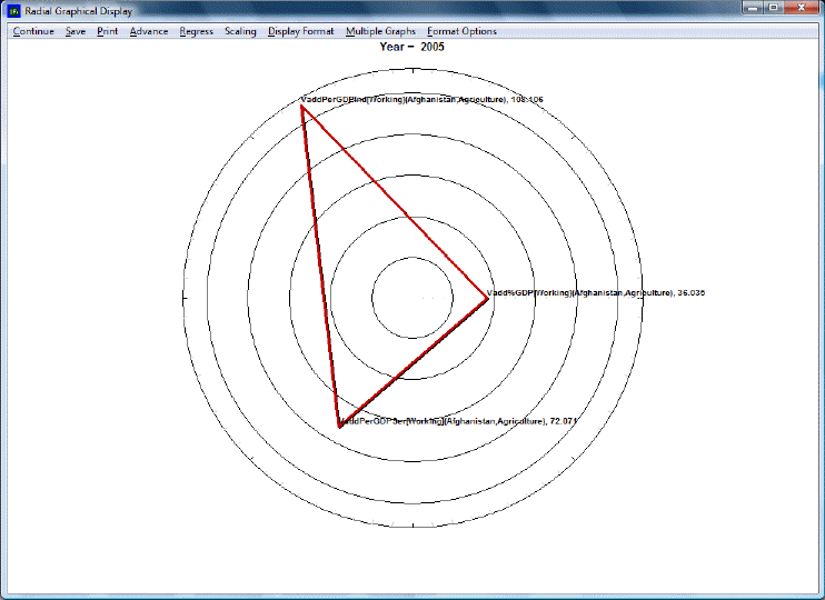
The Radial Graph is accessible through the Flexible Display and Self-Managed Display options. Let's walk through the use of this feature.
The Continue button: Use this to exit out of the graph and return to the previous screen.
The Save option: This will save the image you have created as one of a variety of files. The image can also be exported to the clipboard for pasting in other applications. This option also allows users to specify the size of the file that they will be creating.
The Print option: Select this option, choose what printer you will send the file to and then OK.
Advance: Clicking this button advances the graph by 5 years to a maximum of 2100.
Regress: Clicking this button regresses the graph by 5 years to a minimum of 2005.
Scaling: This option uses the maximum and minimum values for each variable across all regions and time, producing values between 0 and 1. This feature is particularly useful in conjunction with the Display in Different Graphs option (see below).
The Display Format option: This allows users to change the names in the legends, the titles of the graphs and generally customize the image for export.
By double-clicking on the body of the graph, users are presented with a number of other display options. Users can change labels, colors, styles and much more through this option. This new window that is displayed by double-clicking on the body of the graph has its own help system that can be accessed by clicking on the Help button located at the bottom of the window.
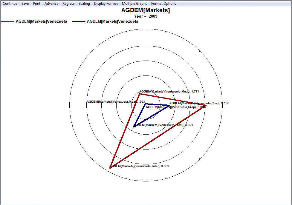
Multiple Graphs: Several sub-options appear after clicking on this option. We will walk through the use of these various features with an example. In Full Variable/Parameter Selection, first select a scenario- try Markets First. Then, select AGDEM-Venezuela-All. Next, select a different scenario, say, Sustainability First. Next, select AGDEM-Venezuela-All. Go the Display, and then to Radial Graph.
The first step is to adjust the number of variables display in the graph. The default number of variables displayed depends on the number selected. In this case, as we have six variables selected, six are displayed. However, selecting more than six variables will nevertheless require the user to manually adjust the number of variables displayed, as the default does not automatically go higher than six. For the example here, change the Variables Per Graph to three. A graph like the one pictured below should appear.
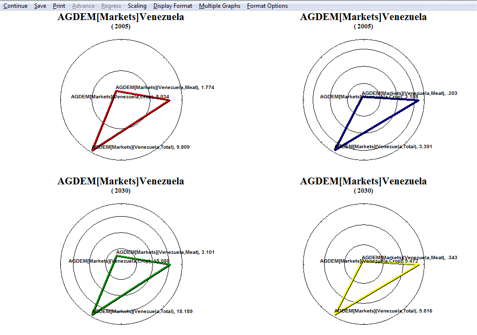
Next, click on Display in Different Graphs. This option is useful when working with two or more years or scenarios, as the user can choose to display the forecast or data for the years in different graphs. To facilitate making comparisons, the user should consider turning on Common Scaling under the Scaling option.
The next feature to experiment with is Continuous Mode. This feature involves adjust the manner in which variables are loaded in radial graph. In the current example, the first items selected in Full Variable/Parameter Selection were the two different scenarios- Markets First and Sustainability First. When Continuous Mode is selected, these are the criteria by which the variables are grouped. With Discontinuous Mode selected, the variables are interspersed between variables loaded in the even positions and variables loaded in the odd positions. To tell which variables are loaded in even and odd positions, simply return to the Display Menu and review the selected names. Similarly, if the variables were loaded according to country instead of by scenario, then using continuous mode would group the variables according to country. Note that selecting between continuous and discontinuous mode requires selecting an even number of variables.
The final feature to experiment with is Display Multiple Years. As the name says, this option allows the user to display multiple years in a single graph. Hold down Ctrl when selecting multiple years. The various years are identifiable by different colors corresponding to certain years. To keep with the current example, select 2005 and 2030. The following graphs should appear.
Format options: Double-clicking or right-clicking anywhere on the graph will bring up a dialogue box that has several display/formatting options.
Map Use
This general topic will go over the possibilities available to users when they access a map. There are two main places where users can access maps while using IFs:
You can find this by selecting Display from IFs Main Menu. Maps located here will display forecasted variables.
The other way that users can access maps when using IFs is through the Data Analysis option on the Main Menu of IFs. These maps will display historic, empirical data.
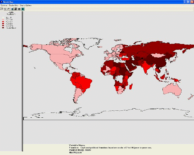
The format for maps used in IFs is displayed below:
Map Use Display
These maps are found by selecting Display from the Main Menu of IFs. Choose Specialized Display and map displays are located in the World Map, Lorenz and Gini option.
A function of the Main Menu of the map feature is the Continue button. Use this to exit and return to the previous display screen.
Another Main Menu option is TimeControl. If this is selected, the forecast can be advanced or regressed across time. Users can also move to the first and last years of the forecast by selecting FirstYear and LastYear respectively.
Yet another option on this version of the map is Display Options. The following options can be found by selecting this option.
- Labels: Selecting this option will allow users to place the names of all countries on the map. Removing Labels will take these names away. Users can also change the font of the country names.
- Colors: By selecting this option, users have the ability to change the color in which data is displayed.
- Projection: By selecting this option, users have the ability to display the map from different perspectives.
- Layers: Selecting this option presents users with the ability to add four different layers on top of the map to more clearly see how geographic changes may or may not play a role in different data displays.
- Equal Count/Equal Interval: Toggling between these two choices allows users to display their data emphasizing either an equal number of countries represented between each data interval (Equal Count) or equal disbursements of data (Equal Interval).
From this world map accessed from the Display option on the Main Menu of IFs, the last option available to users is the Variable option. This brings up a window that allows users to select from a list of variables used in IFs. After selecting these variables, they will be displayed on the world map. Scroll through the list of variables either manually or by clicking characters in the box located at the top of the window. Also, users are able to select from different Run-Result-Files located in the box at the bottom of the screen.
Another feature of the map is the collection of different buttons located directly beneath the Main Menu options.
A magnifying glass next to a plus sign: can be used to zoom in on a specific part of the world. Simply highlight the button, move your mouse over the part of the world you would like to more closely look at and left click.
A magnifying glass next to a minus sign: can be used to zoom out. Simply highlight this button, move your mouse over the world map and left click.
A hand: can be used to move the world map around. Highlight this feature, move your mouse over a zoomed-in world map, left click, hold and drag to your desired location.
A globe: can be used to zoom back out to the standard, centered view of the world map.
A printer: can be used to print out the map you are looking at.
A pointer: can be used to copy the data that underlies the map display. Clicking on this button will present a prompt that tells you that you have copied the data to the computer’s clipboard. If you would like to, say, copy the data to a Word file, simply open the file, right click on the white, empty space and select paste.
Some final features of the map are located to the left of the map and below the map. The map legend is located to the left of the map. It displays the data points that delineate the different display categories. At the bottom left of the display is an option to change the number of display categories. The year being displayed is identified as well as the variable name.
Map Use Data Analysis
These maps are found by selecting Data Analysis from the Main Menu of IFs and then World Map. These maps access and display historic, empirical data.
A function of the menu of the map feature is Continue button. Use this to exit and return to the previous display screen.
Another menu option is Display Data. If this option is selected, a box will appear that allows users to change the data set that is being displayed. The default data set that is available is the TimeSeries data table. By scrolling through the Data Table, users can select from different data sets. These sets then correspond with a larger list of variables displayed in the Variable Name scroll-down. Below the Variable Name option is the Dimension of Variable which allows users to change the year being displayed. At the top right of this box is the ability to increase the amount of categories displayed as well as switching between Equal Interval or Equal Count. The later option allows users to either display an equal number of countries in one category or numerically equal categories. Finally, at the very bottom of this box, users are able to access the Data Information.
Another feature of this version of the map is Display Options. The following options can be found by selecting this option.
- Labels: Selecting this option will allow users to place the names of all countries on the map. Removing Labels will take these names away. Users can also change the font of the country names.
- Colors: By selecting this option, users have the ability to change the color in which data is displayed.
- Projection: By selecting this option, users have the ability to display the map differently.
- Layers: Selecting this option presents users with the ability to add four different layers on top of the map to more clearly see how geographic changes may or may not play a role in different data displays.
Another feature of the map is the collection of different buttons located directly beneath the Main Menu options.
A magnifying glass next to a plus sign: can be used to zoom in on a specific part of the world. Simply highlight the button, move your mouse over the part of the world you would like to more closely look at and left click.
A magnifying glass next to a minus sign: can be used to zoom out. Simply highlight this button, move your mouse over the world map and left click.
A hand: can be used to move the world map around. Highlight this feature, move your mouse over a zoomed-in world map, left click, hold and drag to your desired location.
A globe: can be used to zoom back out to the standard, centered, default view of the world map.
A printer: can be used to print out the map you are looking at.
A pointer: can be used to copy the data that underlies the map display. Clicking on this button will present a prompt that tells you that you have copied the data to the computer’s clipboard. If you would like to, say, copy the data to a Word file, simply open the file, right click on the white, empty space and select paste.
Some final features of the map are located to the left of the map and below the map. The map legend is located to the left of the map. It displays the data points that delineate the different display categories. On the bottom of the map display, the year being displayed is identified as well as the variable name.
