Data Analysis: Difference between revisions
CamrynDreyer (talk | contribs) No edit summary |
No edit summary |
||
| (29 intermediate revisions by 2 users not shown) | |||
| Line 1: | Line 1: | ||
= <span style="font-size:xx-large;">World Map: | = <span style="font-size:xx-large;">World Map: Historic Data</span> = | ||
The World Map is located under the Data Analysis option on the Main Menu of IFs. | The World Map is located under the Data Analysis option on the Main Menu of IFs. | ||
[[File:Worldmap1.png|frame|center|World Map example]] | |||
The main function of the World Map is to display data in a visually dramatic format. Instead of representing country-related forecasts as lines in a graph, or columns in a table, the user is able to view the forecasts as shades of color imposed on a map of the world. | The main function of the World Map is to display data in a visually dramatic format. Instead of representing country-related forecasts as lines in a graph, or columns in a table, the user is able to view the forecasts as shades of color imposed on a map of the world. | ||
| Line 27: | Line 27: | ||
From the Main Menu, an option under Data Analysis provides users with the ability to examine the relationship between historical variables. From the Data Analysis menu, select Analyze Across Countries (Cross-Sectional) to reach the screen displayed below. | From the Main Menu, an option under Data Analysis provides users with the ability to examine the relationship between historical variables. From the Data Analysis menu, select Analyze Across Countries (Cross-Sectional) to reach the screen displayed below. | ||
[[File:Crosssectional1.png|frame|right|Variables across countries window]] | |||
To do a cross-sectional analysis, specify a dependent variable (a variable you want to understand the causes of) and one or more independent variables (the possible causes of change in the dependent variable). By convention, the dependent variable appears on the y-axis and the independent variable appears on the x-axis on a graph. To select a dependent variable first, scroll through the alphabetized variable list and left-click on any variable in which a user might be interested. Click Select to choose that variable. Users can also type a variable name in the simple text search box directly above the list, which filters series by prefix. Alternatively, there is a more sophisticated search feature available through the Search button at the bottom of the screen. From the search screen, a search on "female", for example, would find all results that contain the word, anywhere in the variable name or description. After selecting a dependent variable, either from the variable list or from the search form, a drop-down list will appear, specifying the year to be displayed. A cross-sectional display includes data for a single year, earliest available or most recent available for each country. The process described here is also used to assign independent variables. To reassign any variable, select the corresponding option button and simply load the new series. | To do a cross-sectional analysis, specify a dependent variable (a variable you want to understand the causes of) and one or more independent variables (the possible causes of change in the dependent variable). By convention, the dependent variable appears on the y-axis and the independent variable appears on the x-axis on a graph. To select a dependent variable first, scroll through the alphabetized variable list and left-click on any variable in which a user might be interested. Click Select to choose that variable. Users can also type a variable name in the simple text search box directly above the list, which filters series by prefix. Alternatively, there is a more sophisticated search feature available through the Search button at the bottom of the screen. From the search screen, a search on "female", for example, would find all results that contain the word, anywhere in the variable name or description. After selecting a dependent variable, either from the variable list or from the search form, a drop-down list will appear, specifying the year to be displayed. A cross-sectional display includes data for a single year, earliest available or most recent available for each country. The process described here is also used to assign independent variables. To reassign any variable, select the corresponding option button and simply load the new series. | ||
| Line 33: | Line 33: | ||
As a demonstration, plot a cross-sectional relationship between female education and reproduction rates. For the dependent variable choose total fertility rates, by selecting TFR from the list of variables. Left-click the variable and two options will appear: Select and Data Information. Click Select to choose that variable. The latter provides detailed information about the scope, availability and source of the data set. The ensuing drop-down list determines the year for which data will be displayed. For this example, choose 2010. Notice that TFR(2010) is then shown as the Dependent Variable. Next, choose an Independent Variable, the level of adult female education, by selecting EdYearsAge15Female for the same year. Click the Plot button to generate the graph displayed below. | As a demonstration, plot a cross-sectional relationship between female education and reproduction rates. For the dependent variable choose total fertility rates, by selecting TFR from the list of variables. Left-click the variable and two options will appear: Select and Data Information. Click Select to choose that variable. The latter provides detailed information about the scope, availability and source of the data set. The ensuing drop-down list determines the year for which data will be displayed. For this example, choose 2010. Notice that TFR(2010) is then shown as the Dependent Variable. Next, choose an Independent Variable, the level of adult female education, by selecting EdYearsAge15Female for the same year. Click the Plot button to generate the graph displayed below. | ||
[[File:Crosssectional2.png|frame|center|Scattergram of raw country data example]] | |||
To learn how to use various features on the scatter plot, click [ | To learn how to use various features on the scatter plot, click [[#Cross-Sectional_Scattergram|here]]. | ||
== <span style="font-size:x-large;">Cross-Sectional Scattergram</span> == | == <span style="font-size:x-large;">Cross-Sectional Scattergram</span> == | ||
| Line 41: | Line 41: | ||
This section describes how to use the various features on the Scattergram, which appears after clicking the Plot button in the Analyze Across Countries (Cross-Sectional) option. | This section describes how to use the various features on the Scattergram, which appears after clicking the Plot button in the Analyze Across Countries (Cross-Sectional) option. | ||
[[File:Crosssectional3.png|frame|center|Scattergram of raw country data example]] | |||
The '''Relationships''' option allows users to fit a line to the graph. To impose a line of relationship on the scatter plot as displayed above, choose Relationships from the toolbar, and the option Linear. Notice the r-squared value (a measure of the goodness of fit between the independent and dependent variable) and linear equation displayed at the top of the screen. Additional relationship types include: logarithmic, exponential, power, polynomial and logistic. To remove the line, click on No Regression. | The '''Relationships''' option allows users to fit a line to the graph. To impose a line of relationship on the scatter plot as displayed above, choose Relationships from the toolbar, and the option Linear. Notice the r-squared value (a measure of the goodness of fit between the independent and dependent variable) and linear equation displayed at the top of the screen. Additional relationship types include: logarithmic, exponential, power, polynomial and logistic. To remove the line, click on No Regression. | ||
| Line 53: | Line 53: | ||
= <span style="font-size:xx-large;">Analyze Across Time (Longitudinal Analysis)</span> = | = <span style="font-size:xx-large;">Analyze Across Time (Longitudinal Analysis)</span> = | ||
[ | Whereas [[#Analyze_Across_Countries_.28Cross-Sectional_Analysis.29|cross-sectional analysis (Analyze Across Countries)]] concerns historical relationships between different variables, the primary purpose of the longitudinal analysis (Analyze Across Time) is to trace historical trends of individual data series. This option can be accessed from the Data Analysis option on the Main Menu of IFs. | ||
[[File:Longitudinal1.png|frame|right|Variables across time window]] | |||
To start with, pick any data series to load a dependent variable. Time is set as an independent variable by default. Users can select a variable by scrolling through the dependent variable list box, typing a variable name in the text box or with the more sophisticated, separate Search option, located at the bottom of the screen. Click Select Countries to specify the data that will appear in graphs. (Note that Use Groups , the button beneath Select Countries, is a toggle, switching from country to group selection or vice-versa; e.g. if groups are selected the toggle will read "Use Countries"). From the country selection screen, pick a country, a group or a decomposed group. Buttons on the right side of the country selection screen also allow users to switch aggregation to groups or decomposed groups. Continue back to the original screen for analysis over time and Plot the result. | To start with, pick any data series to load a dependent variable. Time is set as an independent variable by default. Users can select a variable by scrolling through the dependent variable list box, typing a variable name in the text box or with the more sophisticated, separate Search option, located at the bottom of the screen. Click Select Countries to specify the data that will appear in graphs. (Note that Use Groups , the button beneath Select Countries, is a toggle, switching from country to group selection or vice-versa; e.g. if groups are selected the toggle will read "Use Countries"). From the country selection screen, pick a country, a group or a decomposed group. Buttons on the right side of the country selection screen also allow users to switch aggregation to groups or decomposed groups. Continue back to the original screen for analysis over time and Plot the result. | ||
| Line 61: | Line 61: | ||
To demonstrate, pick a variable such as AidDon%GNI (aid donations as a percent of Gross National Income, the successor concept to Gross National Product). Click the Select Countries button and choose United States as a donor country. To generate the graph displayed below, click Plot. You will see the trend of U.S. aid commitment over time. | To demonstrate, pick a variable such as AidDon%GNI (aid donations as a percent of Gross National Income, the successor concept to Gross National Product). Click the Select Countries button and choose United States as a donor country. To generate the graph displayed below, click Plot. You will see the trend of U.S. aid commitment over time. | ||
[[File:Longitudinal2.png|frame|center|Graph of Longitudinal Data Example]] | |||
On the Graphical Display screen as shown above, options on the top menu bar allow users to go back to home screen, alter the scale, display a table, format titles and explore future trends. Under the Trend menu, users can impose extrapolations—linear, polynomial, logarithmic, exponential and s-curve—onto the chart. The sub-option, Extrapolation Setup, features customization options for polynomial, exponential and s-curve trend lines. | On the Graphical Display screen as shown above, options on the top menu bar allow users to go back to home screen, alter the scale, display a table, format titles and explore future trends. Under the Trend menu, users can impose extrapolations—linear, polynomial, logarithmic, exponential and s-curve—onto the chart. The sub-option, Extrapolation Setup, features customization options for polynomial, exponential and s-curve trend lines. | ||
| Line 67: | Line 67: | ||
An additional feature of the longitudinal analysis is the ability to look more closely at the data set in which a user might be interested. Left-click on any variable and a small window with two options will appear: Select and Data Information. Click Data Information in order to access detailed information as to the scope, availability and properties of the data set in question. | An additional feature of the longitudinal analysis is the ability to look more closely at the data set in which a user might be interested. Left-click on any variable and a small window with two options will appear: Select and Data Information. Click Data Information in order to access detailed information as to the scope, availability and properties of the data set in question. | ||
Some other features of this section of IFs include the [ | Some other features of this section of IFs include the [[Repeated_Features#Computations|Computations]] button and the [[Repeated_Features#Table_Use|Table]] button. | ||
Other than the default setting, treating time as an independent variable, which allows users to look at a historical trend of one variable over time, two other types of analysis are also available in the model: treatment of time As Points and As Time. When the Treatment of Time check box labeled As Points is active, the data points become years and users can look at the relationship between two variables as x- and y-axes. The third option, treatment of time as time, facilitates side-by-side comparison of longitudinal trends with two different variables on the same display (the x-axis is time, in this case). | Other than the default setting, treating time as an independent variable, which allows users to look at a historical trend of one variable over time, two other types of analysis are also available in the model: treatment of time As Points and As Time. When the Treatment of Time check box labeled As Points is active, the data points become years and users can look at the relationship between two variables as x- and y-axes. The third option, treatment of time as time, facilitates side-by-side comparison of longitudinal trends with two different variables on the same display (the x-axis is time, in this case). | ||
| Line 79: | Line 79: | ||
By clicking on Show Computed Functions, you will be presented with a menu that looks similar to the one pictured below: | By clicking on Show Computed Functions, you will be presented with a menu that looks similar to the one pictured below: | ||
[[File:Functions.png|frame|center|Show Computed Functions menu]] | |||
The box that is located in the middle of your screen holds hundreds of functions. If you click on the Extend List option right above this box, it will display an expanded list of functions. | The box that is located in the middle of your screen holds hundreds of functions. If you click on the Extend List option right above this box, it will display an expanded list of functions. | ||
| Line 91: | Line 91: | ||
= <span style="font-size:xx-large;">Identify Group or Country/Region Members</span> = | = <span style="font-size:xx-large;">Identify Group or Country/Region Members</span> = | ||
To identify regions or group members used in IFs, click on Data Analysis on the Main Menu of IFs, and then select Identify Group or Country/Region Members. | To identify regions or group members used in IFs, click on Data Analysis on the Main Menu of IFs, and then select Identify Group or Country/Region Members.[[File:Identify.png|frame|right|Identify Group or Country/Region Members window]] | ||
This feature of IFs allows users to identify which countries/regions are represented in certain groups. By clicking on any of the groups in the left-hand list, the members of that group will appear on the right hand side. | This feature of IFs allows users to identify which countries/regions are represented in certain groups. By clicking on any of the groups in the left-hand list, the members of that group will appear on the right hand side. | ||
By clicking on Using Regions, the list of groups on the left hand side will become a list of countries/regions. | By clicking on Using Regions, the list of groups on the left hand side will become a list of countries/regions. | ||
Latest revision as of 20:17, 27 July 2017
World Map: Historic Data
The World Map is located under the Data Analysis option on the Main Menu of IFs.
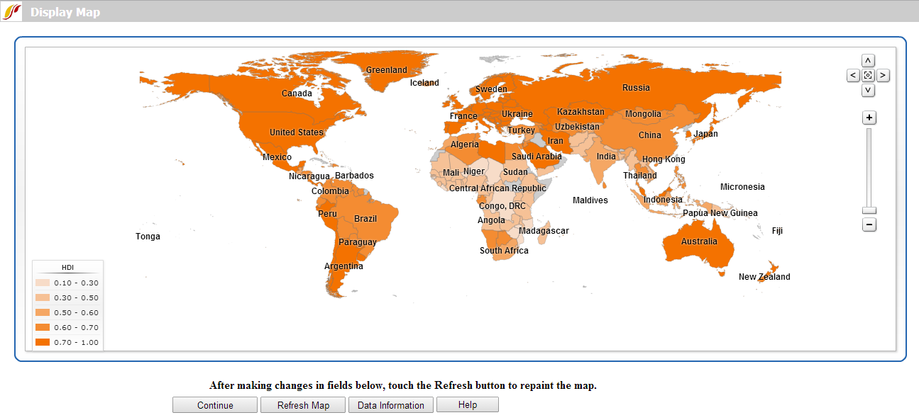
The main function of the World Map is to display data in a visually dramatic format. Instead of representing country-related forecasts as lines in a graph, or columns in a table, the user is able to view the forecasts as shades of color imposed on a map of the world.
The main features of this option are located at the bottom of the screen which allows users to change the data set that is being displayed. Be sure to click the Refresh Map button after making any changes.
- Use Continue button to exit and return to the IFs Main Menu.
- Data availability statistics and source information of each data series are available from the Data Information button.
- The default data table that is available is TimeSeries, a broad group that contains most longitudinal data series in IFs. By clicking the Data Table drop-down menu, users can select from different data sets. These sets then correspond with a larger list of variables displayed in the Data Field list box.
- Below the Data Table option is the Dimension of Variable which allows users to change the year being displayed. Options include individual years, earliest year available for each country and most recent year available for each country.
- Boxes labeled Display Type and Number of Categories allow users to customize the map display. The default display type is set to Equal Interval, which divides the total range of values into the number of categories specified. The alternative categorization, Equal Count, displays an equal amount of responses in each category. For any data display option, users can create up to 7 distinct categories for display.
- Another input box, Color, determines the shading color in which data is displayed.
- Finally, by selecting the Projection option at the very bottom of the page, users are able to toggle between multiple global cartographic projections.
Some final features of the map are located inside the map display.
- The map legend is located to the left of the map. It displays the data points that delineate the different display categories.
- To move around the map, use the arrow buttons located to the right of the map; to reset the view, click the button at the center of the arrow buttons; zoom in or out using the plus/minus bar.
- Hovering over each country in the map displays the associated value of the data set, and left clicking on the map allows users to view either a detailed map of the country or a table of the data values by year.
Analyze Across Countries (Cross-Sectional Analysis)
From the Main Menu, an option under Data Analysis provides users with the ability to examine the relationship between historical variables. From the Data Analysis menu, select Analyze Across Countries (Cross-Sectional) to reach the screen displayed below.
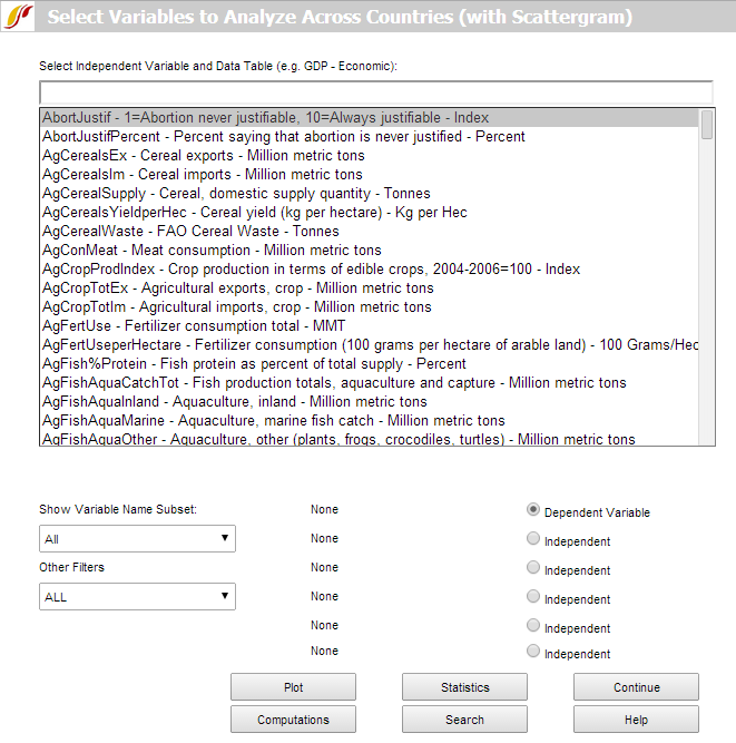
To do a cross-sectional analysis, specify a dependent variable (a variable you want to understand the causes of) and one or more independent variables (the possible causes of change in the dependent variable). By convention, the dependent variable appears on the y-axis and the independent variable appears on the x-axis on a graph. To select a dependent variable first, scroll through the alphabetized variable list and left-click on any variable in which a user might be interested. Click Select to choose that variable. Users can also type a variable name in the simple text search box directly above the list, which filters series by prefix. Alternatively, there is a more sophisticated search feature available through the Search button at the bottom of the screen. From the search screen, a search on "female", for example, would find all results that contain the word, anywhere in the variable name or description. After selecting a dependent variable, either from the variable list or from the search form, a drop-down list will appear, specifying the year to be displayed. A cross-sectional display includes data for a single year, earliest available or most recent available for each country. The process described here is also used to assign independent variables. To reassign any variable, select the corresponding option button and simply load the new series.
As a demonstration, plot a cross-sectional relationship between female education and reproduction rates. For the dependent variable choose total fertility rates, by selecting TFR from the list of variables. Left-click the variable and two options will appear: Select and Data Information. Click Select to choose that variable. The latter provides detailed information about the scope, availability and source of the data set. The ensuing drop-down list determines the year for which data will be displayed. For this example, choose 2010. Notice that TFR(2010) is then shown as the Dependent Variable. Next, choose an Independent Variable, the level of adult female education, by selecting EdYearsAge15Female for the same year. Click the Plot button to generate the graph displayed below.
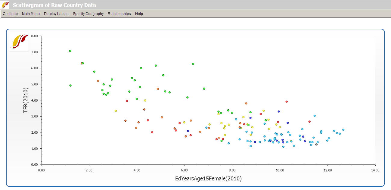
To learn how to use various features on the scatter plot, click here.
Cross-Sectional Scattergram
This section describes how to use the various features on the Scattergram, which appears after clicking the Plot button in the Analyze Across Countries (Cross-Sectional) option.
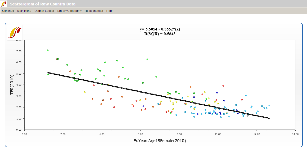
The Relationships option allows users to fit a line to the graph. To impose a line of relationship on the scatter plot as displayed above, choose Relationships from the toolbar, and the option Linear. Notice the r-squared value (a measure of the goodness of fit between the independent and dependent variable) and linear equation displayed at the top of the screen. Additional relationship types include: logarithmic, exponential, power, polynomial and logistic. To remove the line, click on No Regression.
The Display Labels feature allows users to change the labels on the graph. The default selection is No Labels. Although the country names are not shown on the graph with this setting active, users are able to see them by hovering over the data points on the plot area. By switching options under the Display Labels menu, countries can be represented by the full names or the abbreviations of the names instead. Users can also fully customize the labels of the x- and y-axes, the title, and the subtitle of the graph.
Alongside Display Labels, the Specify Geography menu option allows the user to display data by country, group, or geographic list.
Clicking on Continue returns the user to the previous page.
Analyze Across Time (Longitudinal Analysis)
Whereas cross-sectional analysis (Analyze Across Countries) concerns historical relationships between different variables, the primary purpose of the longitudinal analysis (Analyze Across Time) is to trace historical trends of individual data series. This option can be accessed from the Data Analysis option on the Main Menu of IFs.
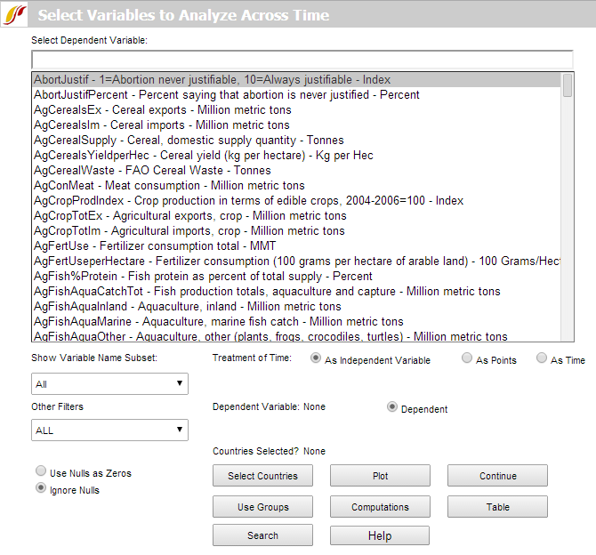
To start with, pick any data series to load a dependent variable. Time is set as an independent variable by default. Users can select a variable by scrolling through the dependent variable list box, typing a variable name in the text box or with the more sophisticated, separate Search option, located at the bottom of the screen. Click Select Countries to specify the data that will appear in graphs. (Note that Use Groups , the button beneath Select Countries, is a toggle, switching from country to group selection or vice-versa; e.g. if groups are selected the toggle will read "Use Countries"). From the country selection screen, pick a country, a group or a decomposed group. Buttons on the right side of the country selection screen also allow users to switch aggregation to groups or decomposed groups. Continue back to the original screen for analysis over time and Plot the result.
To demonstrate, pick a variable such as AidDon%GNI (aid donations as a percent of Gross National Income, the successor concept to Gross National Product). Click the Select Countries button and choose United States as a donor country. To generate the graph displayed below, click Plot. You will see the trend of U.S. aid commitment over time.
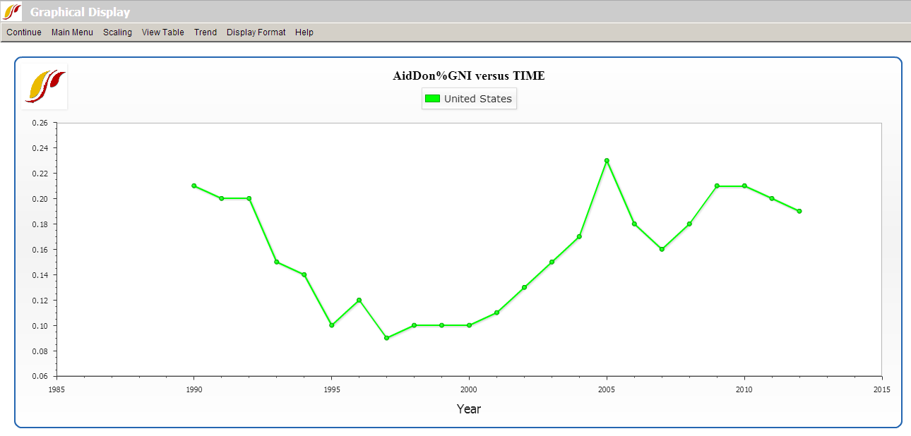
On the Graphical Display screen as shown above, options on the top menu bar allow users to go back to home screen, alter the scale, display a table, format titles and explore future trends. Under the Trend menu, users can impose extrapolations—linear, polynomial, logarithmic, exponential and s-curve—onto the chart. The sub-option, Extrapolation Setup, features customization options for polynomial, exponential and s-curve trend lines.
An additional feature of the longitudinal analysis is the ability to look more closely at the data set in which a user might be interested. Left-click on any variable and a small window with two options will appear: Select and Data Information. Click Data Information in order to access detailed information as to the scope, availability and properties of the data set in question.
Some other features of this section of IFs include the Computations button and the Table button.
Other than the default setting, treating time as an independent variable, which allows users to look at a historical trend of one variable over time, two other types of analysis are also available in the model: treatment of time As Points and As Time. When the Treatment of Time check box labeled As Points is active, the data points become years and users can look at the relationship between two variables as x- and y-axes. The third option, treatment of time as time, facilitates side-by-side comparison of longitudinal trends with two different variables on the same display (the x-axis is time, in this case).
Exploration of maps, cross-sectional and longitudinal relationships, and relationships computed for IFs can give you much information about the apparent relationships among a wide range of global development indicators. Even if you never used IFs for forecasting, this data analysis capacity could significantly enhance your understanding of the world.
Show Computed Functions
To access Show Computed Functions, click on Data Analysis on the Main Menu of IFs.
By clicking on Show Computed Functions, you will be presented with a menu that looks similar to the one pictured below:
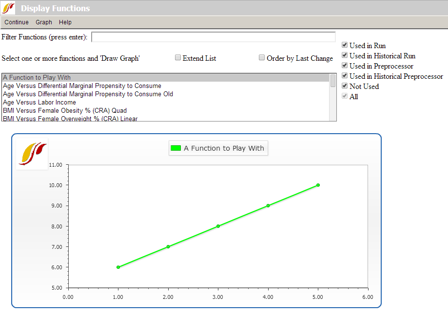
The box that is located in the middle of your screen holds hundreds of functions. If you click on the Extend List option right above this box, it will display an expanded list of functions.
In the Filter Functions box on the top of your page, type in any search terms for functions that you would like to see displayed and hit the Enter key. This will bring up all the functions/relationships that have your term(s) in their names.
After you have selected a function, choose the Graph option from the top of the menu and click on Draw. This will then display the function at the bottom of the screen along with the specific function and an R-Squared value.
Select one or more of functions if you would like to see multiple relationships on one screen. In order to select more than one function, highlight the first function, hold the Ctrl key and select a second function.
Identify Group or Country/Region Members
To identify regions or group members used in IFs, click on Data Analysis on the Main Menu of IFs, and then select Identify Group or Country/Region Members.
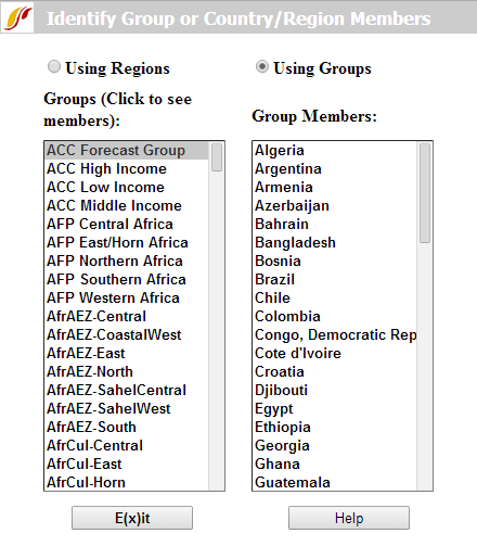
This feature of IFs allows users to identify which countries/regions are represented in certain groups. By clicking on any of the groups in the left-hand list, the members of that group will appear on the right hand side.
By clicking on Using Regions, the list of groups on the left hand side will become a list of countries/regions.