Population by Age and Sex: Difference between revisions
No edit summary |
No edit summary |
||
| Line 1: | Line 1: | ||
= <span style="font-size:xx-large;">Population by Age and Sex</span><span style="font-size:xx-large;"></span> = | |||
[[ | The Population by Age and Sex option can be found from the Main Menu: choose the Display option, the Specialized Displays for Issues sub-option, and the Population by Age and Sex sub-sub-option. The option is also found in the [http://www.du.edu/ifs/help/use-online/display/mainmap.html Main Menu Map] options. | ||
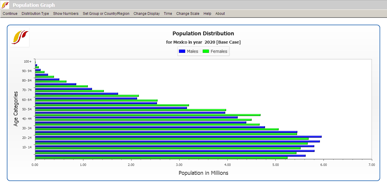
That will bring up what demographers call an age-sex distribution of population, like the one below for Mexico in 2020. From this menu it is possible to display a population chart for any country/region or group of the globe. If you would like to display any specific country chart, click on Change Display and then Change Countries/Regions. A list will appear and you can scroll down to the country of your choice, in this case, Mexico. | |||
In order to set the appropriate year, click on Change Display and then the sub-option Set Year. Clicking on Advance or Regress under the Time option will move the chart forward or backwards 5 years. If you would like to display a chart based on a group, select Set Group or Country/Region and then choose the Groups sub-option. You also have the option of displaying the numbers that were used to create this chart by clicking on the Show Numbers option. | |||
[[File:Useifs13.png|center]] | |||
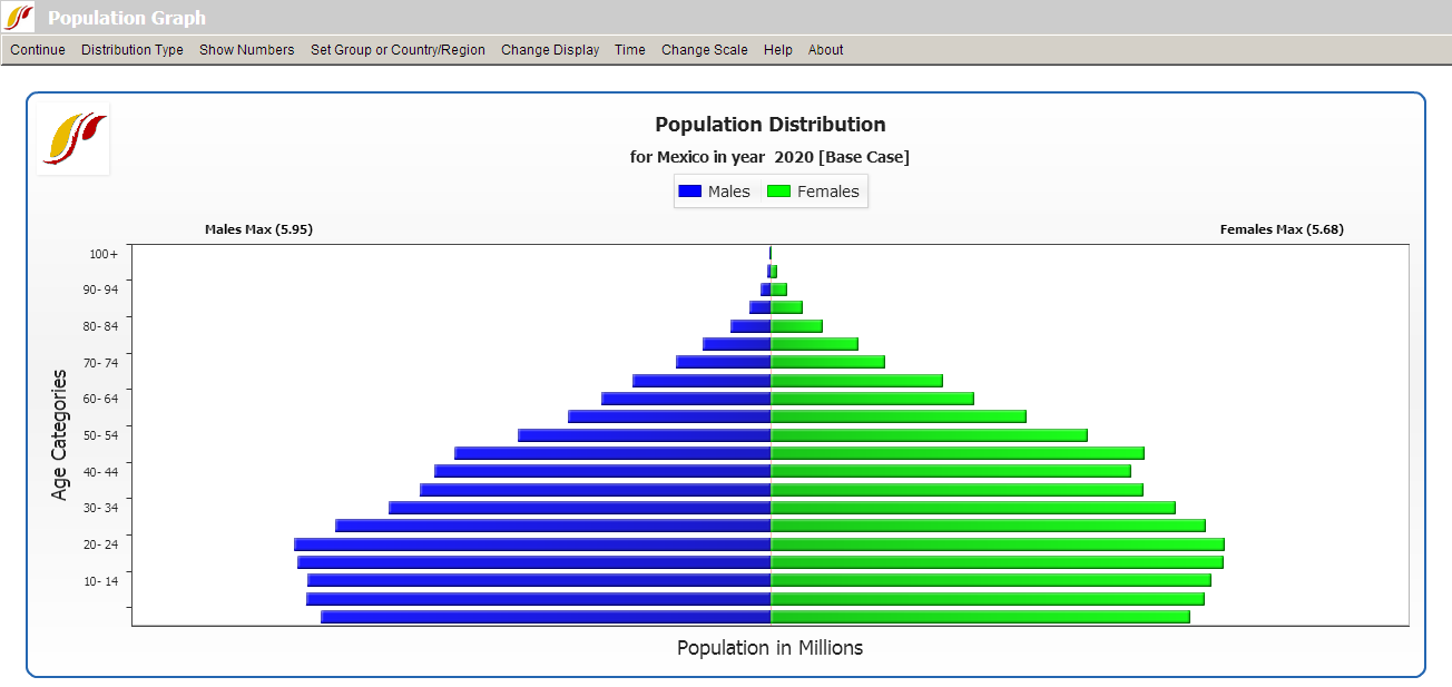
The above age distribution chart displays male and female population sizes for age cohorts separated into 5 year intervals. If you go to the Distribution Type option at the top of this chart and instead select Population Pyramid, you will have a chart that also separates the population into sexes (males on the left, females on the right) and age cohorts in 5 year intervals. This chart (displayed below for Mexico in 2020) is a more common representation of an age-sex distribution, but does not allow easy sex comparison, which is important for countries like China and India with a male selection bias. | |||
[[File:Useifs14.PNG|center]] | |||
The Change Scenario sub-option under Change Display allows display of results from scenarios other than the base case or the working file. | |||
You can also produce fertility and mortality charts from this screen. Click on the Distribution Type option and then the Fertility Distribution sub-option. This will create a chart that shows at what age women are having children. By clicking on the Distribution Type option and the Mortality Distribution sub-option, you are presented with a chart that visually describes the ages that people are dying. Using the Time option with the mortality distribution can help you understand both infant mortality trends and trends in life expectancy. Try two very different countries like Japan and Cambodia. The Compare Countries option under Distribution Type also allows you to compare countries, years, and/or scenarios on the same graphic. | |||
In the interest of transparency, IFs presents [http://www.du.edu/ifs/help/understand/demography/dominant.html information] about population data and equations that are used to determine these numbers. | |||
= <span style="font-size:xx-large;">Birth Cohort Information</span> = | |||
The feature Birth Cohort Information is located under the Specialized Displays for Issues sub-option, which is in turn located under the Display topic on the Main Menu. | |||
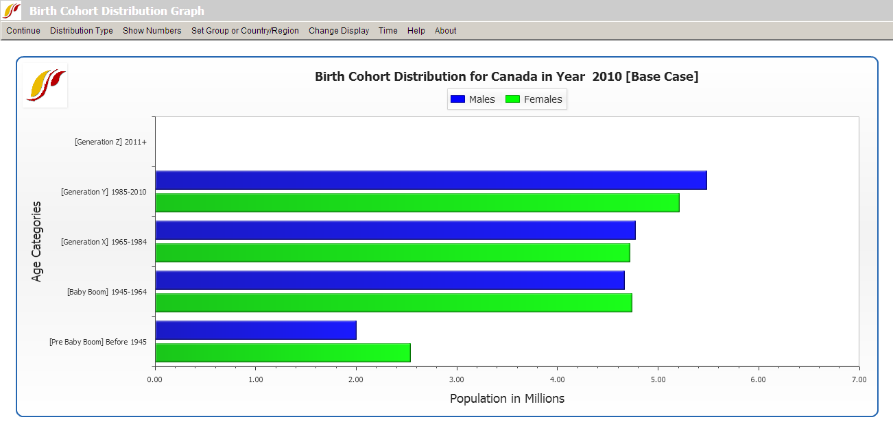
The use of this feature is quite similar to the use of [http://www.du.edu/ifs/help/use-online/display/specialized/population/population.html Population by Age and Sex]. However, this feature allows the user to view the total population of a [http://www.du.edu/ifs/help/use-online/repeated/countryregion.html country/region or group] as broken down into generations (or other age groupings). For example, notice the left side of the picture shown below. In this example, the birth cohorts are for Canada. For the year 2010, the majority of the population is grouped into Generations X and Y, which were born between the years 1965-1984 and 1985-2010 respectively, and the Baby Boom generation (1945-1964). A few of the Pre-Baby Boom generation are alive, while (obviously) no one from Generation Z is born yet in 2010. | |||
[[File:Useifs10.png|center]] | |||
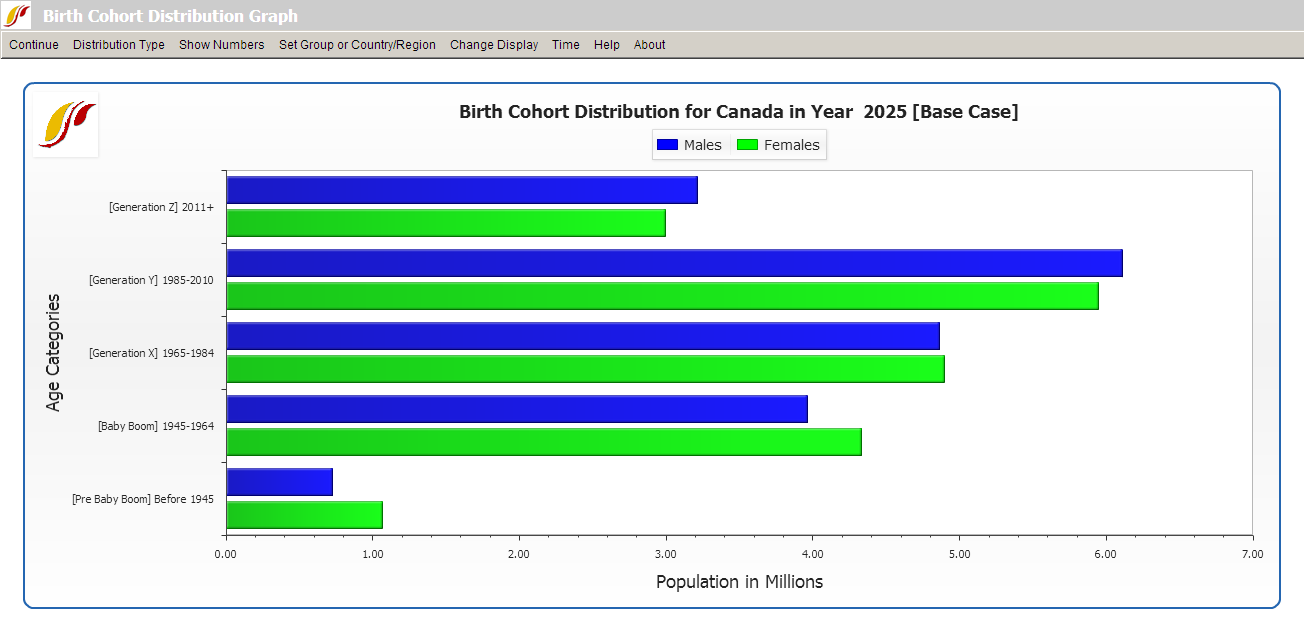
Next, click on the Change Display option on the top of the screen and then select Set Year. Choose the year 2025. The user should see a graph similar to the one below. In this new graph, notice the changes in the distribution of the total population among the various generational cohorts. Members of Generation Z are now represented on the graph, while the numbers of the Pre-Baby Boom generation have decreased since 2010. The numbers of people belonging to the Baby Boom generation have also decreased, while the numbers for Generations X and Y have changed little. | |||
[[File:Useifs11.PNG|center]] | |||
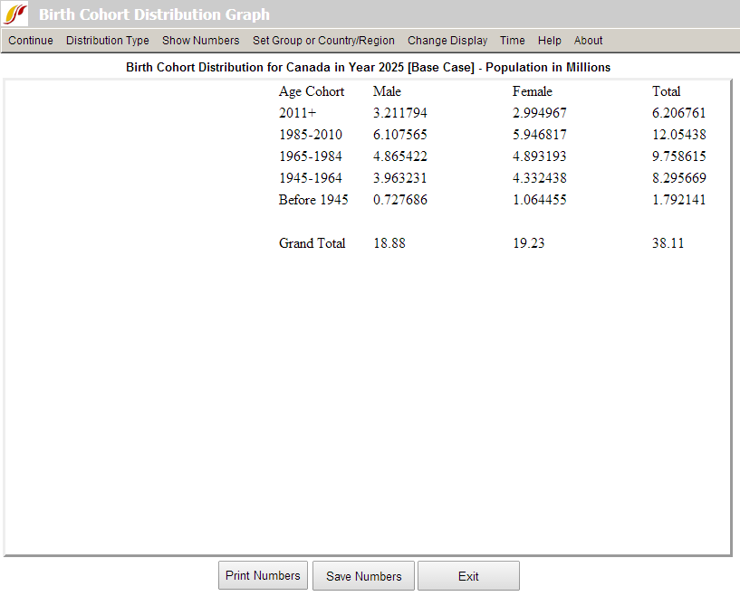
The user is able to customize and experiment with the forecasted birth cohort information, according the preferences of the user. By clicking on the Show Numbers option in the heading, the user is able to view the number of males and females that makes up each cohort. The user is able to save and/or print the birth cohort information. | |||
[[File:Useifs12.PNG|center]] | |||
If the user wants to view other countries, first select Change Display, and then select Change Countries/Regions. A list of countries or regions to choose from should appear. The user may also be interested in view how the distribution of birth cohorts are affected by running scenarios different from the base case. To change the [http://www.du.edu/ifs/help/use-online/scenario/scenario.html scenario], first select Change Display, and then Change Scenario. | |||
| |||
<span style="font-size:xx-large;"></span> | |||
Revision as of 20:39, 17 July 2017
Population by Age and Sex
The Population by Age and Sex option can be found from the Main Menu: choose the Display option, the Specialized Displays for Issues sub-option, and the Population by Age and Sex sub-sub-option. The option is also found in the Main Menu Map options.
That will bring up what demographers call an age-sex distribution of population, like the one below for Mexico in 2020. From this menu it is possible to display a population chart for any country/region or group of the globe. If you would like to display any specific country chart, click on Change Display and then Change Countries/Regions. A list will appear and you can scroll down to the country of your choice, in this case, Mexico.
In order to set the appropriate year, click on Change Display and then the sub-option Set Year. Clicking on Advance or Regress under the Time option will move the chart forward or backwards 5 years. If you would like to display a chart based on a group, select Set Group or Country/Region and then choose the Groups sub-option. You also have the option of displaying the numbers that were used to create this chart by clicking on the Show Numbers option.
The above age distribution chart displays male and female population sizes for age cohorts separated into 5 year intervals. If you go to the Distribution Type option at the top of this chart and instead select Population Pyramid, you will have a chart that also separates the population into sexes (males on the left, females on the right) and age cohorts in 5 year intervals. This chart (displayed below for Mexico in 2020) is a more common representation of an age-sex distribution, but does not allow easy sex comparison, which is important for countries like China and India with a male selection bias.
The Change Scenario sub-option under Change Display allows display of results from scenarios other than the base case or the working file.
You can also produce fertility and mortality charts from this screen. Click on the Distribution Type option and then the Fertility Distribution sub-option. This will create a chart that shows at what age women are having children. By clicking on the Distribution Type option and the Mortality Distribution sub-option, you are presented with a chart that visually describes the ages that people are dying. Using the Time option with the mortality distribution can help you understand both infant mortality trends and trends in life expectancy. Try two very different countries like Japan and Cambodia. The Compare Countries option under Distribution Type also allows you to compare countries, years, and/or scenarios on the same graphic.
In the interest of transparency, IFs presents information about population data and equations that are used to determine these numbers.
Birth Cohort Information
The feature Birth Cohort Information is located under the Specialized Displays for Issues sub-option, which is in turn located under the Display topic on the Main Menu.
The use of this feature is quite similar to the use of Population by Age and Sex. However, this feature allows the user to view the total population of a country/region or group as broken down into generations (or other age groupings). For example, notice the left side of the picture shown below. In this example, the birth cohorts are for Canada. For the year 2010, the majority of the population is grouped into Generations X and Y, which were born between the years 1965-1984 and 1985-2010 respectively, and the Baby Boom generation (1945-1964). A few of the Pre-Baby Boom generation are alive, while (obviously) no one from Generation Z is born yet in 2010.
Next, click on the Change Display option on the top of the screen and then select Set Year. Choose the year 2025. The user should see a graph similar to the one below. In this new graph, notice the changes in the distribution of the total population among the various generational cohorts. Members of Generation Z are now represented on the graph, while the numbers of the Pre-Baby Boom generation have decreased since 2010. The numbers of people belonging to the Baby Boom generation have also decreased, while the numbers for Generations X and Y have changed little.
The user is able to customize and experiment with the forecasted birth cohort information, according the preferences of the user. By clicking on the Show Numbers option in the heading, the user is able to view the number of males and females that makes up each cohort. The user is able to save and/or print the birth cohort information.
If the user wants to view other countries, first select Change Display, and then select Change Countries/Regions. A list of countries or regions to choose from should appear. The user may also be interested in view how the distribution of birth cohorts are affected by running scenarios different from the base case. To change the scenario, first select Change Display, and then Change Scenario.