Use IFs (Download): Millennium Development Goals: Difference between revisions
No edit summary |
No edit summary |
||
| Line 20: | Line 20: | ||
At this point, a chart should appear like the one below. | At this point, a chart should appear like the one below. | ||
[[File:Devgoals.gif|center| | [[File:Devgoals.gif|center|Example of the current trajectory of a particular indicator, the goal for the indicator, and the forecast]]The box at the top left of the picture shows the selected goal, target, and indicator. The top right box in this case is green, which means that the country/region or group is making fast progress towards meeting the MDG. This color of this box will change according to whether the country is making progress towards meeting the MDG and the speed of that progress (green for fast progress, blue for moderate, yellow for slow), whether the country is regressing from the MDG (red for regression), or whether no change is made in relation to the goal (purple for no progress). Next, the user can select to display the data as a chart (the default setting) or to simply view the data. | ||
The chart will usually display blue bars, which represent historic data, and a series of lines. These lines represent the current trajectory of the particular indicator (red), the goal for the indicator (green) and then the forecast, which will come in a variety of colors. The user can choose to display the chart monochromatically by selecting the Monochrome option under the Graphic heading at the top of the screen. The user can also choose to view the earliest available data for the selected indicator or to view the latest, options which are both located under the Display Options heading. By selecting Using estimated historic line that may not meet forecast line, which is also located under the Display Options heading, the user can view an unadjusted historical trajectory; selecting the option Overriding the base year value historic line with forecast value will force the historic trajectory and forecasted data to meet. | The chart will usually display blue bars, which represent historic data, and a series of lines. These lines represent the current trajectory of the particular indicator (red), the goal for the indicator (green) and then the forecast, which will come in a variety of colors. The user can choose to display the chart monochromatically by selecting the Monochrome option under the Graphic heading at the top of the screen. The user can also choose to view the earliest available data for the selected indicator or to view the latest, options which are both located under the Display Options heading. By selecting Using estimated historic line that may not meet forecast line, which is also located under the Display Options heading, the user can view an unadjusted historical trajectory; selecting the option Overriding the base year value historic line with forecast value will force the historic trajectory and forecasted data to meet. | ||
| Line 27: | Line 27: | ||
= <span style="font-size:xx-large;">Poverty Level Display</span> = | = <span style="font-size:xx-large;">Poverty Level Display</span> = | ||
This feature can be accessed from the main menu of IFs by clicking on Display, then Specialized Display and then Poverty Level Display. | This feature can be accessed from the main menu of IFs by clicking on Display, then Specialized Display and then Poverty Level Display. | ||
| Line 40: | Line 38: | ||
Next, it may be of interest to change the Using Countries/Regions and Using Groups toggle. This allows you to see a forecast of how many people live under certain monetary constraints in differently constructed geographically bound regions. The last toggle on this screen allows displays to be either in millions of people or in a percentage of population. | Next, it may be of interest to change the Using Countries/Regions and Using Groups toggle. This allows you to see a forecast of how many people live under certain monetary constraints in differently constructed geographically bound regions. The last toggle on this screen allows displays to be either in millions of people or in a percentage of population. | ||
[[File:Devgoals1.gif|center| | [[File:Devgoals1.gif|center|Example of display settings for poverty levels]] | ||
However, while $1 per day has been a gold standard for poverty measurement for many years, rising incomes have made it necessary to look at populations who live under a higher set of monetary constraints. For example, it is possible to change the default $1 setting to a higher setting, like $5 per day. Additionally, it is possible to display the nth poorest percentile in a country by selecting the Poverty Percentile button and then changing the percentage located in the box. | However, while $1 per day has been a gold standard for poverty measurement for many years, rising incomes have made it necessary to look at populations who live under a higher set of monetary constraints. For example, it is possible to change the default $1 setting to a higher setting, like $5 per day. Additionally, it is possible to display the nth poorest percentile in a country by selecting the Poverty Percentile button and then changing the percentage located in the box. | ||
Revision as of 20:44, 24 July 2017
Millenium Development Goals
The Millennium Development Goals (MDGs) option is located under the Specialized Display option, which is in turn located under the Display option on the main menu. The MDGs option is also located under the Main Menu Map options.
The MDGs are a set of 8 goals which were adopted in 2000 and are supposed to be met by participating countries by 2015. The goals are the following:
- Eradicate extreme poverty and hunger
- Achieve universal primary education
- Promote gender equality and empower women
- Reduce child mortality
- Improve maternal health
- Combat HIV/AIDS, malaria and other diseases
- Ensure environmental sustainability
- Develop a global partnership for development
Each goal has a target that is in turn measured by one or more indicators. For instance, the target of the goal to eradicate extreme poverty is to halve the proportion of people whose income is less than $1 per day, which is measured in by the indicator of purchasing power parity (PPP).
To use the MDGs option, first select the goal to display. Next, select the target, and then the indicator. Experimenting with the various targets and indicators will help familiarize the user to the relationships between the goal, targets, and indicators. The user should then select the country/region or group to display. Click the Use Groups option in the heading to switch from countries to groups. Finally, select the run file with which to forecast the selected indicator. The one to use first is probably the Working File, but the user can begin with any of the available run files.
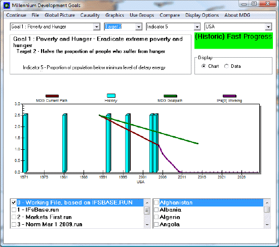
At this point, a chart should appear like the one below.

The box at the top left of the picture shows the selected goal, target, and indicator. The top right box in this case is green, which means that the country/region or group is making fast progress towards meeting the MDG. This color of this box will change according to whether the country is making progress towards meeting the MDG and the speed of that progress (green for fast progress, blue for moderate, yellow for slow), whether the country is regressing from the MDG (red for regression), or whether no change is made in relation to the goal (purple for no progress). Next, the user can select to display the data as a chart (the default setting) or to simply view the data.
The chart will usually display blue bars, which represent historic data, and a series of lines. These lines represent the current trajectory of the particular indicator (red), the goal for the indicator (green) and then the forecast, which will come in a variety of colors. The user can choose to display the chart monochromatically by selecting the Monochrome option under the Graphic heading at the top of the screen. The user can also choose to view the earliest available data for the selected indicator or to view the latest, options which are both located under the Display Options heading. By selecting Using estimated historic line that may not meet forecast line, which is also located under the Display Options heading, the user can view an unadjusted historical trajectory; selecting the option Overriding the base year value historic line with forecast value will force the historic trajectory and forecasted data to meet.
Several options are located in the heading. Clicking on Continue returns the user to the previous screen. The File option allows the user to export or print the file. Clicking on Global Picture causes a dialog box to appear, which contains an option titled Situation Map. The Situation Map is similar to the World Map. The next option is Causality, that, when selected, will display the particular drivers that affect and are affected by the variable in question. To learn more about the MDGs, select one of the options under the About MDG heading.
Poverty Level Display
This feature can be accessed from the main menu of IFs by clicking on Display, then Specialized Display and then Poverty Level Display.
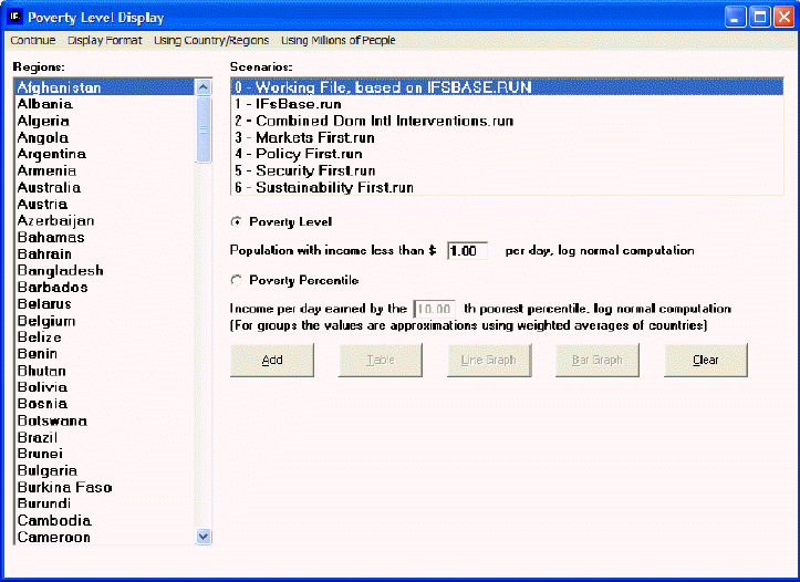
This display feature is useful for visually displaying forecasts of populations who live under a certain monetary constraint within a geographically bound region. For example, if you would like to see a forecast of people living in China who live under $1 a day, simply use the default settings of the "Population with income less than $ ___ per day, log normal computation," box, then select China from the Regions box and click the Add button to place it into the display box at the bottom of this display.
Then, choose to visually display this information as either a Table, a Line Graph or a Bar Graph.
It is also possible to change certain features of the display by selecting the Display Format button at the top of this menu. By selecting these options, it is possible to format your chart or graph for presentation and also change the time horizon of the display to fit your forecasting needs.
Next, it may be of interest to change the Using Countries/Regions and Using Groups toggle. This allows you to see a forecast of how many people live under certain monetary constraints in differently constructed geographically bound regions. The last toggle on this screen allows displays to be either in millions of people or in a percentage of population.

However, while $1 per day has been a gold standard for poverty measurement for many years, rising incomes have made it necessary to look at populations who live under a higher set of monetary constraints. For example, it is possible to change the default $1 setting to a higher setting, like $5 per day. Additionally, it is possible to display the nth poorest percentile in a country by selecting the Poverty Percentile button and then changing the percentage located in the box.