Use IFs (Download): World Map and All-Variable Displays
World Map, Lorenz Curve, Gini, Histogram
The World Map, Lorenz Curve, Gini specialized display can be reached from the Display option on the Main Menu, the Specialized Display sub-option and then the World Map, Lorenz Curve, Gini sub-sub-option.
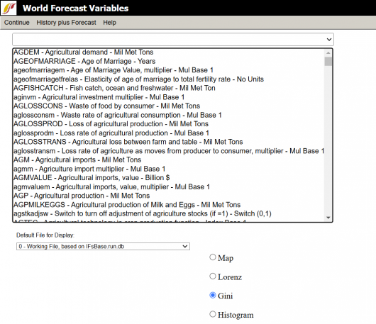
The main screen of World Map, Lorenz Curve, Gini is sown on the right.
There are a few features and options for users at the top of the screen:
- Continue: To go back to the previous menu or to the Main Menu of IFs.
- History plus Forecast: Users can select either On or Off from this drop down. On displays historical data along with the forecast, and Off only displays the forecast.
- Help: Brings the user to the corresponding page in the Pardee Wiki with the current feature or display they are using.
At the bottom of the screen users may select which scenario they would like to use from the scenario drop down. Users can also click the type of display they would like to view the results as. The display options are: Map, Lorenz curve, Gini, or Histogram.
After selecting the desired display and scenario users select the variable they are interested in exploring from a the list of variables that takes up most of the screen. Users can scroll to a variable or click in the text box and search for a variable. After clicking a variable, users will be presented with the chosen display for the scenario and variable they selected. Sometimes, before a user is presented with a display, they will be prompted to select a dimension for certain variables, for example weather they want to display Male Female or Total.
The screens for each of the display options are explained below using GDP MER (2017) as the selected variable:
Map
An example of the Map display is shown below for GDP MER in 2017 USD for each country in the world where data is available. The default view of the map presents results in 5 different equal interval categories. The number of categories and cutoff numbers for categories can be adjusted, along with other aspects such as color.
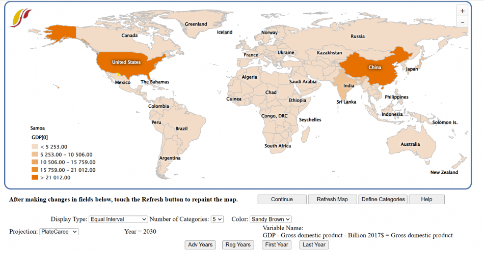
The options and features that users can adjust the map with:
- Continue: To go back to the previous menu or to the Main Menu of IFs
- Refresh Map: After making changes to the display option fields, click this to update those changes in the map
- Define Categories: Brings users to a screen where they can adjust the cutoffs for the display categories
- Help: Brings the user to the corresponding page in the Pardee Wiki with the current feature or display they are using
- Adv Years: Click to move the display year forward by 5 years
- Reg Years: Click to move the display year back 5 years
- First Year: Click to display the base year
- Last Year: Click to display the last year of forecasting: 2100
Display option Fields
- Display Type: Has two sub options that users click:
- Equal Interval: Sets the display categories to have the same range of variables (ex. 0 to 400 and 400 to 800)
- Equal Count: Sets the display categories to each hold the same count of countries.
- Number of Categories: Users can change the number of display categories using this drop down from 2 to 7
- Color: Users can choose the display color of the map: sandy brown, green, blue, red, or gray
- Projection: Users can change the type of map projection
Lorenz
The Lorenz display option on the Menu of World Map leads to a display called a Lorenz curve. Lorenz curves and Gini indices are standard measures of distribution of any variable across any population. Lorenz curves show the portion of the variable being examined (such as GDP) that accrues to different portions of the population (such as the world population). Reading across the bottom of the curve one can see the portions of the population, beginning with those that receive/control the smallest portion of the variable. Thus a 0.1 portion of the population (10%) will normally receive considerably less than a 0.1 (10%) share of the resource. And a 0.5 portion will receive less than 50%. But as one moves across the graph, ultimately a 1.0 (100%) portion of the population will receive or control 100%.
It is theoretically possible that the "poorest" 10% of the population could obtain a 10% share, that the "poorest" 50% portion could obtain 50%, and so on. If so, the Lorenz curve would be equivalent to the diagonal line that rises from the lower left to the upper right. That line is called the "Line of Equality," and it is almost an invariant rule that the actual Lorenz curve will fall well below it. The area between the Line of Equality and the actual Lorenz curve is the area of inequality.
An example of the Lorenz display option, for GDP MER in 2017 USD is shown below.
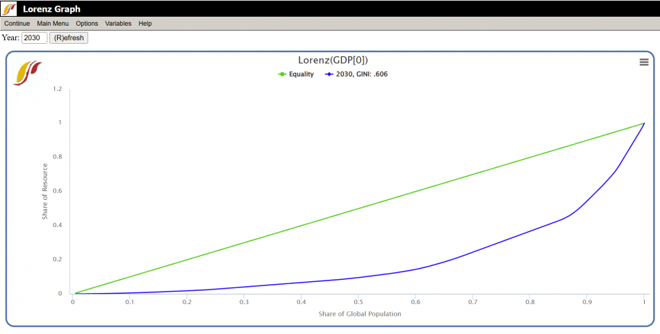
The Lorenz curve window has several options:
- Continue: To go back to the previous menu
- Main Menu: To go back to the Main Menu of IFs
- Options:
- Save: *Not functioning in current version of IFs.*
- Refresh: Updates the display to the chosen year.
- Reset: Removes any curves except the chosen year's.
- Add Curve: Users can forecast changing inequality over time by adding multiple curves. Once the user clicks Add curve, they enter the desired year for an additional curve for then click OK.
- Variables: Brings the user back to the World Map, Lorenz Curve, Gini, and Histogram menu page, so users can select a different variable.
- Help: Brings the user to the corresponding page in the Pardee Wiki with the current feature or display they are using.
Gini
The Gini index is calculated as the area of inequality divided by the entire area under the Line of Equality. Thus larger numbers indicate greater inequality. For most economic distributions value of Gini will fall between 0.2 (quite high equality or low inequality) and 0.8 (very high inequality).
Users are brought to the Display Menu with the Gini index of their chosen variable loaded into the status box. Users can select Graph and then Line to see a line graph of the Gini index they just created.
Histogram
An example of the Histogram display option, for GDP MER in 2017 USD is shown below.
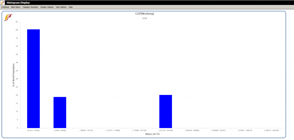
The Histogram Display window has several options:
- Continue: To go back to the previous menu
- Main Menu: To go back to the Main Menu of IFs
- Category Numbers: To change the number of bins or categories in the histogram. Users can adjust number and then hit submit
- Display Options:
- X Values: Users may choose to display the x axis as values or percentage of the variable they are displaying
- Y Values: Users may choose to display the y axis values in percent of countries or percent of global population
- Order Detail: Users can organize the order of histograms by selecting one of the following options:
- Alphabetical for Regions Name
- Value for Chosen Variable
- Set Title, Display Interval, or Year: User can adjust the display year, the title, and the titles of axes
- Display/Run Horizon: User can choose from the drop down or type the maximum year that this histogram can be displayed for, which will limit the Year Options
- Year Options:
- Advance: Click to move the display year forward by 5 years
- Regress: Click to move the display year back 5 years
- Go To Year: User enters the desired year to display
World Map Movie (Forecast)
Feature is no longer available or outdated in the model.
The World Map Movie is accessible in two locations in IFs. The first is under the Data Analysis heading on the main IFs screen. The second is under Specialized Display, which is a sub-heading of the Display heading on the Main Menu. The World Map Movie found under the Data Analysis heading deals with historic data, while the World Map Movie found under the Specialized Display heading deals with forecasted data. Selecting the World Map Movie allows the user to display on a map of the world the changes in selected variables over time in all of the countries for which IFs has data. This section describes how to use the various options to tailor the movie to the user’s preferences.
After selecting World Map Movie, the dialog box pictured below appears on the user’s screen.
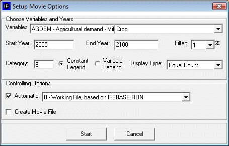
Choose Variables and Years:
Variables: allows user to select from the entire database of variables in IFs for the Historic World Map Movie. The forecasted World Map Movie includes a more limited database of variables from which to choose.
Start Year: Enter the year from which the movie will begin.
End Year: Enter in the year with which the movie will end.
Filter: User can set the filter from 1% to 100%. This feature sets a minimum value for a portion of the data to be displayed in a given year.
Category: Can be set from 1 to 16. Determines the number of categories to divide the values into.
Constant/Variable Legend: Selecting the constant function will keep the numbers and measurements in the individual categories constant. The numbers and measurements will change over time if the variable legend is selected.
Display Type: When Constant Legend is selected, two options will appear under display type: equal interval and equal count. The equal interval function divides the values equally between categories, with the interval calculated by the equation (highest value-lowest value/number of categories= interval width). The equal count function distributes the number of countries equally between the selected of number of categories. When Variable Legend is selected, a third option becomes available: equal match. If equal match is selected, legend values are assigned to each value uniquely. If there are not enough categories to represent each value, the countries that do not have the selected values are represented as blank.
Controlling Options:
Automatic: When deselected, the user scrolls through the years of the movie manually. When selected, the movie will automatically play the start year to the end year.
World/Country: This toggle switch is available only under the Historic World Map Movie. It allows the user to view a movie of changes of the selected variable across the world or, when country is selected, to view a movie of the change in a variable across regions in a country. Three countries are available to the user to select: China, India, and Mexico.
Create Movie File: This toggle switch allows the user to save the movie created. When the playing of the movie is complete, a prompt appears which allows the user to name and save the movie file. The saved movie file is available in Stored Map Movie.
After clicking ‘Start’, the dialog box will close, and the World Map as pictured below (or similar to it) will appear. This section describes what the user is viewing, and how to manipulate the functions at the bottom of the screen.
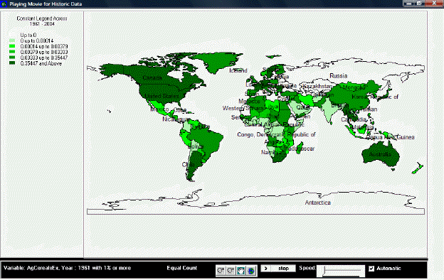
Playing Movie for Historic Data:
The upper left portion of the screen lists whether the movie is showing a variable or constant legend and across which period of time. Underneath this information is the number of categories and the corresponding color for each category, and the numerical range for each category.
The main portion of the screen is the world map, divided into all countries for which IFs has data. The various shadings of the countries correspond to the various shading of the categories listed in the map legend. By right-clicking on the world map, the user is able to copy the map, zoom in on a particular location of the map, zoom out, or to reset the map to its original point of view.
The bottom section of the screen, from left to right, lists the variable displayed by the map, with the start year shown and the level of the filter. Next is the selected display type. The four buttons to the right of the display type allow the user to zoom in, zoom out, pan, and show the full extent of the world map. The first two buttons allow the user to zoom in on or zoom out from the area under which the cursor is located, while the full extent option resets the view of the world to the original perspective. The pan button allows the user to pan across the world by clicking on different parts of the map, which effectively pans across the world by re-centering the map on the area selected, after having zoomed in or zoomed, without zooming in or out any further. The next set of buttons allows the user to play or pause the movie, and to adjust the speed at which the movie will play. Next is a toggle switch which, when selected, makes the movie play automatically; when the switch is not selected, the user is able to advance the year displayed on the map or to go over previous years.
If the user selected “Create Movie File” during the setup phase, a dialog box will appear after the movie is finished playing that prompts the user to provide a name and a place to save the movie file. The program will alert the user if the .avi file is successfully created and saved. To review the saved movie file, go to Stored Map Movie.
Stored Map Movie
Feature is no longer available or outdated in the model.
This feature allows the user to review world map movies that were created and saved. The types of world map movies fall under three categories: Historic, Forecast, and Historic Analysis. The location of a given stored map movie depends on the feature that was used to create it: movie files created in the World Map Movie in Data Analysis are found in the Historic category; movie files created in the World Map Movie in Specialized Display are found in the Forecast category; and movies created in Analyze Across Countries are found in the Historic Analysis category.
To play a movie, simply double click on the desired movie or highlight it and press Play.