World Map, Lorenz Curve, Gini, Histogram
The World Map, Lorenz Curve, Gini, Histogram sub-sub-option can be reached from the Display option on the Main Menu, under the Specialized Displays for Issues sub-option.
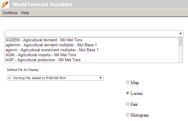
The main screen of World Map, Lorenz Curve, Gini, Histogram allows users to select from a list of variables, choose which Run-Result-Files (scenario) they would like to display these variables from, and then decide whether they would like to see the results as a map, a Lorenz curve, a Gini coefficient, or a histogram.
From the list of variables, scroll down until you see the GDPPCP option. This will display GDP per capita at its PPP. When you click on this variable, you will be presented with a map.
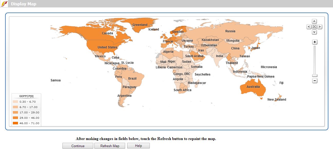
This map shows you GDP per capita at PPP for each country in the world where data is available. The reason that so many countries are shown with the same light shades because the default view of the map presents results in equal intervals. This means that the difference between GDP per capita at PPP from the richest and poorest countries is separated into 5 different equal intervals and most countries fall into the lower intervals. If you would like to display your results with an equal number of countries in each category of the variable, you have to click on the Display Type drop-down list box and then the Equal Count sub-option. Upon refreshing the map you will be presented with a graph that displays the results differently.
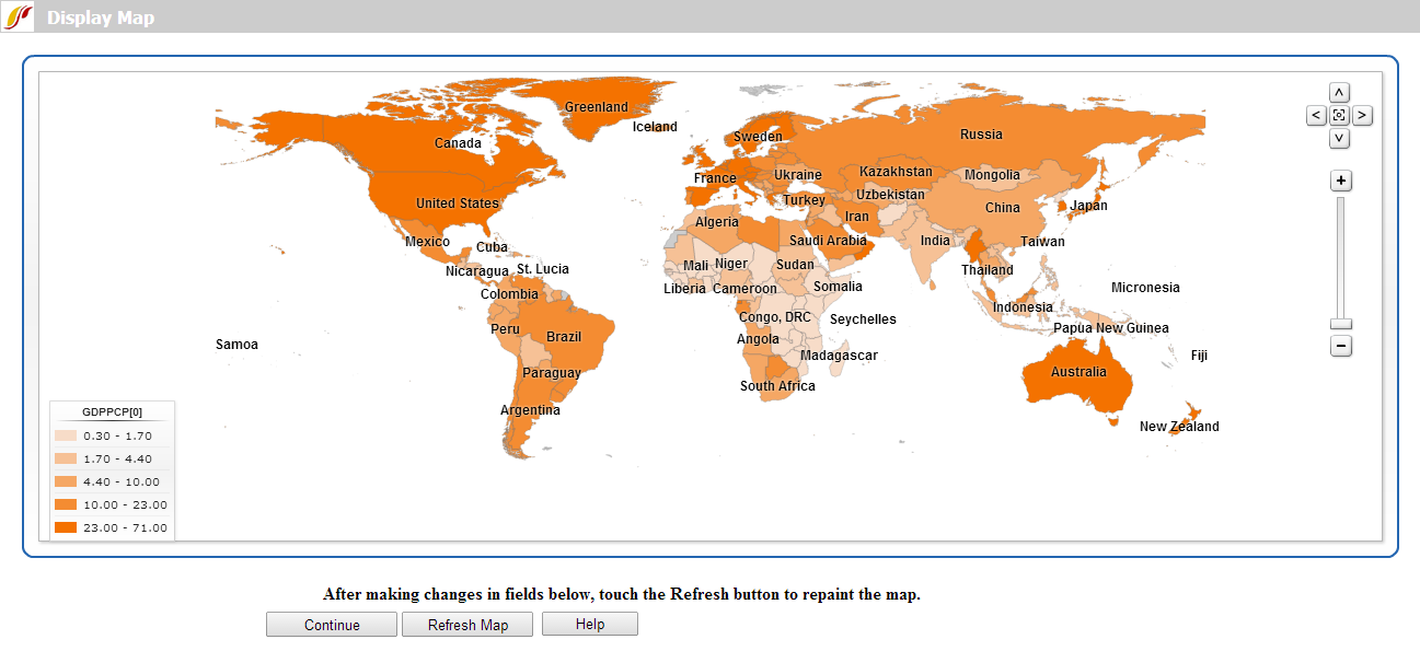
Experiment with the different options on the World Map feature of Specialized Displays. From the World Map screen, you are able to change the year that is presented by clicking on the buttons (Adv Years, Reg Years, First Year and Last Year) at the bottom of the screen.
Other options on the main screen of World Forecast Variables are the Lorenz Curve, Gini, and Histogram.
Lorenz curves and Gini indices are standard measures of distribution of any variable across any population. Lorenz curves show the portion of the variable being examined (such as GDP) that accrues to different portions of the population (such as the world population). Reading across the bottom of the curve below one can see the portions of the population, beginning with those that receive/control the smallest portion of the variable. Thus a 0.1 portion of the population (10%) will normally receive considerably less than a 0.1 (10%) share of the resource. And a 0.5 portion will receive less than 50%. But as one moves across the graph, ultimately a 1.0 (100%) portion of the population will receive or control 100%.
It is theoretically possible that the "poorest" 10% of the population could obtain a 10% share, that the "poorest" 50% portion could obtain 50%, and so on. If so, the Lorenz curve would be equivalent to the diagonal line that rises from the lower left to the upper right. That line is called the "Line of Equality," and it is almost an invariant rule that the actual Lorenz curve will fall well below it. The area between the Line of Equality and the actual Lorenz curve is the area of inequality.
To display a Lorenz curve like that below, select the Lorenz Curve option from the World Map, Lorenz Curve, Gini, Histogram form and choose the same variable you displayed in the World Map: GDP per capita at PPP or GDPPCP. Choose a year to display.
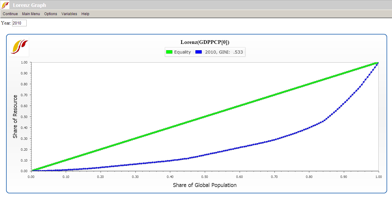
The Lorenz curve window has several options. You can add curves from more than one year so that you can see the forecast of changing inequality over time. You are also able to change the year that is presented by typing in the box located at the top of the screen. Make sure to click on the Refresh button under Options to view the new results. Note that the Gini index is calculated and displayed for each curve on the graphic, as well as being available as a separate measure across all time periods.
The Gini index is calculated as the area of inequality divided by the entire area under the Line of Equality. Thus larger numbers indicate greater inequality. For most economic distributions value of Gini will fall between 0.2 (quite high equality or low inequality) and 0.7 (very high inequality).
A histogram is a graphical display of the distribution of data using bars of different heights. It is similar to a bar chart, but a histogram groups continuous data (such as weight and height) into ranges to show distributions while bar charts compare categorical values (In IFs, the x-axis of a bar graph generally represents year).
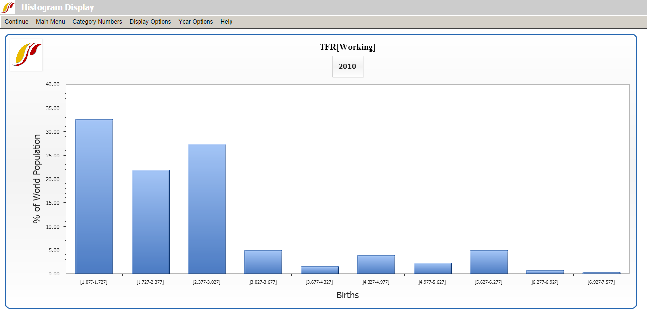
To display a histogram like the one below, select the Histogram option from the World Map, Lorenz Curve, Gini, Histogram form and choose TFR (Total Fertility Rate). The height of the first bar means that 32.5% of the world population lives in countries that have an average total fertility rate of 1.077-1.727 (In statistics, the fertility rate is assumed to be a continuous variable).
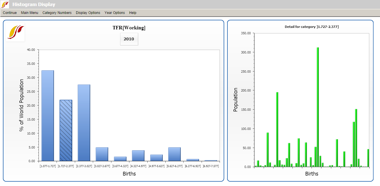
Clicking on a bar on the histogram will provide a detailed bar chart with the countries that fall into that particular category. Hovering over each bar in the chart displays population and TFR of each country. To hide this graph, click on the Hide Detail Graph sub-option under Display Options.
Several menu options allow users to define the number of categories (10 by default) on the x-axis; switch options between values and percentiles (x-axis) or between % of population and % of countries (y-axis); change the presentation of the data (data interval, graph titles, axis labels, years, etc.); and move forward and backwards through time at 5 year increments or display data for any forecast year.