Use IFs (Download): Population: Difference between revisions
(Made some changes to images, Playing around to see how to get the best quality. This page is still a work in progress.) |
m (Changed titles to the Heading format) |
||
| Line 1: | Line 1: | ||
= <span style="font-size:xx-large;">Population by Age and Sex</span> = | == <span style="font-size:xx-large;">Population by Age and Sex</span> == | ||
The Population by Age and Sex option can be found from the Main Menu: choose the Display option, the Specialized Displays sub-option, and the Population by Age and Sex sub-sub-option. The option is also found in the [[Main Menu Map]] options. | The Population by Age and Sex option can be found from the Main Menu: choose the Display option, the Specialized Displays sub-option, and the Population by Age and Sex sub-sub-option. The option is also found in the [[Main Menu Map]] options. | ||
| Line 27: | Line 26: | ||
In the interest of transparency, IFs presents [[Population#Dominant_Relations:_Population|information]] about population data and equations that are used to determine these numbers. | In the interest of transparency, IFs presents [[Population#Dominant_Relations:_Population|information]] about population data and equations that are used to determine these numbers. | ||
= <span style="font-size:xx-large;">Birth Cohort Information</span> = | == <span style="font-size:xx-large;">Birth Cohort Information</span> == | ||
The feature Birth Cohort Information is located under the Specialized Display suboption, which is in turn located under the Display topic on the Main Menu. | The feature Birth Cohort Information is located under the Specialized Display suboption, which is in turn located under the Display topic on the Main Menu. | ||
Revision as of 17:53, 23 January 2025
Population by Age and Sex
The Population by Age and Sex option can be found from the Main Menu: choose the Display option, the Specialized Displays sub-option, and the Population by Age and Sex sub-sub-option. The option is also found in the Main Menu Map options.
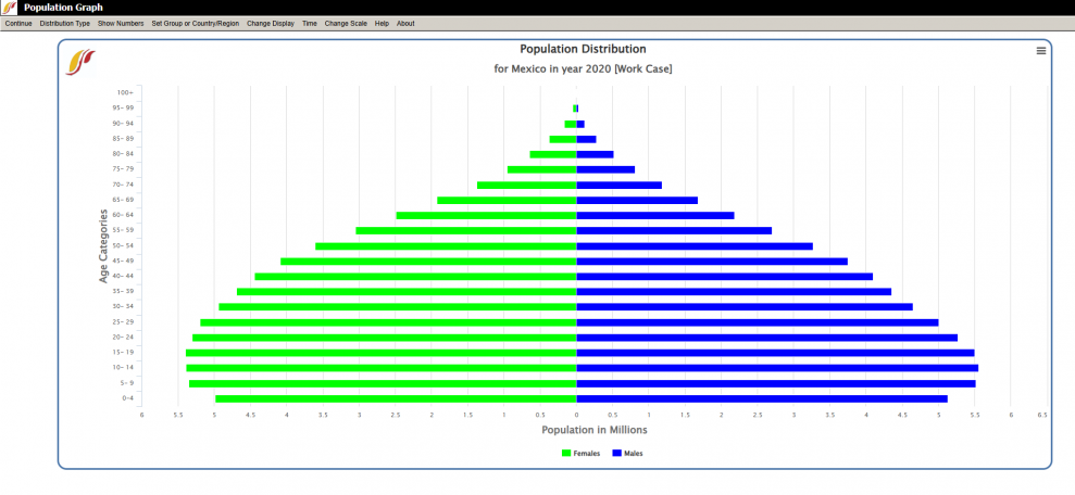
That will bring up what demographers call an age-sex distribution of population, like the one below for Mexico in 2020. From this menu it is possible to display a population chart for any country/region or group of the globe. To change between displaying either country/region or group click on the Select Group or Country/Region option from the menu bar at the top of the screen, and click which is preferred. To select a specific group or country, click on Change Display and then hover over Change Country/Region. A list will appear and you can scroll down to the country of your choice, in this case, Mexico.
In order to set the appropriate year, click on Time then the Advance sub-option to move the chart forward 5 years. Clicking on Time and the Regress sub-option will move the chart backwards 5 years. If you would like to display a chart for a particular year or advance faster then 5 year increments, click on the Change Display option form the menu bar, then hover over the Set Year sub-option which will list all available years to display; click on the desired year.
Hovering over the Change Scenario sub-option under Change Display allows the display of results from the base case or any other saved scenario runs.
To display the numbers that were used to create this chart click on the Show Numbers option.
To change the scale of the chart choose the Change Scale option. From here click on Fix Constant Scale Manually, to set the maximum value to be displayed for Population, Fertility, and Mortality. From the Change Scale option, clicking on Use Percent of Population will adjust the x-ais to display percent of population and no longer the count.
The above age distribution chart displays male and female population sizes for age cohorts separated into 5 year intervals.
The Distribution Type option at the top of this page allows users to select other types of population charts to be displayed. From clicking Distribution Type, a user can click on Age Distribution, Fertility Distribution, Mortality Distribution, Population Pyramid, or Compare Countries, to change to another type of population chart.
The Fertility Distribution chart shows at what age women are having children. The Mortality Distribution chart displays the mortality rate for each age cohort.
The Population Pyramid chart separates the population into sexes (males on the left, females on the right) and age cohorts in 5 year intervals. This chart (displayed below for Mexico in 2020) is a visual representation of population swells and shrinkages across time.
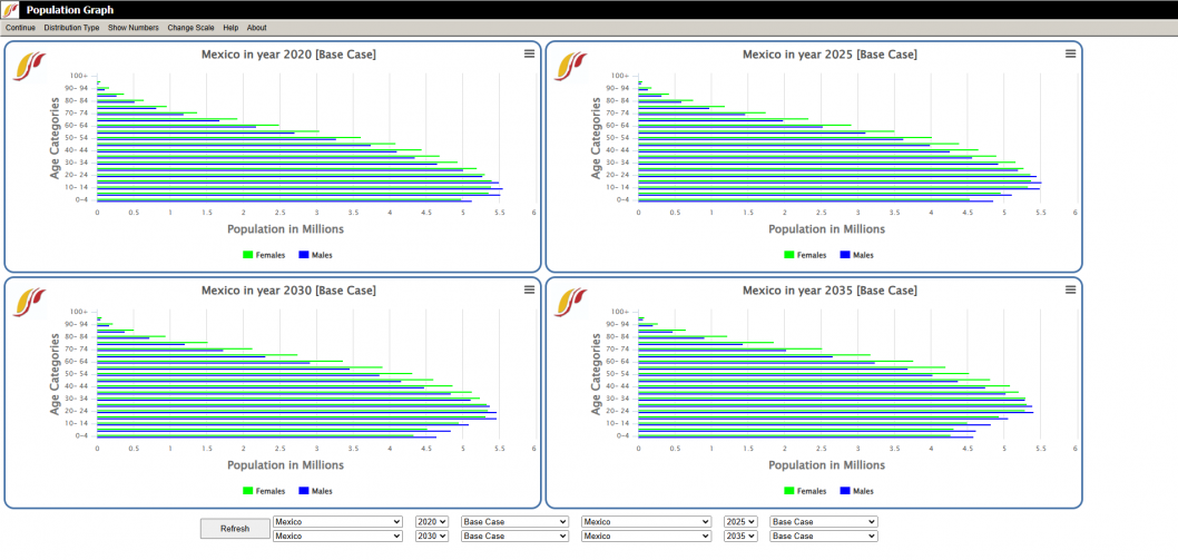
The Compare Countries option allows users to compare between four charts for different countries years or scenarios, or any combination of the three. This option will initially bring up four charts for the country and distribution type most recently displayed for the years 2020, 2025, 2030, and 2035. An example of this display is shown below for Mexico.
At the bottom of the compare countries screen users can select which country, year, and scenario that they desire to display for each of the four graphs. To switch to a different type of population chart to compare, click Distribution Type form the menu bar and click the desired distribution.
In the interest of transparency, IFs presents information about population data and equations that are used to determine these numbers.
Birth Cohort Information
The feature Birth Cohort Information is located under the Specialized Display suboption, which is in turn located under the Display topic on the Main Menu.
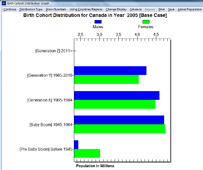
The use of this feature is quite similar to the use of Cohorts of Population. However, this feature allows the user to view the total population of a country/region or group as broken down into generations. For example, notice the left side of the picture shown below. In this example, the birth cohorts are for Canada. For the year 2005, the majority of the population is grouped into Generations X and Y, which were born between the years 1965-1984 and 1985-2010 respectively, and the Baby Boom generation (1945-1964). A few of the Pre-Baby Boom generation is alive, while (obviously) no one from Generation Z is born yet.
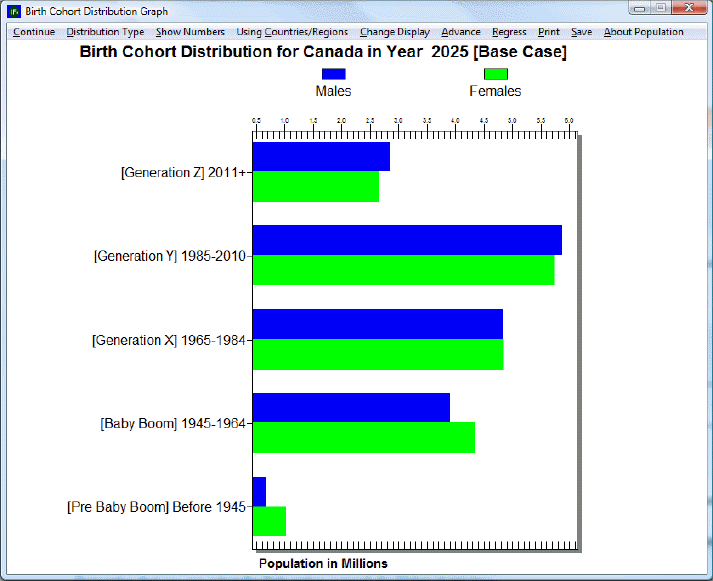
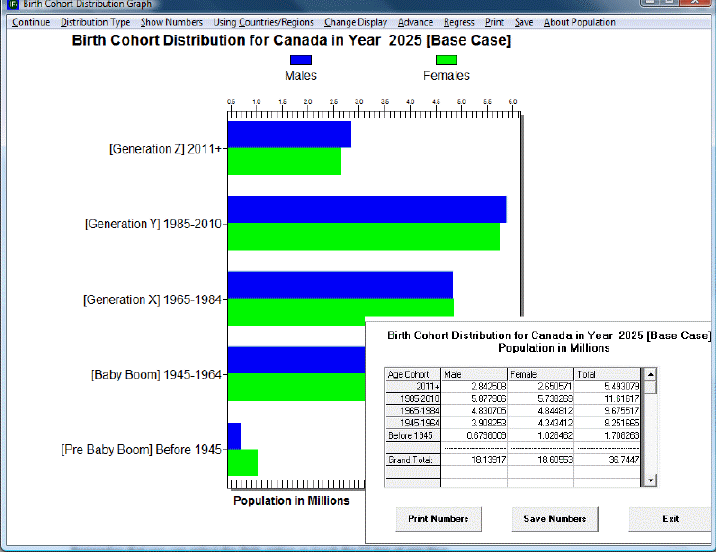
Next, click on the Advance option on the top of the screen until year 2025 is reached, or click four times on the option. The user should see a graph similar to the one below. In this new graph, notice the changes in the distribution of the total population among the various generational cohorts. Members of Generation Z are now represented on the graph, while the numbers of the Pre-Baby Boom generation have decreased since 2005. The numbers of people belonging to the Baby Boom generation have also decreased, while the numbers for Generations X and Y seem to have changed little. To return the year to 2005 or any previous year, click on Regress in the heading.
The user is able to customize and experiment with the forecasted birth cohort information, according the preferences of the user. By clicking on the Show Numbers options in the heading, the user is able to view the number of males and females that makes up each generation. A dialogue box similar to the one shown below should appear. The user is able to save and/or print the birth cohort information.
If the user wants to change countries to view, first select Change Display, and then select Change Country/Region. A list of countries or regions to choose from should appear.
The year 2005 is displayed when the Birth Cohort option is first opened. Clicking on Advance or Regress will change the displayed year in five-year increments- from 2005 to 2010, from 2010 to 2015, and so on. To view a specific year, and to avoid having to click Advance multiple times to reach that year, simply select Set Year in the Change Display option in the heading. The user can select any year between 2005 and 2100.
The user may also be interested in view how the distribution of generational birth cohorts are affected by running scenarios different from the base case. To change the scenario, first select Change Display, and then Change Scenario.

