Use IFs (Download): Development Goals: Difference between revisions
(Changing Descriptions and images of the SDG Overview Display, still in progress) |
No edit summary |
||
| Line 19: | Line 19: | ||
* '''Select Reference Scenario''': Choose the desired saved scenario to display from the drop down. | * '''Select Reference Scenario''': Choose the desired saved scenario to display from the drop down. | ||
* '''Select Intervention Scenario''': Choose the desired saved scenario to display from the drop down. | * '''Select Intervention Scenario''': Choose the desired saved scenario to display from the drop down. | ||
* '''Goal''': Choose the desired SDG from the drop down. | |||
=<span style="font-size:xx-large;">Poverty Level Display</span>= | = <span style="font-size:xx-large;">SDG Graph</span> = | ||
= <span style="font-size:xx-large;">Poverty Level Display</span> = | |||
This feature can be accessed from the main menu of IFs by clicking on Display, then Specialized Display and then Poverty Level Display. | This feature can be accessed from the main menu of IFs by clicking on Display, then Specialized Display and then Poverty Level Display. | ||
Revision as of 19:32, 29 April 2025
The Development Goals specialized display options, explore how far the world and countries are from attaining the Sustainable Development Goals. The Sustainable Development Goals (SDGs) are a set of 17 goals adopted by all United Nations Member states in 2015, that focus on collaboration between countries to better lead sustainable development. Each goal has several targets that help to quantify their attainment. Each of the display options described below can help to assess SDG targets over time and explore their potential in the future.
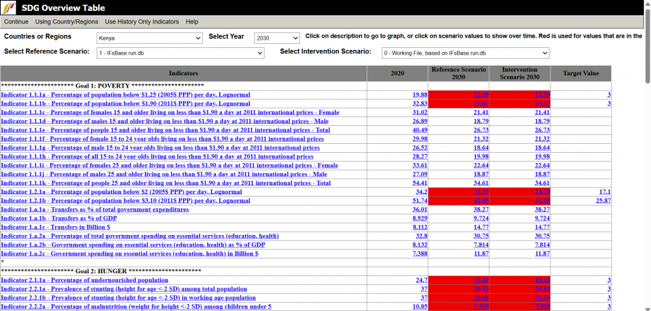
SDG Overview Table
The SDG Overview Table display can be found from the Main Menu: choose the Display option, the Specialized Display sub-option, and then the SDG Overview Table sub-sub-option.
This display shows a table of the SDGs and their targets for all the the targets that IFs has corresponding variables to measure. This table displays forecasts and historical data on SDG targets for a chosen country and scenario. The table has five columns: the names of indicators that correspond with a certain target and SDG, the most recent year of historical data, forecast for chosen year and chosen reference scenario, forecast for chosen intervention scenario, and if available the target value set out in the SDGs.
There are several options and features to adjust and explore the display that can be found in the menu bar or the display field options at the top of the screen:
- Continue:Goes back to the previous menu or to the Main Menu of IFs.
- Using Groups or Using Countries/Regions: Click Switch to change between displaying groups or countries and regions. If groups are currently selected then Using Groups will be displayed on the tool bar and vice versa.
- Use History Only Indicators:
- Help: Opens the corresponding page in the Pardee Wiki with the current feature or display they are using.
Display Option Fields:
- Groups or Countries or Regions: Choose the desired country or region, or group form the drop down.
- Select Year: Choose the desired year to display form the drop down.
- Select Reference Scenario: Choose the desired saved scenario to display from the drop down.
- Select Intervention Scenario: Choose the desired saved scenario to display from the drop down.
- Goal: Choose the desired SDG from the drop down.
SDG Graph
Poverty Level Display
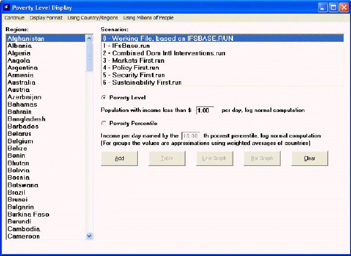
This feature can be accessed from the main menu of IFs by clicking on Display, then Specialized Display and then Poverty Level Display.
This display feature is useful for visually displaying forecasts of populations who live under a certain monetary constraint within a geographically bound region. For example, if you would like to see a forecast of people living in China who live under $1 a day, simply use the default settings of the "Population with income less than $ ___ per day, log normal computation," box, then select China from the Regions box and click the Add button to place it into the display box at the bottom of this display.
Then, choose to visually display this information as either a Table, a Line Graph or a Bar Graph.
It is also possible to change certain features of the display by selecting the Display Format button at the top of this menu. By selecting these options, it is possible to format your chart or graph for presentation and also change the time horizon of the display to fit your forecasting needs.
Next, it may be of interest to change the Using Countries/Regions and Using Groups toggle. This allows you to see a forecast of how many people live under certain monetary constraints in differently constructed geographically bound regions. The last toggle on this screen allows displays to be either in millions of people or in a percentage of population.
However, while $1 per day has been a gold standard for poverty measurement for many years, rising incomes have made it necessary to look at populations who live under a higher set of monetary constraints. For example, it is possible to change the default $1 setting to a higher setting, like $5 per day. Additionally, it is possible to display the nth poorest percentile in a country by selecting the Poverty Percentile button and then changing the percentage located in the box.

