Repeated Features: Difference between revisions
CamrynDreyer (talk | contribs) No edit summary |
No edit summary |
||
| (29 intermediate revisions by 2 users not shown) | |||
| Line 1: | Line 1: | ||
== Annotation | = <span style="font-size:xx-large;">Explain Scenario (Annotation)</span> = | ||
This feature of IFs allows users to quickly | This feature of IFs allows users to quickly display an annotation of different Run-Result-Files (.run file) and Scenario-Load-Files (.sce file) to understand exactly what parameters have been altered and how they were altered. When you see an Explain Scenario option, be sure to highlight the Run-Result-File or Scenario-Load-File that you would like to more clearly understand and click on Explain Scenario. The ensuing page (similar to the image below) will appear after a moment (because IFs is going online to retrieve the information you are looking for) that will show you specifically what interventions have been made in the Run-Result-File or Scenario-Load-File that you have chosen. | ||
== Country/Region, Group or | [[File:Annotation.png|frame|center|Annotate Working Scenario Window]] | ||
= <span style="font-size:xx-large;">Country/Region, Group or Geography-List</span> = | |||
186 countries underpin the functioning of IFs and these countries can be displayed separately or as parts of larger groups that users can determine. | 186 countries underpin the functioning of IFs and these countries can be displayed separately or as parts of larger groups that users can determine. | ||
Below is a visual representation of how different entities are organized into Countries/Regions, Groups or Geography-Lists.[[File:Geodiagram.png|frame|right|Visual representation of IFs definitions of regions/countries/groups/glists]] | |||
'''Countries/Regions''' are currently the smallest geographical unit that users can represent. There are 186 different countries/regions that users can display. But the ability to split countries down into smaller regions like states, provinces, or districts is under development and only available for selected countries (South Africa, India, China, and Mexico). Moreover, it is only available in the stand-alone model version, not in the online version. | |||
''*Important Note: In older versions of IFs, Regions were used as intermediaries between Countries and Groups. That use of the term Regions is no longer relevant and when you see Country/Region references in the online version of the model you should simply think of this as a term that really means Country.'' | |||
'''Groups''' are variably organized geographically or by memberships in international institutions/regimes. You can find out the countries represented in each group by exploring the [[Data_Analysis#Identify_Group_or_Country/Region_Members|Identify Group or Country/Region Members]] sub-option under Data Analysis from the Main Menu. | |||
IFs also features a grouping option titled '''Decomposed Groups''' that allows users to select a group and display forecasts or data for individual member countries of that group. Decomposed Group options are located in several IFs display forms, including the Flexible Displays. | |||
'''Geography Lists (or G-Lists)''' can contain Countries, Groups, or both. The Geography-List can be useful as some users may want to place, for example, the Africa group in a display with the country of India. | |||
When using IFs, there are many occasions where the user is asked whether or not they would like to display their results as a product of single countries, or larger groups. This is typically a toggle switch that moves between Country/Region and Groups; however, it might be a three-way-toggle that includes Country/Region, Group and Geography-List. | |||
= <span style="font-size:xx-large;">Define, Drivers, Explain, View Equations, View Code, and Delete</span> = | |||
If you have selected one or more variables for display in '''[[Self_Managed_Display_(Complete_Flexibility)|Self-Managed Display]],''' it will appear in status box at bottom of the form. If you left-click on the name of a variable in the status box, a new box (shown below) will appear with a large set of options that can help you learn more about the variable (or simply to delete it from the status box).[[File:Define3.png|frame|center|Variable Options Window]] | |||
A subset of these same options can be obtained from the '''[[Quick_Scenario_Analysis_with_Tree|Quick Scenario Analysis with Tree]] '''form by using either a left-click or right-click on a list of parameters within the tree: | |||
[[File:Define1.png|frame|center|List of Parameters]] | |||
There is an option to '''search''' for variables and parameters in several locations of the interface, including within Self-Managed Display and the Quick Scenario Analysis with Tree forms. When the search returns a list of parameters or variables as below, a click on any in the list provides explanatory pop-up options (when the browser has enabled pop-ups): | |||
[[File:Define2.png|frame|center|Variable/Parameter Search Window]] | |||
However you reach these explanatory options, here is what they provide: | |||
'''Define''': This option generates a window that will define the variables that are being displayed. | |||
'''Drivers (Linkages)''': This option generates a window that graphically displays the drivers of the variable selected (backward linkages or causes) and also the forward linkages or variables driven by it. That is, the form will include a diagram showing the variable in the center and the variables from which it is computed on the left plus the variables to which it contributes on the right. This drivers diagram is derived directly from parsing the computer code of the model. If you float the cursor over any variable name on this screen, a more extended name (or a brief definition) will pop up. You will be able to see these definitions by selecting Show Definitions under the Variables option as well. If you double click on any driver variable or driven variable, the diagram will repaint with the variable selected at the middle. Select Continue to return to the previous screen. | |||
'''View Historic Analog Variable''': This option shows the name of the variable in historical data, if any, that is associated with a forecasted variable in IFs. For instance, if you select the forecast variable POP, it will show that the name of the analog in the data files is Population. | |||
'''Delete''': This option allows you to clear the selected variable/parameter from this box. | |||
'''View Equations''': Selecting this option will bring up a help page that shows the equations used in computing the variable selected. | |||
'''Explain (Block Diagram)''': Selecting this option will bring up a help page that shows a diagram that broadly explains how drivers interact for the area of inquiry (agriculture, economics, etc.) that you have displayed in your table. There normally is also textual explanation. | |||
'''View Code''': Select this feature and a new page will be opened that shows the computer code used to express the calculation of these drivers and their interaction in IFs. | |||
'''Cancel''': This option allows you to cancel your selection and return to the previous screen. | |||
= <span style="font-size:xx-large;">General Display Options</span> = | |||
== <span style="font-size:x-large;">Table Use</span> == | |||
This help topic will go over possibilities available to users when they access a table while using IFs. | |||
The format for tables used in IFs is displayed below: | |||
[[File:Table.png|frame|center|IFs Table Format Example]] | |||
Users can access tables from many different forms within IFs. A typical table is organized into rows and columns with the rows representing different years and the columns representing different data and/or forecast series (depending on how the table is set up, the columns could also be one variable shown across different scenarios or geographic units). | |||
Some users will want to save these tables to .xls files that can then be used for further analysis. IFs provides many save options and users will be interested in the transpose and decompose save features detailed below. Other users will be interested in highlighting values that are above or below a certain specified range. For example, users may want to look at GDP growth data that is higher than 5%. Scroll down this help topic to the Filter section to learn how to do this. | |||
'''Continue:''' Use this option to go back to the previous menu or to the Main Menu of IFs. | |||
'''Refresh:''' If you have made any changes away from the default settings of the table, clicking on Refresh will bring about the default table settings. | |||
'''Graph:''' Click on this and you will be able to create a line or a bar graph. | |||
'''Map:''' Clicking on this option will bring up the world map display. | |||
'''Save:''' This option offers IFs users flexibility in saving their work. | |||
*By selecting '''First Year to Save''', you can determine at what year your saved file will begin. | |||
*By selecting '''Save Normal View''', you will be prompted with a screen that allows you to save your file in an Excel file with years as rows. | |||
*By selecting '''Save Transpose''', you are then able to decide whether you would like to save the table as all of the years, every 5 years or every 10 years. Transposing your data switches the columns and rows so that the years are across the columns of the table. | |||
*By choosing '''Save Transpose and Decompose''', users are able to save their data, move the years to the columns and automatically decompose geographic groupings into individual member countries. This is a very helpful feature of IFs for those who choose to display values for a group or G-list and who would then like that information broken down into individual members upon saving. | |||
'''Display Options''' | |||
*'''Percent/Whole:''' By toggling between these two sub-options, you can display data and/or forecasts regularly (whole) or as year-to-year percent change. | |||
*'''Cumulative:''' You can choose to display your results regularly, or as a cumulative sum of values across time. | |||
*'''Discount:''' This discounts all values past by base year by 3 percent each year; such discounting is often used in economic analysis. | |||
*'''Cumulative with Discount:''' This sub-option combines discounting with accumulation over time (so as, for instance, to calculate the present value of a stream of expenditures or revenues). | |||
*'''Change Display Interval:''' This sub-option, at the bottom of the list, allows movement from display of all years to display of those at selected intervals (e.g. 5). (In the Flexible Display form the interval can also be changed before generating a table or graphic by using the select Set Title, Display Interval, or Year from the Display Format option on the forms menu). Unless the interval has been changed from every year, the following options will not be meaningful: | |||
**'''Interval Average:''' This feature allows the user to toggle between regular displays and those that show the average value within a time interval when the numerical values are not shown every year. This feature somewhat smoothes the values so that the trends are more clearly shown. If the interval were set at 5, the value for the year 2015 would be calculated by adding the values for the years 2013-2017 and dividing that number by 5, and so on. | |||
**'''Interval Total Change:''' This shows a percentage change from year to year across whatever interval the user selects (b/a*100). | |||
**'''Interval Total Absolute Change:''' This shows an absolute change from year to year across the interval (b-a). | |||
*'''Index Base One:''' This sub-option sets the initial year's value for each variable to 1 and displays the changes over time relative to that base value. | |||
*'''Moving Average:''' This sub-option allows the user to smooth the data series or forecast over time. The average is "moving" because the recomputed values take into account values for previous and future years. Take the moving average for the population of the USA as an example, with the number of years included in the moving average set at 5. The value for the year 2012 with the moving average turned off is 317.9 million people (model version 7.0). With the moving average turned on, the value for the year 2012 becomes 318.9. The moving average for 2012 is calculated by adding the moving averages for the years 2010 and 2011, as well as the unaltered values for the years 2012-2014, and dividing the total number by 5. The moving averages for the years 2010 and 2011 are calculated similarly, although with fewer years due to the lack of years prior to 2010. The moving average for the year 2010 is calculated by adding the values for years 2010-2012 and dividing by 3. The user is able to change the number of years included in the moving average from the default number of years, which is 5. | |||
*'''Unit Conversion:''' This sub-option changes units on the fly in tables, for instance energy units from billion barrels of oil equivalent to million metric tons of coal equivalent. The model recognizes some units (such as energy units) and offers a menu of choices. For other variables and units, the user will find no such menu, but may specify the units desired. | |||
*'''Use Alias for Group Names:''' Most IFs group names are shortened for easy display, but aliases often exist and can be selected to improve display appearance. | |||
'''Filter:''' This feature allows users to highlight certain variables that exceed or fall below user-defined thresholds. | |||
*'''Set Filter Parameters''' allows users to customize what minimum, maximum, range and rate of change thresholds they would like IFs to highlight. For example, if you are displaying Youth Bulge information for all countries, set the minimum filter level at 0.5 to highlight country values above that level. | |||
*Users are then able to click on either''' Apply Min Level Filter''',''' Apply Max Level Filter''','''Apply Rate Level Filter '''or''' Apply Range Level Filter'''. After selecting what filter the user would like to highlight, IFs will change the font of those values identified by the filter bold. For our Youth Bulge example, click on Apply Min Level Filter and all country-year values with a youth bulge higher than 50% will be highlighted in bold. | |||
'''Rank Options:''' This feature allows the user to set a year by which to rank the forecast in ascending or descending order across multiple countries or groups. For instance, a user can determine the country with the highest forecasted infant mortality rate in 2040. | |||
'''Percent of Total Options:''' This feature scans across the columns of a table and computes the percentage that each column-year constitutes of the total across the columns for the year. It could be used, for instance, to show the percentage contribution of each energy type to the total energy production of the European Union. | |||
'''Comparison Options:''' This feature allows the user to divide or subtract values in adjacent columns. While this feature is most likely to be used to compare forecasts of the same variable from two scenarios, it can be used for comparisons between different countries on the same variable, etc. The use of the feature requires the selection of an even number of columns. | |||
'''Display Run Horizon:''' This allows users to choose how far into the future their table will forecast their selected variables. | |||
== <span style="font-size:x-large;">Graph Use</span> == | |||
=== <span style="font-size:medium;">Line Graph, Bar Graph, Pie Chart and Scatter Plot</span> === | |||
This general topic will go over the possibilities available to users when they access a graph. | |||
There are several types of graphs available in IFs. These include Line Graphs, Bar Graphs, Pie Charts, Scatter Plots, and Radial Graphs. The use of Radial Graphs is discussed as [[#Radial_Graph|another topic]]. Depending on whether you are accessing graphics to display historical data or forecast data, different options will be available. | |||
It is possible to generate graphics from various forms of IFs, including from tables. As an illustration of graphics from the Flexible Displays form, plot a line graph of a power index. From the form, select the Hard or Capabilities Power variable list under the Power category. For the geographic dimension select three countries, the United States, China and India. Set 2050 for the time horizon, and click the Line Graph button located on the bottom of the Flexible Displays screen to produce the graphic displayed below. | |||
[[File:Linegraph.png|frame|center|Graphical Display Line Graph Example]] | |||
The display options at the top of the chart are typical for most graphs. | |||
'''Continue:''' Use this to exit from the graphical display and return to the previous screen. | |||
'''Main Menu:''' Selecting this option will bring users to the Main Menu of IFs. | |||
'''Scaling (No Scaling and Common Scale sub-options):''' The default No Scaling option displays a traditional graph. The Common Scale sub-option scales the data points for each variable displayed so that the minimum value is zero and the maximum value is one. This option is useful for those who are simultaneously displaying multiple variables that differ greatly in scale, making changes over time in the variable(s) with smaller numbers very difficult to see. | |||
'''Scaling (Index Base 1):''' This sub-option sets the initial year's value for each variable to 1 and displays the changes over time relative to that base value. | |||
'''Display Format:''' This allows users to change the names in the legends, the titles of the graphs and generally customize the image for presentation purposes. | |||
Continue back to form from which you generated the graphic (in our example to the Flexible Displays form) and change the display of hard power in the United States, China and India to a bar chart by selecting the Bar Graph option at the bottom of Flexible Displays. That will create the chart displayed below. | |||
[[File:Bargraph.png|frame|center|Graphical Display Bar Graph Example]] | |||
To display the same variable as a pie chart or a scatter plot, return to the Flexible Displays menu. The Other Graphs option on the menu bar will allow different types of displays. | |||
The Pie Chart sub-option will display a pie chart (not shown here) for a specific year and the Time option in the menu will allow you to Advance or Regress time or to go to a specific year. | |||
Use of the Scatter Plot sub-option of Other Graphs in Flexible Displays requires that you select two variables to plot against each other. To demonstrate, create a scatter plot of GDP per capita and total fertility rates. On the Flexible Displays screen, select two categories, Economy GDP per Capita and Population. (After selecting the first category, hold down the Ctrl key while selecting the second.) From the Displays field, select GDP per Capita at PPP and Fertility Rate in the same way you selected the two categories. For the geographic dimension, select all countries. Click the country on the top of the list, Afghanistan, hold down the Shift key, and click the last country, Zimbabwe. This will highlight all 186 countries in the field. As an alternative, set Geography Options to Decomposed Groups and select World. Leave the Horizon and Scenarios option as default, select Other Graphs, and click Scatter Plot to produce the graph displayed below. | |||
[[File:Scatterplot.png|frame|center|Graphical Display Scatter Plot Example]] | |||
Unlike other types of graphical displays, Scatter Plots have different options available at the top of the chart: | |||
The '''Continue''' option allows users to return to the previous screen, and the '''Main Menu'''option will navigate users back to the Main Menu of IFs. | |||
'' | The '''Time''' option allows users to move forward (Advance) or backward (Regress) in time at 5 year intervals, or to displays data for any forecast year (Go To Year). | ||
'''Grouping Options''' control geographic aggregation by only displaying members of a certain geographic list or group rather than all 186 countries. | |||
''' | '''Analysis''' (Relationships), only available when you are displaying all 186 countries, statistically fits different line types to the values plotted on the graph; these can represent linear, logarithmic, exponential, power, polynomial or logistic relationships. Analysis (Statistics) computes standard regression statistics for any kind of line chosen (linear by default). | ||
''' | '''Bubble Diameter''' adds a third dimension, either population or GDP, to the plot. | ||
''' | The '''Display Format''' option includes tools that customize titles, display intervals, run horizon, legends, etc. | ||
'''Swap''' switches the x- and y-axes on the plot. | |||
== | === <span style="font-size:medium;">Radial Graph</span> === | ||
The Radial Graph is accessible through the options and sub-options of [[Flexible_Displays|Flexible Displays]] (option Other Graphs/Radial) and [[Self_Managed_Display_(Complete_Flexibility)|Self-Managed Display]] (select the variables and geography, click on Go to Display and select Graph/Radial Chart). | |||
From | As an illustration, create a radial chart that explores three dimensions of governance (security, capacity and inclusion). From the Flexible Displays screen, click the Governance category and select the display titled Governance Triangle Security Capacity Inclusion. For comparison, select a group of countries such as Iraq, Kenya, Venezuela and the United States. (After selecting the first country, hold down the Ctrl key, and then select the rest.) Set the year 2010 as the time horizon. Now click the Other Graphs button on the tool bar, and select Radial.[[File:Radialgraph1.png|frame|center|Graphical Radial Display Example]]The single graph display as shown above enables users to make direct comparison among multiple countries. Each of the four countries is represented by a triangle, with one vertex for each variable, in this case, each dimension of governance. The farther from the center a point is, the higher its value is on the dimension represented by the vertex. | ||
Options along the menu bar are similar to those featured on other graphical displays. The Multiple Graphs option, however, is unique to the radial diagram form. We will walk through the use of several sub-features under Multiple Graphs with an example. | |||
From | To demonstrate, click Display from the IFs Main Menu, and select Self-Managed Display. From the Full Variable/Parameter Selection screen, first select a scenario- Markets First. Then, select AGDEM-Venezuela-All. Next, select a different scenario, say, Sustainability First. Next, select AGDEM-Venezuela-All. Now, click on Go to Display, and then Radial Chart under Graph. A graph like the one pictured below should appear. | ||
[[File:Radialgraph2.png|frame|center|Graphical Display: Multiple Radial Graph Example]] | |||
''' | The first step is to adjust the number of variables displayed in the graph. The default number of variables displayed depends on the number selected. In this case, as we have six variables selected, six were identified in Self-Managed Display but there were really only three variables (each type of agricultural demand) times two scenarios. Set Multiple Graphs/'''Variables per Graph''' to three to generate the graph displayed below. | ||
[[File:Radialgraph3.png|frame|center|Graphical Display: Multiple Graph/Variable Example]] | |||
Next, click on Multiple Graphs/'''Display in Different Graphs'''. This option is useful when working with two or more years or scenarios, as the user can choose to display the different forecast years or scenarios in different graphs. To facilitate making comparisons, the user should consider turning on Common Scaling under the Scaling option. The following graphs should appear.<br/>[[File:Radialgraph4.png|frame|center|Graphical Display: Displaying in Multiple Graphs example]]The next feature to experiment with is Multiple Graphs/'''Continuous Mode'''. This feature adjusts the manner in which variables are loaded in a radial graph. In the current example, the first items selected in Full Variable/Parameter Selection were the two different scenarios- Markets First and Sustainability First. When Continuous Mode is selected, these are the criteria by which the variables are grouped. With Discontinuous Mode selected (when Multiple Graphics/Continuous Mode is toggled off), the variables are interspersed between variables loaded in the even positions and variables loaded in the odd positions. To tell which variables are loaded in even and odd positions, simply return to the Display Menu and review the selected names. Similarly, if the variables were loaded according to country instead of by scenario, then using continuous mode would group the variables according to country. Note that selecting between continuous and discontinuous mode requires selecting an even number of variables. | |||
''' | The final feature to experiment with is Multiple Graphs/'''Display Multiple Years'''. As the name says, this option allows the user to display multiple years in a single graph. Hold down Ctrl when selecting multiple years. The various years are identifiable on the same graphic by different colors as indicated in the legend. | ||
= <span style="font-size:xx-large;">Computations</span> = | |||
Another feature of IFs is the Computations button. Computations allow users to create a formula of variables which correlate historic data with forecasted data, format data for uniform analysis, or provide for interesting combinations of variables that are not directly available in IFs.[[File:Computations1.png|frame|right|Computations window]] | |||
To access Computations, open [[Self_Managed_Display_(Complete_Flexibility)|Self-Managed Display (Complete Flexibility)]] under Display to reach the Full Variable/Parameter Selection screen. | |||
Click on the Computations button at the bottom of the page. A new screen will appear as displayed above. In the box, type in a formula you would like IFs to calculate. For an example, let us determine the number of literate people within a country. As variables in the model we have the percent of literate people (LIT) in each country and the absolute number of people (POP) in each country, so we simply need to multiply the percentage of literate people with the total population and divide by 100. Our formula will be a*b/100 (the use of "a" and "b" are arbitrary and other letters can be used). Use standard symbols in order to distinguish different mathematical functions. Use * for multiplication, / for division, + for addition, - for subtraction, () to group terms etc. After typing in this formula, click Enter. This will bring up the next screen. From there, you can accomplish the following:[[File:Computations2.png|frame|right|Formula Naming Window]] | |||
The | '''Formula Name, Dimensions Name, and Units Name:''' These three naming options are available but only the Formula Name is required. The Dimensions Name could be used to describe, for example, the geographic bounds of your formula. The Units Name could be used to describe the units being displayed in your formula (e.g. thousands of US$). | ||
After you have typed in the names you prefer (e.g. lit ppl), click Enter or hit the Ok button. This will bring you back to the Type your formula page but with a small table added at the bottom. The variables you used in your formula will be displayed in this table. | |||
[[File:Computations3.png|frame|center|Type your formula page]] | |||
Now, click on Select Vars. You will return to the Full Variable/Parameter Selection page where you will select a variable. For our example, we have two variables. For the first variable, we would like to select the LIT. After you have selected the LIT variable, you will be asked to choose a geographic location. For our example, make sure Country/Regions is selected and choose ALL. After choosing your first variable, you will return to the Type your formula screen. Click on Select Vars again to choose your second variable. From the Full Variable/Parameter Selection screen, choose the POP variable for ALL countries/regions, which will return you to the Type your formula page. Finally, click on Exit to return to the Full Variable/Parameter Selection page. Now, your formula of variables will be displayed in the display box as shown below. | |||
[[File:Computations4.png|frame|center|Full Variable/Parameter Selection]] | |||
Click on Go to Display and choose a Line Graph (the Line sub-option under Graph). You can now display the absolute population that is literate in each country, a variable that is not directly available for display in IFs but that is available after creating a formula of variables. | |||
Latest revision as of 20:37, 27 July 2017
Explain Scenario (Annotation)
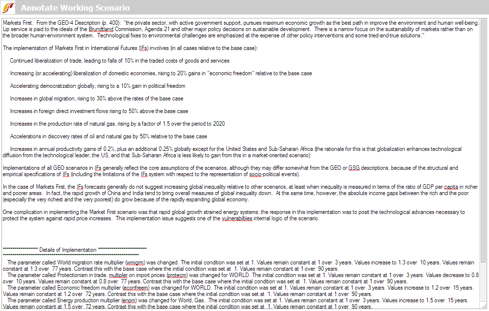
This feature of IFs allows users to quickly display an annotation of different Run-Result-Files (.run file) and Scenario-Load-Files (.sce file) to understand exactly what parameters have been altered and how they were altered. When you see an Explain Scenario option, be sure to highlight the Run-Result-File or Scenario-Load-File that you would like to more clearly understand and click on Explain Scenario. The ensuing page (similar to the image below) will appear after a moment (because IFs is going online to retrieve the information you are looking for) that will show you specifically what interventions have been made in the Run-Result-File or Scenario-Load-File that you have chosen.
Country/Region, Group or Geography-List
186 countries underpin the functioning of IFs and these countries can be displayed separately or as parts of larger groups that users can determine.
Below is a visual representation of how different entities are organized into Countries/Regions, Groups or Geography-Lists.
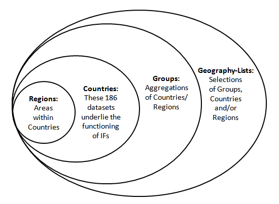
Countries/Regions are currently the smallest geographical unit that users can represent. There are 186 different countries/regions that users can display. But the ability to split countries down into smaller regions like states, provinces, or districts is under development and only available for selected countries (South Africa, India, China, and Mexico). Moreover, it is only available in the stand-alone model version, not in the online version.
*Important Note: In older versions of IFs, Regions were used as intermediaries between Countries and Groups. That use of the term Regions is no longer relevant and when you see Country/Region references in the online version of the model you should simply think of this as a term that really means Country.
Groups are variably organized geographically or by memberships in international institutions/regimes. You can find out the countries represented in each group by exploring the Identify Group or Country/Region Members sub-option under Data Analysis from the Main Menu.
IFs also features a grouping option titled Decomposed Groups that allows users to select a group and display forecasts or data for individual member countries of that group. Decomposed Group options are located in several IFs display forms, including the Flexible Displays.
Geography Lists (or G-Lists) can contain Countries, Groups, or both. The Geography-List can be useful as some users may want to place, for example, the Africa group in a display with the country of India.
When using IFs, there are many occasions where the user is asked whether or not they would like to display their results as a product of single countries, or larger groups. This is typically a toggle switch that moves between Country/Region and Groups; however, it might be a three-way-toggle that includes Country/Region, Group and Geography-List.
Define, Drivers, Explain, View Equations, View Code, and Delete
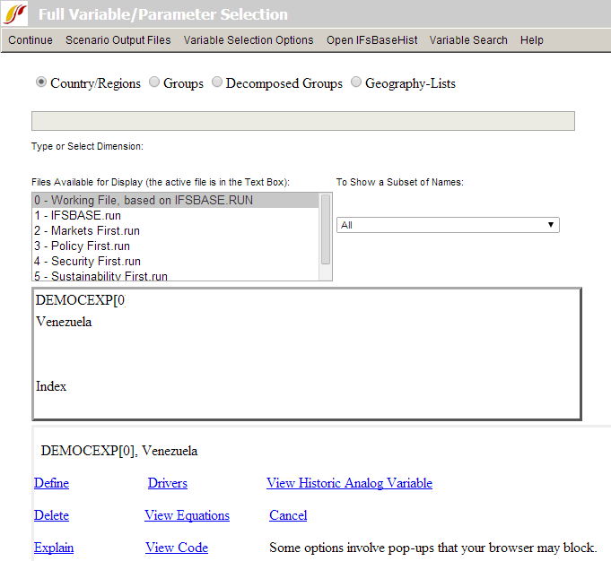
If you have selected one or more variables for display in Self-Managed Display, it will appear in status box at bottom of the form. If you left-click on the name of a variable in the status box, a new box (shown below) will appear with a large set of options that can help you learn more about the variable (or simply to delete it from the status box).
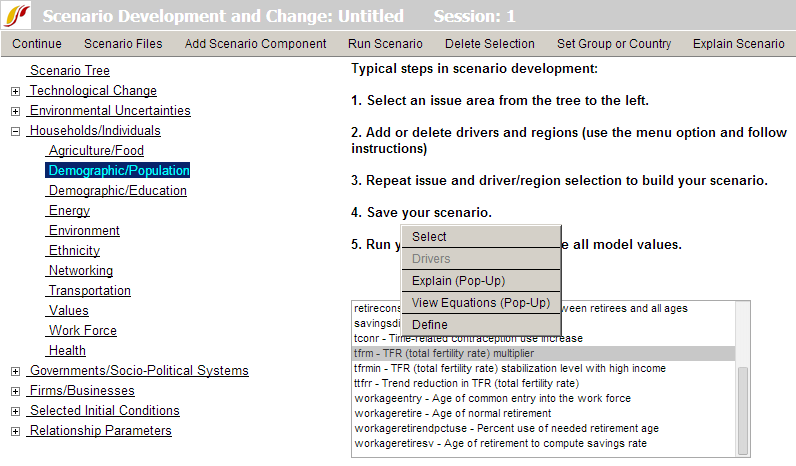
A subset of these same options can be obtained from the Quick Scenario Analysis with Tree form by using either a left-click or right-click on a list of parameters within the tree:
There is an option to search for variables and parameters in several locations of the interface, including within Self-Managed Display and the Quick Scenario Analysis with Tree forms. When the search returns a list of parameters or variables as below, a click on any in the list provides explanatory pop-up options (when the browser has enabled pop-ups):
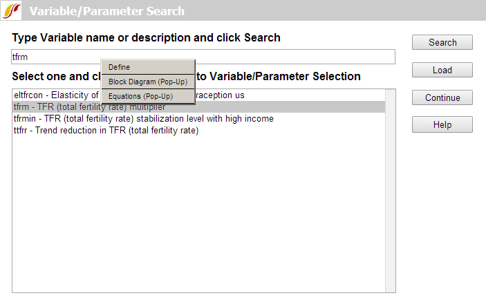
However you reach these explanatory options, here is what they provide:
Define: This option generates a window that will define the variables that are being displayed.
Drivers (Linkages): This option generates a window that graphically displays the drivers of the variable selected (backward linkages or causes) and also the forward linkages or variables driven by it. That is, the form will include a diagram showing the variable in the center and the variables from which it is computed on the left plus the variables to which it contributes on the right. This drivers diagram is derived directly from parsing the computer code of the model. If you float the cursor over any variable name on this screen, a more extended name (or a brief definition) will pop up. You will be able to see these definitions by selecting Show Definitions under the Variables option as well. If you double click on any driver variable or driven variable, the diagram will repaint with the variable selected at the middle. Select Continue to return to the previous screen.
View Historic Analog Variable: This option shows the name of the variable in historical data, if any, that is associated with a forecasted variable in IFs. For instance, if you select the forecast variable POP, it will show that the name of the analog in the data files is Population.
Delete: This option allows you to clear the selected variable/parameter from this box.
View Equations: Selecting this option will bring up a help page that shows the equations used in computing the variable selected.
Explain (Block Diagram): Selecting this option will bring up a help page that shows a diagram that broadly explains how drivers interact for the area of inquiry (agriculture, economics, etc.) that you have displayed in your table. There normally is also textual explanation.
View Code: Select this feature and a new page will be opened that shows the computer code used to express the calculation of these drivers and their interaction in IFs.
Cancel: This option allows you to cancel your selection and return to the previous screen.
General Display Options
Table Use
This help topic will go over possibilities available to users when they access a table while using IFs.
The format for tables used in IFs is displayed below:
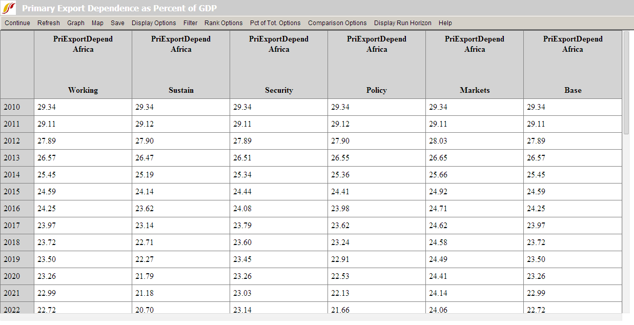
Users can access tables from many different forms within IFs. A typical table is organized into rows and columns with the rows representing different years and the columns representing different data and/or forecast series (depending on how the table is set up, the columns could also be one variable shown across different scenarios or geographic units).
Some users will want to save these tables to .xls files that can then be used for further analysis. IFs provides many save options and users will be interested in the transpose and decompose save features detailed below. Other users will be interested in highlighting values that are above or below a certain specified range. For example, users may want to look at GDP growth data that is higher than 5%. Scroll down this help topic to the Filter section to learn how to do this.
Continue: Use this option to go back to the previous menu or to the Main Menu of IFs.
Refresh: If you have made any changes away from the default settings of the table, clicking on Refresh will bring about the default table settings.
Graph: Click on this and you will be able to create a line or a bar graph.
Map: Clicking on this option will bring up the world map display.
Save: This option offers IFs users flexibility in saving their work.
- By selecting First Year to Save, you can determine at what year your saved file will begin.
- By selecting Save Normal View, you will be prompted with a screen that allows you to save your file in an Excel file with years as rows.
- By selecting Save Transpose, you are then able to decide whether you would like to save the table as all of the years, every 5 years or every 10 years. Transposing your data switches the columns and rows so that the years are across the columns of the table.
- By choosing Save Transpose and Decompose, users are able to save their data, move the years to the columns and automatically decompose geographic groupings into individual member countries. This is a very helpful feature of IFs for those who choose to display values for a group or G-list and who would then like that information broken down into individual members upon saving.
Display Options
- Percent/Whole: By toggling between these two sub-options, you can display data and/or forecasts regularly (whole) or as year-to-year percent change.
- Cumulative: You can choose to display your results regularly, or as a cumulative sum of values across time.
- Discount: This discounts all values past by base year by 3 percent each year; such discounting is often used in economic analysis.
- Cumulative with Discount: This sub-option combines discounting with accumulation over time (so as, for instance, to calculate the present value of a stream of expenditures or revenues).
- Change Display Interval: This sub-option, at the bottom of the list, allows movement from display of all years to display of those at selected intervals (e.g. 5). (In the Flexible Display form the interval can also be changed before generating a table or graphic by using the select Set Title, Display Interval, or Year from the Display Format option on the forms menu). Unless the interval has been changed from every year, the following options will not be meaningful:
- Interval Average: This feature allows the user to toggle between regular displays and those that show the average value within a time interval when the numerical values are not shown every year. This feature somewhat smoothes the values so that the trends are more clearly shown. If the interval were set at 5, the value for the year 2015 would be calculated by adding the values for the years 2013-2017 and dividing that number by 5, and so on.
- Interval Total Change: This shows a percentage change from year to year across whatever interval the user selects (b/a*100).
- Interval Total Absolute Change: This shows an absolute change from year to year across the interval (b-a).
- Index Base One: This sub-option sets the initial year's value for each variable to 1 and displays the changes over time relative to that base value.
- Moving Average: This sub-option allows the user to smooth the data series or forecast over time. The average is "moving" because the recomputed values take into account values for previous and future years. Take the moving average for the population of the USA as an example, with the number of years included in the moving average set at 5. The value for the year 2012 with the moving average turned off is 317.9 million people (model version 7.0). With the moving average turned on, the value for the year 2012 becomes 318.9. The moving average for 2012 is calculated by adding the moving averages for the years 2010 and 2011, as well as the unaltered values for the years 2012-2014, and dividing the total number by 5. The moving averages for the years 2010 and 2011 are calculated similarly, although with fewer years due to the lack of years prior to 2010. The moving average for the year 2010 is calculated by adding the values for years 2010-2012 and dividing by 3. The user is able to change the number of years included in the moving average from the default number of years, which is 5.
- Unit Conversion: This sub-option changes units on the fly in tables, for instance energy units from billion barrels of oil equivalent to million metric tons of coal equivalent. The model recognizes some units (such as energy units) and offers a menu of choices. For other variables and units, the user will find no such menu, but may specify the units desired.
- Use Alias for Group Names: Most IFs group names are shortened for easy display, but aliases often exist and can be selected to improve display appearance.
Filter: This feature allows users to highlight certain variables that exceed or fall below user-defined thresholds.
- Set Filter Parameters allows users to customize what minimum, maximum, range and rate of change thresholds they would like IFs to highlight. For example, if you are displaying Youth Bulge information for all countries, set the minimum filter level at 0.5 to highlight country values above that level.
- Users are then able to click on either Apply Min Level Filter, Apply Max Level Filter,Apply Rate Level Filter or Apply Range Level Filter. After selecting what filter the user would like to highlight, IFs will change the font of those values identified by the filter bold. For our Youth Bulge example, click on Apply Min Level Filter and all country-year values with a youth bulge higher than 50% will be highlighted in bold.
Rank Options: This feature allows the user to set a year by which to rank the forecast in ascending or descending order across multiple countries or groups. For instance, a user can determine the country with the highest forecasted infant mortality rate in 2040.
Percent of Total Options: This feature scans across the columns of a table and computes the percentage that each column-year constitutes of the total across the columns for the year. It could be used, for instance, to show the percentage contribution of each energy type to the total energy production of the European Union.
Comparison Options: This feature allows the user to divide or subtract values in adjacent columns. While this feature is most likely to be used to compare forecasts of the same variable from two scenarios, it can be used for comparisons between different countries on the same variable, etc. The use of the feature requires the selection of an even number of columns.
Display Run Horizon: This allows users to choose how far into the future their table will forecast their selected variables.
Graph Use
Line Graph, Bar Graph, Pie Chart and Scatter Plot
This general topic will go over the possibilities available to users when they access a graph.
There are several types of graphs available in IFs. These include Line Graphs, Bar Graphs, Pie Charts, Scatter Plots, and Radial Graphs. The use of Radial Graphs is discussed as another topic. Depending on whether you are accessing graphics to display historical data or forecast data, different options will be available.
It is possible to generate graphics from various forms of IFs, including from tables. As an illustration of graphics from the Flexible Displays form, plot a line graph of a power index. From the form, select the Hard or Capabilities Power variable list under the Power category. For the geographic dimension select three countries, the United States, China and India. Set 2050 for the time horizon, and click the Line Graph button located on the bottom of the Flexible Displays screen to produce the graphic displayed below.
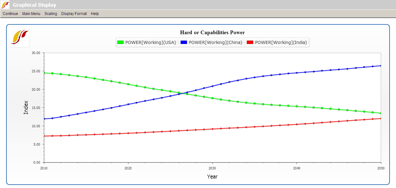
The display options at the top of the chart are typical for most graphs.
Continue: Use this to exit from the graphical display and return to the previous screen.
Main Menu: Selecting this option will bring users to the Main Menu of IFs.
Scaling (No Scaling and Common Scale sub-options): The default No Scaling option displays a traditional graph. The Common Scale sub-option scales the data points for each variable displayed so that the minimum value is zero and the maximum value is one. This option is useful for those who are simultaneously displaying multiple variables that differ greatly in scale, making changes over time in the variable(s) with smaller numbers very difficult to see.
Scaling (Index Base 1): This sub-option sets the initial year's value for each variable to 1 and displays the changes over time relative to that base value.
Display Format: This allows users to change the names in the legends, the titles of the graphs and generally customize the image for presentation purposes.
Continue back to form from which you generated the graphic (in our example to the Flexible Displays form) and change the display of hard power in the United States, China and India to a bar chart by selecting the Bar Graph option at the bottom of Flexible Displays. That will create the chart displayed below.
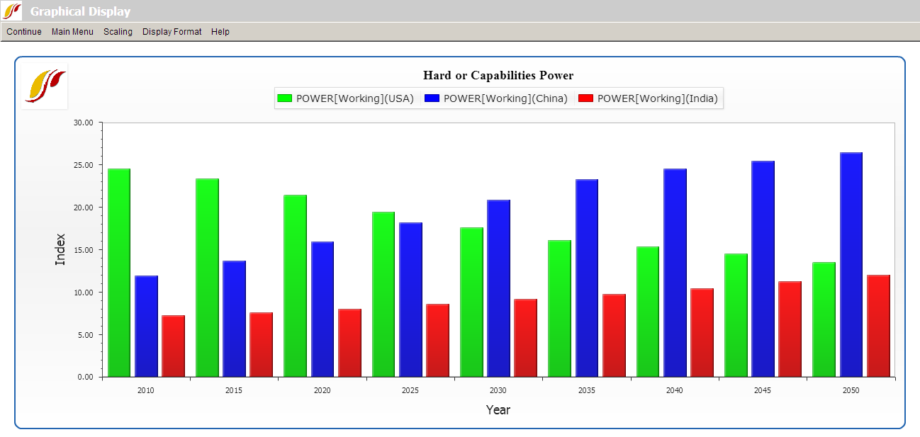
To display the same variable as a pie chart or a scatter plot, return to the Flexible Displays menu. The Other Graphs option on the menu bar will allow different types of displays.
The Pie Chart sub-option will display a pie chart (not shown here) for a specific year and the Time option in the menu will allow you to Advance or Regress time or to go to a specific year.
Use of the Scatter Plot sub-option of Other Graphs in Flexible Displays requires that you select two variables to plot against each other. To demonstrate, create a scatter plot of GDP per capita and total fertility rates. On the Flexible Displays screen, select two categories, Economy GDP per Capita and Population. (After selecting the first category, hold down the Ctrl key while selecting the second.) From the Displays field, select GDP per Capita at PPP and Fertility Rate in the same way you selected the two categories. For the geographic dimension, select all countries. Click the country on the top of the list, Afghanistan, hold down the Shift key, and click the last country, Zimbabwe. This will highlight all 186 countries in the field. As an alternative, set Geography Options to Decomposed Groups and select World. Leave the Horizon and Scenarios option as default, select Other Graphs, and click Scatter Plot to produce the graph displayed below.
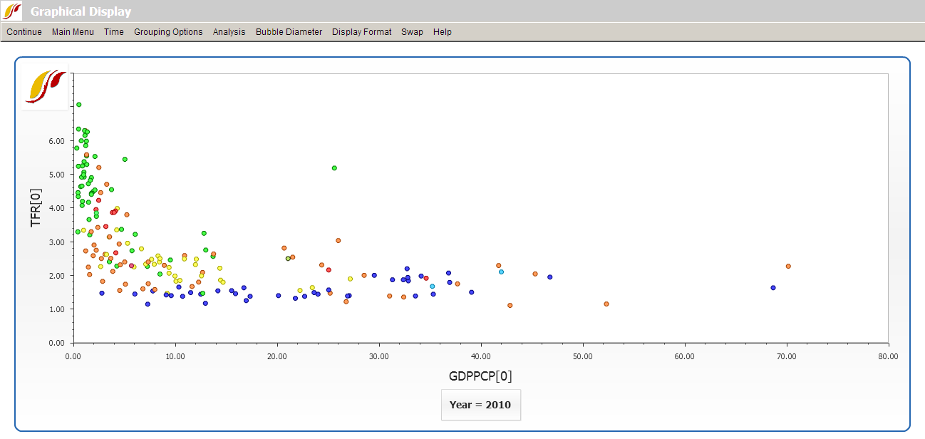
Unlike other types of graphical displays, Scatter Plots have different options available at the top of the chart:
The Continue option allows users to return to the previous screen, and the Main Menuoption will navigate users back to the Main Menu of IFs.
The Time option allows users to move forward (Advance) or backward (Regress) in time at 5 year intervals, or to displays data for any forecast year (Go To Year).
Grouping Options control geographic aggregation by only displaying members of a certain geographic list or group rather than all 186 countries.
Analysis (Relationships), only available when you are displaying all 186 countries, statistically fits different line types to the values plotted on the graph; these can represent linear, logarithmic, exponential, power, polynomial or logistic relationships. Analysis (Statistics) computes standard regression statistics for any kind of line chosen (linear by default).
Bubble Diameter adds a third dimension, either population or GDP, to the plot.
The Display Format option includes tools that customize titles, display intervals, run horizon, legends, etc.
Swap switches the x- and y-axes on the plot.
Radial Graph
The Radial Graph is accessible through the options and sub-options of Flexible Displays (option Other Graphs/Radial) and Self-Managed Display (select the variables and geography, click on Go to Display and select Graph/Radial Chart).
As an illustration, create a radial chart that explores three dimensions of governance (security, capacity and inclusion). From the Flexible Displays screen, click the Governance category and select the display titled Governance Triangle Security Capacity Inclusion. For comparison, select a group of countries such as Iraq, Kenya, Venezuela and the United States. (After selecting the first country, hold down the Ctrl key, and then select the rest.) Set the year 2010 as the time horizon. Now click the Other Graphs button on the tool bar, and select Radial.
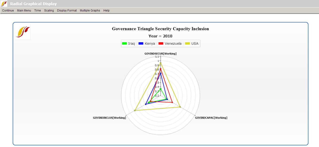
The single graph display as shown above enables users to make direct comparison among multiple countries. Each of the four countries is represented by a triangle, with one vertex for each variable, in this case, each dimension of governance. The farther from the center a point is, the higher its value is on the dimension represented by the vertex.
Options along the menu bar are similar to those featured on other graphical displays. The Multiple Graphs option, however, is unique to the radial diagram form. We will walk through the use of several sub-features under Multiple Graphs with an example.
To demonstrate, click Display from the IFs Main Menu, and select Self-Managed Display. From the Full Variable/Parameter Selection screen, first select a scenario- Markets First. Then, select AGDEM-Venezuela-All. Next, select a different scenario, say, Sustainability First. Next, select AGDEM-Venezuela-All. Now, click on Go to Display, and then Radial Chart under Graph. A graph like the one pictured below should appear.
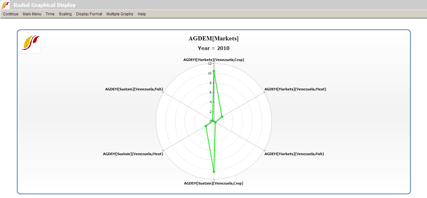
The first step is to adjust the number of variables displayed in the graph. The default number of variables displayed depends on the number selected. In this case, as we have six variables selected, six were identified in Self-Managed Display but there were really only three variables (each type of agricultural demand) times two scenarios. Set Multiple Graphs/Variables per Graph to three to generate the graph displayed below.
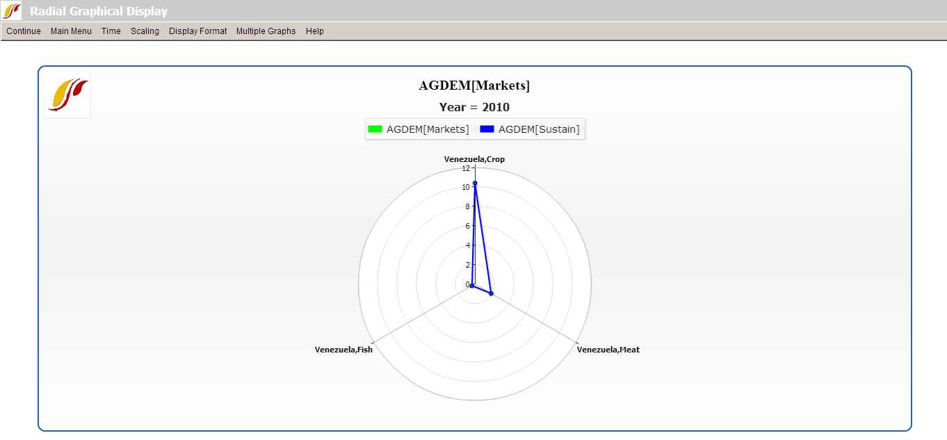
Next, click on Multiple Graphs/Display in Different Graphs. This option is useful when working with two or more years or scenarios, as the user can choose to display the different forecast years or scenarios in different graphs. To facilitate making comparisons, the user should consider turning on Common Scaling under the Scaling option. The following graphs should appear.

The next feature to experiment with is Multiple Graphs/Continuous Mode. This feature adjusts the manner in which variables are loaded in a radial graph. In the current example, the first items selected in Full Variable/Parameter Selection were the two different scenarios- Markets First and Sustainability First. When Continuous Mode is selected, these are the criteria by which the variables are grouped. With Discontinuous Mode selected (when Multiple Graphics/Continuous Mode is toggled off), the variables are interspersed between variables loaded in the even positions and variables loaded in the odd positions. To tell which variables are loaded in even and odd positions, simply return to the Display Menu and review the selected names. Similarly, if the variables were loaded according to country instead of by scenario, then using continuous mode would group the variables according to country. Note that selecting between continuous and discontinuous mode requires selecting an even number of variables.
The final feature to experiment with is Multiple Graphs/Display Multiple Years. As the name says, this option allows the user to display multiple years in a single graph. Hold down Ctrl when selecting multiple years. The various years are identifiable on the same graphic by different colors as indicated in the legend.
Computations
Another feature of IFs is the Computations button. Computations allow users to create a formula of variables which correlate historic data with forecasted data, format data for uniform analysis, or provide for interesting combinations of variables that are not directly available in IFs.
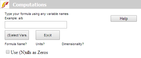
To access Computations, open Self-Managed Display (Complete Flexibility) under Display to reach the Full Variable/Parameter Selection screen.
Click on the Computations button at the bottom of the page. A new screen will appear as displayed above. In the box, type in a formula you would like IFs to calculate. For an example, let us determine the number of literate people within a country. As variables in the model we have the percent of literate people (LIT) in each country and the absolute number of people (POP) in each country, so we simply need to multiply the percentage of literate people with the total population and divide by 100. Our formula will be a*b/100 (the use of "a" and "b" are arbitrary and other letters can be used). Use standard symbols in order to distinguish different mathematical functions. Use * for multiplication, / for division, + for addition, - for subtraction, () to group terms etc. After typing in this formula, click Enter. This will bring up the next screen. From there, you can accomplish the following:
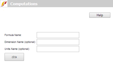
Formula Name, Dimensions Name, and Units Name: These three naming options are available but only the Formula Name is required. The Dimensions Name could be used to describe, for example, the geographic bounds of your formula. The Units Name could be used to describe the units being displayed in your formula (e.g. thousands of US$).
After you have typed in the names you prefer (e.g. lit ppl), click Enter or hit the Ok button. This will bring you back to the Type your formula page but with a small table added at the bottom. The variables you used in your formula will be displayed in this table.
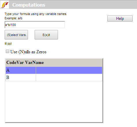
Now, click on Select Vars. You will return to the Full Variable/Parameter Selection page where you will select a variable. For our example, we have two variables. For the first variable, we would like to select the LIT. After you have selected the LIT variable, you will be asked to choose a geographic location. For our example, make sure Country/Regions is selected and choose ALL. After choosing your first variable, you will return to the Type your formula screen. Click on Select Vars again to choose your second variable. From the Full Variable/Parameter Selection screen, choose the POP variable for ALL countries/regions, which will return you to the Type your formula page. Finally, click on Exit to return to the Full Variable/Parameter Selection page. Now, your formula of variables will be displayed in the display box as shown below.
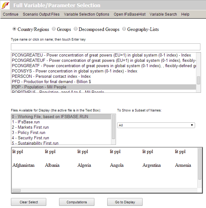
Click on Go to Display and choose a Line Graph (the Line sub-option under Graph). You can now display the absolute population that is literate in each country, a variable that is not directly available for display in IFs but that is available after creating a formula of variables.