China Sub-Regional June 2017 Consolidation
Overview
China's sub-regional model has a total of 63 preprocessor series. Although there are 652 preprocessor series in the IFs model, there are many that are not applicable to sub-regional models or do not significantly impact forecasts; only 355 preprocessor series are sought for sub-regionalization. Thus China's sub-regional model has nearly 18% coverage at this point. There are a 29 preprocessor series that have been identified that could be pulled into the model. If this data was to be pulled the the total coverage of the model would increase to nearly 26%.
Below is a table that shows the module coverage for the China sub-regional model. Population has the most coverage, but this is also the fewest number of preprocessor series. The economy module has the second highest coverage, which is good. Population and Economy have the greatest impact on the model's overall behavior and coverage in these modules is important. Health and education are areas of weakness for the China sub-regional model. In part the weakness is driven by the large number of series in those modules. There is more education data available that could be brought into the model, but some of the data requires historical age-sex cohorts to calculate rates with the data. Health has low coverage because there is not a lot of health data that is available for free and in English. It appears that much of China's health data is proprietary and not publicly available, but there may be alternative sources available if a researcher searched in Mandarin.
| IFs Module | Preprocessor Series Pulled | Total Preprocessor Series | Module Coverage |
|---|---|---|---|
| Population | 7 | 8 | 87.5% |
| Economy | 24 | 55 | 43.6% |
| Health | 5 | 57 | 8.8% |
| Education | 8 | 91 | 8.8% |
| Agriculture | 11 | 36 | 30.6% |
| Energy | 7 | 66 | 10.6% |
| Infrastructure | 1 | 21 | 4.8% |
| Environment | 0 | 9 | 0.0% |
| Socio-Political |
0 | 12 | 0.0% |
| Total | 63 | 355 | 17.7% |
| Potential Series | 92 | 355 | 25.9% |
Population
China's Population
The provincial model's population for China was rolled up in IFs and compared to other population forecasts for China, as shown below. It is clear that the population forecast from the sum of the provinces (IFs_WB) is in line with other forecasting models. Nanjing University's forecasting model is the most off from the rest of the forecasts, where population growth is forecast to continue to rise.

It was difficult to find provincial forecasts on China, but there was one paper that was found in Mandarin that had provincial population forecasts for China's provinces. The paper from Nanjing University compared its forecasts to several other population forecasting models of China and this data was used to compare the IFs provincial model to. As was previously stated, Nanjing University's model has a steeper slope and forecasts population to continue to rise at the same rate, which all other forecasting models do not. This suggests that it might not be as good of a model as the others, but it gives some information about our forecasts.
Migration
Migration rates for China's provinces are not publicly available, nor are there forecasts of China's migration rates. This means that the model is without migration, which is problematic because intranational migration is a salient issue that is shaping provincial populations. For instance, Beijing's population pyramid shows a population that has been shaped by migration because of the large young working population relative to the number of children. There are also visible jumps up and down in population in provinces that are clearly attributed to migration.

To address the lack of migration data and appropriately capture the impact of migration within China, migration rates are estimated. First, provinces with net inward migration and net outward migration are identified by looking at the population data from 2000 through 2014. This span of years is when internal migration in China increased significantly and it is where migration rates are most visible in graphs of population. Below is a table that summarizes the migration trends that are visible in the provincial population and the following section shows graphs of population with history and forecasts for each province in China for comparison.
| Net Inward Migration | Net Outward Migration | Flat Migration |
| Beijing | Anhui | Chongqing |
| Guangdong | Gansu | Fujian |
| Hebei | Guizhou | Hunan |
| Hubei | Guangxi | Jiangsu |
| Jiangxi | Heilongjiang | Liaoning |
| Shanghai | Henan | Nei Mongol |
| Tianjin | Jilin | Ningxia |
| Xinjiang | Shaanxi | Qinghai |
| Hainan | Sichuan | Shandong |
| Yunnan | Shanxi | |
| Tibet | ||
| Zhejiang |
Estimation Methods
Below is a province-by-province comparison of migration and population. First is population by province in the base case, without migration that is compared to Nanjing University's provincial population forecasts.
Second is the first method of estimating the flow of migrants, this is the net number of new migrants in millions. To estimate the new migrants; historical crude birth rates, crude death rates, and population were used to calculate total births and deaths in millions starting in 1990. Births and deaths were then added to the previous year's population to generate an estimate of population without migration. For instance, population in 1990 for Anhui province is 54.7 million and births and deaths total to a net 0.84 million people in 1991. Then the population without migration in 1991 is estimated to be 55.54 million (54.7+0.84=55.54). These migration estimates are compared to a 5-year moving average of migrant flows from a paper that estimated subnational migration in China from 1990 through 2005.
The third graph is a comparison of a second method of net migrant estimation with the first method and the paper's migrant flows. The second estimation method is a five-year moving average of the first method's net migrants.
Migration Scenario 1
A migration scenario was generated using the second method of net migrants estimation and population to calculate a net migration rate. The calculated migration rate for 2014 was used for 2014 in the scenario using the migrater parameter. Then all provinces were interpolated to 0 at the end of the time horizon in 2100.
China's Population After Migration Scenario 1
After the migration scenario the total population in China is slightly higher than the 186 model and the base case.

Migration Scenario 2
Building upon the first migration scenario, a second scenario was created. The second scenario includes India's final scenario migration data and China's in the same scenario run. Additionally, some province's migration rates were adjusted to improve model behavior because the inclusion of India's migration rates in the scenario run made the net inward migration in several Chinese provinces greater than it was in the original run.
China's Population After Migration Scenario 2
The second scenario forecasts all of China's population to be greater than the first scenario, but after careful calibration it is still close. The first scenario forecasts population to be about 18 million greater than the 186 model forecasts in 2100. Whereas, the second scenario forecasts population to be about 36 million greater than the 186 model in 2100.

The migration scenario also improved age-sex forecasts for provinces, such as Beijing, that have a substantial migrant worker population. Below is a comparison of the base case forecast of Beijing's population pyramid and the second scenario's forecast in 2060. It is clear that there will be a significant elderly population in Beijing by 2060, but the burden is more realistic in the scenario because of the influx of migrants.


Anhui
Population
Anhui's population takes a significant dip around 2008, which shows net-outward migration.

New Migrant Flow Estimate 1

New Migrant Flow Estimate 2

Migration Scenario 1 Results
Population After Migration Scenario 1
Anhui has significantly lower population forecasts after the migration scenario.

Migration Rate After Migration Scenario 1
The model pushes the rate to zero earlier than what is in the scenario.

Migration Scenario 2 Results
Anhui province's migration rates did not change in the second scenario.
Population After Migration Scenario 2
In the second scenario, population in Anhui is slightly higher.

Migration Rate After Migration Scenario 2

Beijing
Population
Beijing has a large jump up in population from 2005 through 2014, which shows net-inward migration.

New Migrant Flow Estimate 1

New Migrant Flow Estimate 2

Migration Scenario 1 Results
Population After Migration Scenario 1
Beijing's population is significantly higher after the senario and we may want to decrease the inward migration slightly.

Migration Rate After Migration Scenario 1
The model pushes migration down more rapidly than what is in the scenario, which is probably a good thing being the initial migration rate for Beijing is so high.

Migration Scenario 2 Results
Beijing's migration rate has been lowered in the second scenario from 3.56 in 2014 to 1.26 in 2014.
Population After Migration Scenario 2

Migration Rate After Migration Scenario 2

Chongqing
Population
The World Bank data was interpolated in the model which fills the population back to 1960 smoothly. In reality the municipality did not bifurcate from Sichuan until 1997 and its borders were redefined several times between 1997 and 2008. Thus Nanjing University's historical data's strange behavior makes sense, but the forecasts look too high.

New Migrant Flow Estimate 1
The Chan paper's migrant stock estimates do not have data for Chongqing because the municipality did not come to be until 1997.

New Migrant Flow Estimate 2

Migration Scenario 1 Results
Population After Migration Scenario 1
The population of Chongqing is greater in the scenario by about 5 million people at the end of the time horizon.

Migration Rate After Migration Scenario 1

Migration Scenario 2 Results
Chongqing's migration rate was decreased from 0.43 to 0.33 in 2014 in the second scenario.
Population After Migration Scenario 2
Despite the decline in migration rates in the second scenario, there is an increase in total population in Chongqing.

Migration Rate After Migration Scenario 2

Fujian
Population

New Migrant Flow Estimate 1

New Migrant Flow Estimate 2

Migration Scenario 1 Results
Population After Migration Scenario 1

Migration Rates After Migration Scenario 1

Migration Scenario 2 Results
Fujian province's migration rates were not changed in the second scenario from the first.
Population After Migration Scenario 2
Population looks to be the same in second scenario as in the first.

Migration Rates After Migration Scenario 2

Gansu
Population
Gansu appears to have net-outward migration.

New Migrant Flow Estimate 1

New Migrant Flow Estimate 2

Migration Scenario 1 Results
Population After Migration Scenario 1
Gansu's population is lower in the scenario by about 3.5 million.

Migration Rate After Migration Scenario 1
The model pushes the migration rates to zero more rapidly than what is in the scenario.

Migration Scenario 2 Results
Gansu's Migration rates did not change from the first scenario to the second scenario.
Population After Migration Scenario 2
Although the second migration scenario's data did not change from the first scenario, population is slightly greater in the second scenario for Gansu.

Migration Rates After Migration Scenario 2

Guangdong
Population
Guangdong experienced rapid inward migration in the mid to late 2000s.

New Migrant Flow Estimate 1

New Migrant Flow Estimate 2

Migration Scenario 1 Results
Population After Migration Scenario 1
There is a significant increase in population in Guangdong due to migration. By the end of the time horizon there are almost 40 million more people.

Migration Rates After Migration Scenario 1

Migration Scenario 2 Results
Guangdong's migration rate was decreased in the second scenario from 0.83 in the first scenario to 0.43.
Population After Migration Scenario 2
Guangdong's population is slightly lower than the first scenario in the second, but is significantly greater than the base case.

Migration Rates After Migration Scenario 2

Guizhou
Population
Guizhou appears to have had significant net-outward migration.

New Migrant Flow Estimate 1

New Migrant Flow Estimate 2

Migration Scenario 1 Results
Population After Migration Scenario 1

Migration Rates After Migration Scenario 1
The model pushes migration rates down lower than what are in the scenario, which is probably a good thing because there is a substantial change in population in the scenario.

Migration Scenario 2 Results
Guizhou's migration rates were not changed from the first scenario to the second scenario.
Population After Migration Scenario 2
The second scenario has slightly larger population than in the first scenario.

Migration Rate After Migration Scenario 2

Guangxi
Population
There is net-outward migration in Guangxi.

New Migrant Flow Estimate 1

New Migrant Flow Estimate 2

Migration Scenario 1 Results
Population After Migration Scenario 1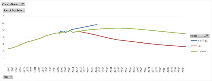

Migration Rates After Migration Scenario 1
The model pushes migration rates to zero before they reach zero in the migration scenario. 
Migration Scenario 2 Results
The migration rates were not changed from the first scenario to the second.
Population After Migration Scenario 2
Population after the second scenario is slightly greater than the first scenario. 
Migration Rates After Migration Scenario 2

Hainan
Population
There appears to be net-outward migration in Hainan in the early years and then net-inward in the late-2000s.

New Migrant Flow Estimate 1

New Migrant Flow Estimate 2

Migration Scenario 1 Results
Population After Migration Scenario 1

Migration Rates After Migration Scenario 1
The model pushes migration rates to zero before they reach zero in the scenario.

Migration Scenario 2 Results
Hainan province's migration rates were not changed in the second scenario.
Population After Migration Scenario 2
Population is slightly lower in the second scenario.

Migration Rates After Migration Scenario 2

Hebei
Population
There appears to be net-inward migration into Hebei.

New Migrant Flow Estimate 1

New Migrant Flow Estimate 2

Migration Scenario 1 Results
Population After Migration Scenario 1

Migration Rates After Migration Scenario 1

Migration Scenario 2 Results
Hebei's migration rates were decreased slightly in the second scenario, from 0.19 in 2014 in the first scenario to 0.15 in the second.
Population After Migration Scenario 2
Despite the decrease in migration rates, the total population is slightly greater in the second scenario than in the first.

Migration Rates After Migration Scenario 2

Heilongjiang
Population
There is net-outward migration.

New Migrant Flow Estimate 1

New Migrant Flow Estimate 2

Migration Scenario 1 Results
Population After Migration Scenario1

Migration Rates After Migration Scenario 1

Migration Scenario 2 Results
Heilongjiang's migration rates were decreased slightly in the second scenario, from -0.21 to -0.31.
Population After Migration Scenario 2
The second migration scenario has slightly lower population forecasts than the first scenario.

Migration Rates After Migration Scenario 2

Henan
Population
Henan province appears to have net-outward migration.

New Migrant Flow Estimate 1

New Migrant Flow Estimate 2

Migration Scenario 1 Results
Population After Migration Scenario 1

Migration Rates After Migraion Scenario 1

Migration Scenario 2 Results
Henan's migration did not change after the second scenario.
Population After Migration Scenario 2
Henan's population is slightly greater in the second scenario than it was in the first.

Migration Rates After Migration Scenario 2

Hubei
Population
There are several other models that are compared here, the additional models were found in a paper that compared population models in China. IFs is in between all of the models, which is probably a good sign. There is a net-outward migration in the late 2000s.

New Migrant Flow Estimate 1

New Migrant Flow Estimate 2

Migration Scenario 1 Results
Population After Migration Scenario 1

Migration Rates After Migration Scenario 1

Migration Scenario 2 Results
Hubei's migration rates were lowered slightly in the second scenario from -0.25 to -0.35.
Population After Migration Scenario 2

Migration Rates After Migration Scenario 2

Hunan
Population

New Migrant Flow Estimate 1

New Migrant Flow Estimate 2

Migration Scenario 1 Results
Population After Migration Scenario 1

Migration Rates After Migration Scenario 1

Migration Scenario 2 Results
Hunan's migration rates are the same in the second scenario as they were in the first.
Population After Migration Scenario 2
Despite the same migration rates going into the scenario, the second scenario forecasts slightly greater population than the first scenario.

Migration Rates After Migration Scenario 2

Jiangsu
Population

New Migrant Flow Estimate 1

New Migrant Flow Estimate 2

Migration Scenario 1 Results
Population After Migration Scenario 1

Migration Rates After Migration Scenario 1

Migration Scenario 2 Results
The second scenario has the same migration rates for Jiangsu as were in the first scenario.
Population After Migration Scenario 2
Population after the second scenario is slightly greater than in the first.

Migration Rates After Migration Scenario 2

Jiangxi
Population

New Migrant Flow Estimate 1

New Migrant Flow Estimate 2

Migration Scenario 1 Results
Population After Migration Scenario 1

Migration Rates After Migration Scenario 1

Migration Scenario 2 Results
The same migration rates were used for Jiangxi in the second scenario as were in the first.
Population After Migration Scenario 2

Migration Rates After Migration Scenario 2

Jilin
Population
There appears to be a small amount of outward migration.

New Migrant Flow Estimate 1

New Migrant Flow Estimate 2

Migration Scenario 1 Results
Population After Migration Scenario 1

Migration Rates After Migration Scenario 1

Migration Scenario 2 Results
Jilin's migration rates were unchanged in this scenario.
Population After Migration Scenario 2

Migration Rates After Migration Scenario 2

Liaoning
Population

New Migrant Flow Estimate 1

New Migrant Flow Estimate 2

Migration Scenario 1 Results
Population After Migration Scenario 1

Migration Rates After Migration Scenario 1

Migration Scenario 2 Results
Liaoning's migration rates were slightly lowered in the second scenario from 0.25 to 0.2 in 2014.
Population After Migration Scenario 2
Despite the lowering of migration rates, the population is forecast to be greater in the second scenario than in the first.

Migration Rates After Migration Scenario 2

Nei Mongol
Population

New Migrant Flow Estimate 1

New Migrant Flow Estimate 2

Migration Scenario 1 Results
Population After Migration Scenario 1

Migration Rates After Migration Scenario 1

Migration Scenario 2 Results
Nei Mongol's migration rates were unchanged in the second scenario.
Population After Migration Scenario 2

Migration Rates After Migration Scenario 2

Ningxia
Population

New Migrant Flow Estimate 1

New Migrant Flow Estimate 2

Migration Scenario 1 Results
Population After Migraton Scenario 1

Migration Rates After Migration Scenario 1

Migration Scenario 2 Results
Ningxia's migration was unchanged from the first scenario in the second.
Population After Migration Scenario 2
Population after the second scenario is greater than in the first scenario.

Migration Rates After Migration Scenario 2

Qinghai
Population

New Migrant Flow Estimate 1

New Migrant Flow Estimate 2

Migration Scenario 1 Results
Population After Migration Scenario 1

Migration Rates After Migration Scenario 1

Migration Scenario 2 Results
Qinghai's migration rates were unchanged in the second scenario from the first.
Population After Migration Scenario 2

Migration Rates After Migration Scenario 2

Shaanxi
Population
There is net-outward migration in Shaanxi.

New Migrant Flow Estimate 1

New Migrant Flow Estimate 2

Migration Scenario 1 Results
Population After Migration Scenario 1

Migration Rates After Migration Scenario 1

Migration Scenario 2 Results
Shaanxi's migration rates have not been changed in the second scenario from the first.
Population After Migration Scenario 2

Migration Rates After Migration Scenario 2

Shandong
Population

New Migrant Flow Estimate 1

New Migrant Flow Estimate 2

Migration Scenario 1 Results
Population After Migration Scenario 1

Migration Rate After Migration Scenario 1

Migration Scenario 2 Results
Shandong's migration rates are unchanged in the second scenario from the first scenario.
Population After Migration Scenario 2

Migration Rates After Migration Scenario 2

Shanghai
Population
There is significant in-migration into Shanghai.

New Migrant Flow Estimate 1

New Migrant Flow Estimate 2

Migration Scenario 1 Results
Population After Migration Scenario 1

Migration Rates After Migration Scenario 1

Migration Scenario 2 Results
Shanghai's migration rates were lowered in the second scenario from 2.1 to 1 in 2014.
Population After Migration Scenario 2

Migration Rates After Migration Scenario 2

Shanxi
Population
New Migrant Flow Estimate 1

New Migrant Flow Estimate 2

Migration Scenario 1 Results
Population After Migration Scenario 1

Migration Rates After Migration Scenario 1

Migration Scenario 2 Results
Shanxi's migration rates were lowered in the second scenario from 0.61 to 0.41 in 2014.
Population After Migration Scenario 2
Despite the lowering of migration rates in the second scenario, population is greater in the second scenario.

Migration Rates After Migration Scenario 2

Sichuan
Population
There is outward migration from Sichuan.

New Migrant Flow Estimate 1

New Migrant Flow Estimate 1

Migration Scenario 1 Results
Population After Migration Scenario 1

Migration Rates After Migration Scenario 1

Migration Scenario 2 Results
Sichuan's migration rates were unchanged from the first scenario in the second.
Population After Migration Scenario 2

Migration Rates After Migration Scenario 2

Tianjin
Population
There is significant inward migration into Tianjin

New Migrant Flow Estimate 1

New Migrant Flow Estimate 2

Migration Scenario 1 Results
Population After Migration Scenario 1

Migration Rates After Migration Scenario 1

Migration Scenario 2 Results
Tianjin's migration rates were lowered in the second scenario from 3.67 to 1.67 in 2014.
Population After Migration Scenario 2

Migration Rates After Migration Scenario 2

Tibet
Population

New Migrant Flow Estimate 1

New Migrant Flow Estimate 2

Migration Scenario 1 Results
Population After Migration Scenario 1

Migration Rates After Migration Scenario 1

Migration Scenario 2 Results
Tibet's migration rates were unchanged in the second scenario from the first.
Population After Migration Scenario 2
Population in Tibet is slightly greater in the second scenario than in the first.

Migration Rates After Migration Scenario 2

Xinjiang
Population
There is net-inward migration.

New Migrant Flow Estimate 1

New Migrant Flow Estimate 2

Migration Scenario 1 Results
Population After Migration Scenario 1

Migration Rates After Migration Scenario 1

Migration Scenario 2 Results
Xinjiang's migration is unchanged in the second scenario after the first.
Population After Migration Scenario 2

Migration Rates After Migration Scenario 2

Yunnan
Population
There is net-outward migration in Yunnan.

New Migrant Flow Estimate 1

New Migrant Flow Estimate 2

Migration Scenario 1 Results
Population After Migration Scenario 1

Migration Rates After Migration Scenario 1

Migration Scenario 2 Results
Yunnan's migration rates are the same in the second scenario as in the first.
Population After Migration Scenario 2

Migration Rates After Migration Scenario 2

Zhejiang
Population

New Migrant Flow Estimate 1

New Migrant Flow Estimate 2

Migration Scenario 1 Results
Population After Migration Scenario 1

Migration Rates After Migration Scenario 1

Migration Scenario 2 Results
Zhejiang's migration rates were lowered from 0.55 to 0.35 in the second scenario from the first in 2014.
Population After Migration Scenario 2

Migration Rates After Migration Scenario 2

China's Crude Birth Rates
CBRs in the provincial model are quite close to the 186 model. There is a greater difference in the historical data than in the forecasts, but overall the two models are quite close.

China's Crude Death Rates
Like CBRs, CDRs are quite close in the two models. There is a greater difference towards the end of the forecasts after 2065.

China's Migration Rates
Migration rates that have been included in the model are historical and were found in a paper[1] that estimates sub-national migration in China. Chinese intranational migration has proven to be a difficult measure because there is a significant amount of illegal migration from rural areas to urban areas.
There is only historical data available. Therefore the migration rates do not impact the forecasts because the model does not endogenously calculate migration forecasts.
The two models appear to be different historically, but it should be noted that both models' migration rates are almost zero for all years. The difference between them is small in total, but the magnitude appears to be large.

China's Total Fertility Rates
There is only a single year of historical data for provincial TFR in China and unfortunately the data is from 2000, making this series outdated. For all provinces except Beijing, the 2000 historical data point is the same as the 2014 data point when the model initializes. Due to the outdated data being used for model initialization the provincial model's forecasts of TFR are slightly lower than the 186 model initially.

It is also important to note that provinces such as Beijing are outliers compared to the rest of the world due to the impact of the One Child Policy in China's urban areas. Unlike the rest of the world where TFR is forecast to decline to 1.9 and then remain at that level throughout the end of the time horizon, most provinces are forecast to have TFR increase to 1.9 and then remain at that rate through the end of the time horizon. Only Guizhou, Tibet, and Yunnan provinces have TFR above 1.9 historically that are forecast to decline to 1.9.
There are no known forecasts to compare the provincial forecasts for TFR with. The model's behavior looks good and without an available data source to update the historical data there is nothing that can be reasonably done to get the provincial model to match the 186 version.
China's Life Expectancy
Life expectancy in China's provincial model is in line with the 186 model historically and through the end of the time horizon in the forecasts. Male life expectancy is slightly lower in the provincial model than in the 186 model, but female life expectancy and total life expectancy are nearly identical in the two models.
Total Life Expectancy

Life Expectancy Female

Life Expectancy Male

Economy
China's provincial model GDP appears to be too high in the forecasts relative to the 186 model. This appears to be driven by productivity in the provincial model, specifically in Physical Capital, as documented below. There is positive contributions to growth from Physical Capital in the provincial model when it is negative in the 186 model. What is driving this divergence is unclear because there is so little provincial data in the Infrastructure module. There is only one series in China's Infrastructure module, which is ICTTelephoneLinesPer1000. This series appears to be identical to the 186 model and does not appear to be the cause of this increased productivity in the provincial model. Value added appears to be inline with the 186 model as does government spending and both are normalized to the 186 model using ApplyMultAll. 
The following sections document the economy module as it appears after the final migration scenario. The documentation also breaks down what may be driving the observed divergence in forecast GDP growth between the provincial model and the 186 model.
China's GDP
Provincial GDP is significantly greater than the 186-model's GDP and after the migration scenario, this difference is greater in the latter years of forecasts. The second migration scenario forecasts lower GDP than in the first, but it is still significantly greater than the 186 model.

Anhui's GDP
Anhui's GDP is lower in the two scenarios because the population is forecast to decline due to outward migration.

Beijing's GDP
Beijing's GDP varies greatly between the three versions. This is driven by the composition of the population in Beijing. Beijing's population in the base case is forecast to age rapidly due to the lack of migration that makes up much of Beijings workforce. This working-aged population is largest in the first scenario, and the second scenario is about in between the base case and the first scenario. 
Chongqing's GDP

Fujian's GDP

Gansu's GDP

Guangdong's GDP

Guangxi's GDP

Guizhou's GDP

Hainan's GDP

Hebei's GDP

Heilongjiang's GDP

Henan's GDP

Hubei's GDP

Hunan's GDP

Jiangsu's GDP

Jiangxi's GDP

Jilin's GDP

Liaoning's GDP

Nei Mongol's GDP

Ningxia's GDP

Qinghai's GDP

Shaanxi's GDP

Shandong's GDP

Shanghai's GDP
Like Beijing the three GDP forecasts are dramatically different due to variances in the working-aged population. The base case forecasts a rapidly aging population that is a drag on the economy because there is a shrinking working-aged population. The first scenario increases GDP by a significant margin due to a huge migrant population that improves the stock of labor. The second scenario shoots in the middle, producing a forecast of growing GDP by a decreasing rate due to the aging population.

Shanxi's GDP

Sichuan's GDP

Tianjin's GDP
Tianjin's population is aging, much like what was documented in Shanghai and Beijing. The inward migration is where much of the labor force comes from and therefore, the inward migration of the scenarios increases GDP forecasts substantially. The second scenario is a more cautious forecast and shows GDP growth at a decreasing rate due to the aging population that is supported by inward migration.

Tibet's GDP

Xinjiang's GDP

Yunnan's GDP

Zhejiang's GDP

China's GDP per Capita
China's GDP per capita in the provincial model and in the scenario are significantly greater than the GDP per capita in the 186 version of IFs. This is expected because the total population is close in the models but, the GDP is greater in the provincial model.

Anhui's GDP per Capita

Beijing's GDP per Capita

Chongqing's GDP per Capita

Fujian's GDP per Capita

Gansu's GDP per Capita

Guangdong's GDP per Capita

Guangxi's GDP per Capita

Guizhou's GDP per Capita

Hainan's GDP per Capita

Hebei's GDP per Capita

Heilongjiang's GDP per Capita

Henan's GDP per Capita

Hubei's GDP per Capita

Hunan's GDP per Capita

Jiangsu's GDP per Capita

Jiangxi's GDP per Capita

Jilin's GDP per Capita

Liaoning's GDP per Capita

Nei Mongol's GDP per Capita

Ningxia's GDP per Capita

Qinghai's GDP per Capita

Shaanxi's GDP per Capita

Shandong's GDP per Capita

Shanghai's GDP per Capita

Shanxi's GDP per Capita

Sichuan's GDP per Capita

Tianjin's GDP per Capita

Tibet's GDP per Capita

Xinjiang's GDP per Capita

Yunnan's GDP per Capita

Zhejiang's GDP per Capita

Value Added
Value added in all sectors are relatively close in both models, but it is slightly lower in the provincial model overall. The disparity between the two model's GDP does not appear to be driven by value added.
Agriculture Value Added as a Percentage of GDP
The provincial model has higher value added in agriculture historically, but is forecast to have slightly lower value added in the future.

Energy Value Added as a Percentage of GDP
Value added in energy is forecast to be lower in the provincial model until around 2075 when the two models are forecast to be about the same.

Materials Value Added as a Percentage of GDP
Value added in materials is forecast to be lower in the provincial model by about a percentage point for all years.

Manufacturing Value Added as a Percentage of GDP
Manufacturing value added is relatively close in both models, with the provincial model being slightly greater.

Services Value Added as a Percentage of GDP
The two models are close historically and are forecast to be identical after 2035.

ICT Value Added as a Percentage of GDP
ICT forecasts are nearly identical.

Government Consumption
Government spending is a key driver in the economy module and it directly impacts multifactor productivity. The graphs of GDS suggest that the 186 and provincial model have the same starting point but have different growth rates in the forecasts.
Military
Military spending is greater in the provincial model, why this is occurring is not clear because there is not any historical data for this series.

Education
The provincial model is initially greater than the 186-model and after 2055 the provincial model is lower. There is historical data in the provincial model for this series.

Health
The two models are initially close together, but over time the provincial model becomes greater than the 186-model by an increasing margin. There is historical data for this series.

Research and Development
There is more investment in research and development in the provincial model, but the total amount is very small in both models. There is historical provincial data for this series.

Infrastructure
Infrastructure spending is close in the two models. There is not any historical provincial data for this series.

InfraOther
The provincial model has more InfraOther spending than the 186-model.

Other
Other spending is significantly greater in the provincial model.

MultiFactor Productivity
Multifactor productivity is significantly larger in the provincial model than in the 186-model, and therefore it is the likely culprit for what is driving the disparity between the two model's GDP forecasts.
Agriculture MFP
The provincial model is slightly lower than the 186-model until around 2040. After 2040, the provincial model is greater than the 186-model by an increasing margin.

Energy MFP
Multifactor productivity in energy is much greater in the provincial model.

Materials MFP
Multifactor productivity in materials is much greater in the provincial model than in the 186-model.

Manufacturing MFP
The provincial model has much greater multifactor productivity in manufacturing than the 186-model.

Services MFP
Multifactor productivity is much greater in the provincial model.

ICT MFP
Multifactor productivity is significantly greater in the provincial model.

Growth Acounting
Capital
There is significantly more growth in capital in the materials sector in the provincial model, than there is in the 186 model.
Capital in the Provincial Model

Capital in the 186 Model

Labor
The two models are quite close in the area of labor, but the provincial model is positive in the beginning, whereas the 186 model is not.
Labor in the Provincial Model

Labor in the 186 Model

MultiFactor Productivity
MFP is greater in 2019 in the 186 model, but it is greater in all other years in the provincial model. Manufacturing is the key exception to this because it is greater in all years in the 186 model.
MultiFactor Productivity in the Provincial Model

MultiFactor Productivity in the 186 Model

Technology Base MultiFactor Productivity
ICT is about the same in the two models, but it decreases at a slower rate in the 186 model. The remaining sectors are greater in the provincial model and decline over time, whereas the 186 model forecasts all other sectors (not ICT) to be about the same in all years.
Technology Base MFP in the Provincial Model

Technology Base MFP in the 186 Model

Knowledge Base MultiFactor Productivity
There are differences between sectors in the provincial model, whereas the 186 model shows them all the be the same. The actual growth contributions are similar, but clearly there is a difference. The provincial model is greater in some of the earlier years where there is the large jump in provincial GDP.
Knowledge Base MFP in the Provincial Model

Knowledge Base MFP in the 186 Model

Human Capital MultiFactor Productivity
Like what was documented in the area of Knowledge Capital, there is a difference among the sectors contribution to growth in the provincial. The 186 model has the same amount of growth contribution for all sectors in all years. On average the two models appear to be about the same.
Human Capital MFP in the Provincial Model

Human Capital MFP in the 186 Model

Social Capital MultiFactor Productivity
Social Capital MFP is greater in the provincial model from the first year of forecasts through 2044, after that the 186 model is greater. Once again there is a difference between sectors in the provincial model, but not in the 186 model.
Social Capital MFP in the Provincial Model

Social Capital MFP in the 186 Model

Physical Capital MultiFactor Productivity
This area appears to be the area of greatest difference between the two models. Physical capital contributes to growth in the provincial model, whereas, in the 186 model it has a negative contribution. There is also a difference among sectors in the provincial model, that does not occur in the 186 model.
Physical Capital MFP in the Provincial Model

Physical Capital MFP in the 186 Model

Correction MultiFactor Productivity
Correction MFP in the Provincial Model

Correction MFP in the 186 Model

Foreign Direct Investment
Provincial FDI historically is quite close to the 186 model from 1973 through 1995. After 1995, there is a dramatic divergence. The provincial forecast initializes at 0 in 2014. This appears to be a major contributor to throwing off GDP in China.

- ↑ Kam Wing Chan, Forthcoming in; The Encyclopedia of Global Migration, edited by Immanuel Ness (Blackwell Publishing, 2017).