Use IFs (Download): Health: Difference between revisions
Helen.Lee230 (talk | contribs) m Applied recommended changes |
Updating, still in progress |
||
| Line 1: | Line 1: | ||
= <span style="font-size:xx-large;">Mortality and Morbidity by Age, Sex, and Cause</span> = | = <span style="font-size:xx-large;">Mortality and Morbidity by Age, Sex, and Cause</span> = | ||
Mortality by Age, Sex, and Cause and the Morbidity by Age, Sex, and Cause pages | The ''Mortality by Age, Sex, and Cause'' and the ''Morbidity by Age, Sex, and Cause'' pages can be found from the Main Menu: choose the '''Display''' option, the '''Specialized Displays''' sub-option, and the '''''Mortality by Age, Sex, and Cause''' or'' '''''Morbidity by Age, Sex, and Cause''''' sub-sub-option. Both options are also found in the [[Main_Menu_Map|Main Menu Map]] options. | ||
The ''Mortality by Age, Sex, and Cause'' pages show the distribution of the number of deaths per 1000 people between males and females and between age groups for varying causes. The ''Morbidity by Age, Sex, and Cause'' pages show the distribution of the number of people with diseases or illnesses per 1000 people between males and females and between age groups for varying ailments. | |||
The | [[File:Mortality by Age, Sex, and Cause Display Example.png|center|thumb|950x950px|An example of the Mortality by Age, Sex, and Cause Display when it is first opened, for Kenya in the year 2030.]] | ||
There are several options and features that can adjust the display to explore the causes and distributions of mortality and morbidity deeper: | |||
* [[Repeated Features#General%20Display%20Options|'''Continue''']]: Go back to the previous menu or to the Main Menu of IFs. | |||
* '''Distribution Type''': Select other types of mortality/morbidity charts to be displayed. Click on one of the following sub-options. | |||
** '''All types of Mortality/Morbidity''': Display a distribution of the three main categories: communicable disease, non communicable disease, and injury. | |||
** '''Communicable Disease''': Display a distribution of only communicable disease. | |||
** '''Non communicable Disease''': Display a distribution of only non communicable disease. | |||
** '''Injuries''': Display a distribution of only injuries. | |||
** '''Communicable Disease Subtypes''': Display a distribution of communicable disease broken down into subtypes: aids, diarrhea, malaria, respiratory infections, and other communicable diseases. | |||
** '''Non Communicable Disease Subtypes''': Display a distribution of non communicable disease broken down into subtypes: malignant neoplasms, cardio vascular, digestive, respiratory, diabetes, mental health, and other non communicable diseases. | |||
** '''Injuries Subtypes''': Display a distribution of injuries broken down into subtypes: road traffic accidents, intentional, other unintentional. | |||
** '''Compare Countries''': Compare four charts for different countries or groups, years, or scenarios; or any combination of the three. This option will initially bring up four charts for the country and distribution type most recently displayed for the next four 5-year increments for example 2030, 2035, 2040, and 2045. An example of this display option is shown below for Kenya. | |||
* '''Show Numbers''': | |||
** '''Show Numbers:''' Display the numbers that were used to create the current chart being viewed. | |||
** '''Show Factors:''' | |||
* '''Set Group or Country/Region''': Click '''Countries/Regions''' or '''Groups''' to change between the two or click '''Hide Non Core Groups''' to hide or display them. The current selections will have check mark next to it. | |||
* '''Change Display''': Display a mortality or morbidity chart for any country or group, scenario, or year in IFs by hovering over any of the three sub-options. | |||
** '''[[Country/Region, Group or G-List|Change Countries/Regions]]''' [[Country/Region, Group or G-List|or '''Group''']]: A list will appear; scroll down and then click on the country or group of interest. | |||
** '''Set Year''': A list of available years to display will appear; click on the desired year. | |||
** '''Change Scenario''': Display the results from the base case or any other saved scenario runs by clicking the desired scenario. | |||
** '''Using Deaths''': Choose '''On''' to display in total number of deaths or '''Off''' display deaths per thousand. | |||
* '''Time''': Hover over to bring up two sub-options to click. | |||
** '''Advance:''' Move the chart forward 5 years. | |||
** '''Regress''': Move the chart backwards 5 years. | |||
* '''Include oldest age group''': Choose '''On''' or '''Off''' to display up to the oldest 125-129 age group or not. | |||
* '''Change Scale''': Hover over to bring up four sub-options for different ways to adjust the scaling of Mortality or Morbidity charts. | |||
** '''Fix Constant Scale across Time and Regions''': Set a constant scale for the number of deaths or number of people (X) axis across all years and across all countries or groups. | |||
** '''Fix Constant Scale across Time''': Set a constant scale for the number of deaths or number of people (X) axis across all years for the currently selected country or group. | |||
** '''Fix Constant Scale Manually''': Manually set the maximum value to be displayed for Mortality or Morbidity. | |||
** '''Help''': Open the corresponding page in the [[Main Page|Pardee Wiki]]. | |||
[[File:Example Compare Countries Mortality Display.png|center|thumb|950x950px|Example of the Compare Countries Mortality Display for Kenya.]] | |||
At the bottom of the compare countries screen, select which country, year, and scenario desired to be displayed for each of the four graphs; after adjusting then click '''Refresh''' to change the displays. To switch to a different type of population chart to compare, click '''Distribution Type''' form the menu bar and click the desired distribution. | |||
= <span style="font-size:xx-large;">Mortality Display: J-Curve</span> = | = <span style="font-size:xx-large;">Mortality Display: J-Curve</span> = | ||
Revision as of 15:50, 3 June 2025
Mortality and Morbidity by Age, Sex, and Cause
The Mortality by Age, Sex, and Cause and the Morbidity by Age, Sex, and Cause pages can be found from the Main Menu: choose the Display option, the Specialized Displays sub-option, and the Mortality by Age, Sex, and Cause or Morbidity by Age, Sex, and Cause sub-sub-option. Both options are also found in the Main Menu Map options. The Mortality by Age, Sex, and Cause pages show the distribution of the number of deaths per 1000 people between males and females and between age groups for varying causes. The Morbidity by Age, Sex, and Cause pages show the distribution of the number of people with diseases or illnesses per 1000 people between males and females and between age groups for varying ailments.

There are several options and features that can adjust the display to explore the causes and distributions of mortality and morbidity deeper:
- Continue: Go back to the previous menu or to the Main Menu of IFs.
- Distribution Type: Select other types of mortality/morbidity charts to be displayed. Click on one of the following sub-options.
- All types of Mortality/Morbidity: Display a distribution of the three main categories: communicable disease, non communicable disease, and injury.
- Communicable Disease: Display a distribution of only communicable disease.
- Non communicable Disease: Display a distribution of only non communicable disease.
- Injuries: Display a distribution of only injuries.
- Communicable Disease Subtypes: Display a distribution of communicable disease broken down into subtypes: aids, diarrhea, malaria, respiratory infections, and other communicable diseases.
- Non Communicable Disease Subtypes: Display a distribution of non communicable disease broken down into subtypes: malignant neoplasms, cardio vascular, digestive, respiratory, diabetes, mental health, and other non communicable diseases.
- Injuries Subtypes: Display a distribution of injuries broken down into subtypes: road traffic accidents, intentional, other unintentional.
- Compare Countries: Compare four charts for different countries or groups, years, or scenarios; or any combination of the three. This option will initially bring up four charts for the country and distribution type most recently displayed for the next four 5-year increments for example 2030, 2035, 2040, and 2045. An example of this display option is shown below for Kenya.
- Show Numbers:
- Show Numbers: Display the numbers that were used to create the current chart being viewed.
- Show Factors:
- Set Group or Country/Region: Click Countries/Regions or Groups to change between the two or click Hide Non Core Groups to hide or display them. The current selections will have check mark next to it.
- Change Display: Display a mortality or morbidity chart for any country or group, scenario, or year in IFs by hovering over any of the three sub-options.
- Change Countries/Regions or Group: A list will appear; scroll down and then click on the country or group of interest.
- Set Year: A list of available years to display will appear; click on the desired year.
- Change Scenario: Display the results from the base case or any other saved scenario runs by clicking the desired scenario.
- Using Deaths: Choose On to display in total number of deaths or Off display deaths per thousand.
- Time: Hover over to bring up two sub-options to click.
- Advance: Move the chart forward 5 years.
- Regress: Move the chart backwards 5 years.
- Include oldest age group: Choose On or Off to display up to the oldest 125-129 age group or not.
- Change Scale: Hover over to bring up four sub-options for different ways to adjust the scaling of Mortality or Morbidity charts.
- Fix Constant Scale across Time and Regions: Set a constant scale for the number of deaths or number of people (X) axis across all years and across all countries or groups.
- Fix Constant Scale across Time: Set a constant scale for the number of deaths or number of people (X) axis across all years for the currently selected country or group.
- Fix Constant Scale Manually: Manually set the maximum value to be displayed for Mortality or Morbidity.
- Help: Open the corresponding page in the Pardee Wiki.

At the bottom of the compare countries screen, select which country, year, and scenario desired to be displayed for each of the four graphs; after adjusting then click Refresh to change the displays. To switch to a different type of population chart to compare, click Distribution Type form the menu bar and click the desired distribution.
Mortality Display: J-Curve
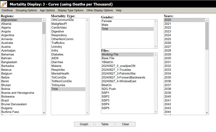
The Mortality Display: J-Curve option is located under the Specialized Display option, located in turn under Display from the main IFs screen. This option allows the user to view the distribution of types of mortality across various dimensions, which include grouping options, gender, years, and different scenarios. The J-Curve refers to the shape that most of the graphs have.
Upon clicking on Mortality Display, a dialogue box similar to the one displayed appears. The dialogue box features a row of options along the top of the screen, boxes with various variables that the user can select, and buttons along the bottom of the screen. The Continue button allows the user to return to the previous screen. The Grouping Options button allows the user to select the unit of country, region, group, or Glist (Geography list). The Age Option allows the user to include people aged over 100 years and/or infants, to display only adults (considered as aged 25 to 100 years old), or use the Global Burden of Disease (GBD) Age Categories.
The Scale options button allows the user to view the graph or table linearly or as a logarithm.
The Display Type option allows the user to choose to view data related to children or to all age groups. The options are as follows: The Probability of Dying as a Child 0-4 (Longitudinal), Child Mortality Rate per Year 0-4 (Longitudinal), Probability of Dying as an Adult (Longitudinal), Adult Mortality Rate per Year (Longitudinal), and Life Expectancy by Age. There is also a Define Adult Age (x to y) option where the user can manually define the age range the application uses.
The Other Display option allows the user to toggle between displaying deaths in real numbers, as deaths in thousands, or as a ratio, as deaths per thousand people.
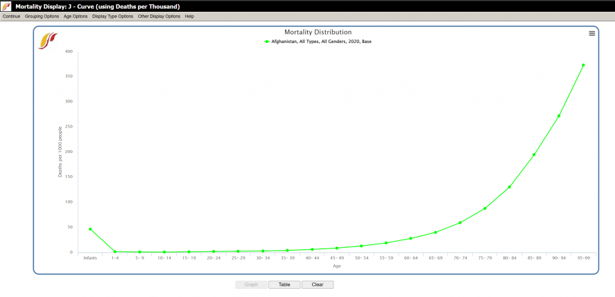
Having picked the dimensions and navigated the options at the top of the screen, generate a graph or table. Click on Graph or Table to display the data.
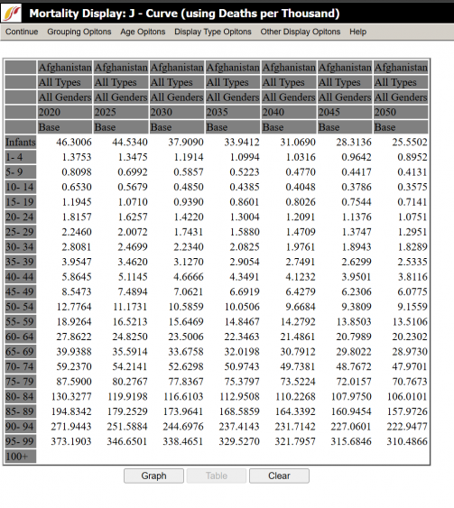
The options at the top of the new screen, titled Morality Distribution, are similar to those on the first screen displayed above, with the exception that the new screen has the options to save and print the graph or table. The user can alternate between viewing the data as a graph or table. Click the Clear button to return to the mortality display screen.
The table shown above is similar to the regular graph, but has features specific to Mortality Display. For instance, the option to exclude certain ages groups under the Age Options located at the top of the dialog box.
Mortality and Disability Years

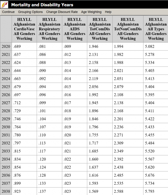
Mortality and Disability Years is a feature found on the Specialized Display sub-option of the Display Option on the Main Menu. This feature forecasts mortality from various causes while calculating a discount rate, set by the user. Specifically, forecasting the number of years of life lost because of a given mortality type, and the years of living with a disability due to contracting a mortality type.
The use of this feature is similar to other features in the IFs program, such as Flexible Displays. While the wide array of features that the IFs program offers may overwhelm those who are just beginning to use the program, there are similarities found in how the features are used throughout IFs.
The first step is to select a region to display from the column on the left-hand side of the screen. Countries are listed in the region column by default, but the user is able to display groups, decomposed groups, or g-lists under Grouping Options, found at the top of the screen.
Next, select the mortality type and gender for the display.
Then, specify choices in the Options Bar located at the top of the page. Consider at what percent to set the discount rate. The discount rate is often used to estimate the time value of money- that is, the value of a given sum of money over time relative to a base year. Assuming that having money is better presently than in the future, the diminished worth of the future money is estimated by ‘discounting’ the money by a percentage for every year into the future. For instance, with a discount rate of 4%, $100 at year 1 is worth $100. At year 2, however, that $100 is worth $96; at year 3, $92.16; at year 4, $88.47, and so on. The percentage is set at 3% by default, but the user is able to adjust the percentage.
Age weighting refers to the practice of assigning more value to certain years of life based upon its social role. For instance, one might consider working years more socially valuable than retirement years or those of childhood. Under the Age Weighting option the Beta parameter allows control over the age weighting but only a very rare application of IFs would want to adjust this value. For more information on discounting and age weighting formulations in IFs see the specialized document of the project on the health model.
Lastly, click on Display options and decide whether to display Years of Life Lost (HLYYL), Years of Living with Disability (HLYLD), or Disability Adjustment Living Years (HLDALY). HLDALY is calculated by adding together HLYYL and HLYLD, so that HLYYL + HLYLD = HLDALY.
Display the result of the previous steps in the form of a graph or table. Note, however, that the discount rate or display options cannot be changed while a graph or table is open. Close the open application, and then adjust the discount rate or display option. Then the recalculated data can be displayed in a table or graph.
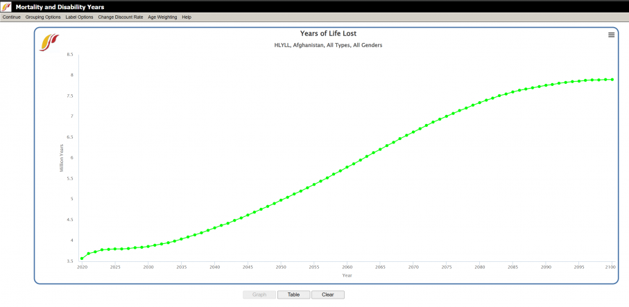
When using the graph option, there is an added Label Options button in the top bar. If the user has chosen to display two or more variables within a single dimension (i.e., multiple years as opposed to a single year), then, after clicking on the Graph button, the user is able to adjust how the lines are labeled. The different labels refer to the various dimensions of which the lines on the graph are composed- by region (1st dimension), mortality type (2nd dimension), gender (3rd dimension), scenario names only, use alias for group names, or even to fully edit and reset labels.
Health Proximate Driver Display
Feature is no longer available or outdated in the model.
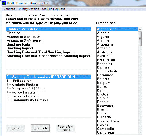
Health Proximate Driver Display is a sub-sub-option of Specialized Display, which is a sub-option of Display, which is in turn an option on the main menu of IFs. The Health Proximate Driver Display allows the user to view the level of a given driver and the effect of that driver on the level of mortality in a country/group or region over time.
To use this application, first select one or more proximate drivers. Next, choose a country/group or region to display. Toggle through the different selections under the Grouping Options heading. After selecting a driver, other boxes may appear which offer ways to disaggregate the data represented by the driver according to gender, age, and types of access to safe water and sanitation. If displayed, the user selects the desired 2nd and 3rd dimensions, and then selects one or more files that display the trends of the data over time. The user then opts to view the data in a table or as a graph. In Display Options, choose to view the level of the drivers, the effect on mortality of the driver, or both.
