Millennium Development Goals
The Millennium Development Goals (MDGs) option is located under the Specialized Displays for Issues option, which is in turn located under the Display option on the main menu. The MDGs option is also located among the Main Menu Map Pop-up options, a pop-up list box shown after a click on a country from the map on the Main Menu window.
The MDGs are a set of 8 goals which were adopted by and for the global community in 2000. The goals are the following:
- Eradicate extreme poverty and hunger
- Achieve universal primary education
- Promote gender equality and empower women
- Reduce child mortality
- Improve maternal health
- Combat HIV/AIDS, malaria and other diseases
- Ensure environmental sustainability
- Develop a global partnership for development
Each goal has a target that is in turn measured by one or more indicators. For instance, the target of the goal to eradicate extreme poverty is to halve the proportion of people whose income is less than $1 per day, which is measured in by the indicator of purchasing power parity (PPP), between 1990 and the 2015 target year for the original MDGs.
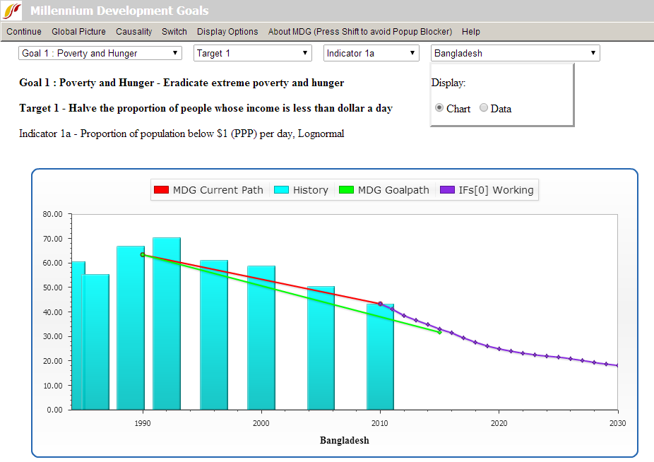
To use the MDGs option, first select the goal to display (the default is Poverty and Hunger). Next, select the target (the default is Target 1, which for that goal is 50 percent reduction in poverty rate), and then the indicator variable from IFs forecasting (the default is the IFs forecast of poverty rate using its log-normal forecasting approach). Experimenting with the various targets and indicators will help familiarize the user to the relationships between the goal, targets, and indicators. So, too, the sub-options under About MDG will help explain the MDG goals, targets, and indicators. The user should also select the country/region or group to display from the drop-down box just below the menu (the default is Afghanistan). Click the Switch option and then Use Groups in the heading if you wish to switch from countries to groups. Finally, select the run file with which to forecast the selected indicator from the box in the lower left (the default is the Working File). As you make your selections a graphic like the one below will repaint. Below the only change of default selections was for country. If you prefer a table to the graphic, select the radio button for Data in the Display option box.

If there are an historical data associated with the selection set, the chart will display then as blue bars. The graphic will also contain a series of lines. These lines represent the current trajectory of the particular indicator (red) built from the historical data bars as much as usual, the goal path from 1990 to 2015 for the indicator (green), and the IFs forecast from the base year forward past 2015 to 2030 (purple).
The user can potentially extend the display of historical data to view the earliest available data for the selected indicator or to view the latest, options which are both located under the Display Options menu. Under Display Options, the user can toggle between the default option of 'Overriding the base year value historic line with forecast value' selected which forces the historic trajectory and forecasts to meet or an unadjusted historical trajectory by selecting 'Using estimated historical line that may not meet forecast line.'
Several other options are located in the menu. Clicking on Continue returns the user to the previous screen. Clicking on Global Picture/Situation Map calls up a new window with a global map showing the latest historical values for the target variable (thus the contemporary situation); the map is very similar to the World Map. Continue will take you back to the MDG form. The next option is Causality - when selected, it will display the IFs model drivers that affect and are affected by the forecasted variable. Under Switch is a Compare sub-option that allows the comparison of two countries, the one you have selected from the drop-down box in the upper right and one that you select from the list box of countries in the lower right; make sure that you select a country in the lower right before you select Switch/Compare (you can actually select up to three countries from the list box in the lower right allowing comparison in total of up to four countries).
Poverty Level Display
This feature can be accessed from the main menu of IFs by clicking on Display, then Specialized Displays for Issues and then Poverty Level Display.

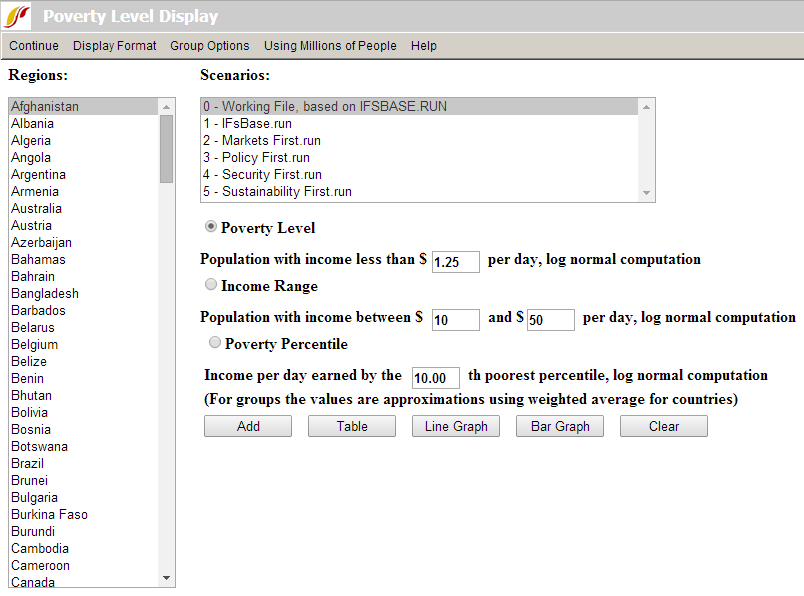
This display is useful for visually displaying forecasts of the number or percentage of people who live below a daily poverty level that you can specify with great flexibility. You can also specify an income range and see the number or percent of people within that range, for instance to assess the size of the middle class over time. Further, you can select a percentile share of the population (e.g. the poorest 10 percent which is the default), and see over time the income that defines the level below which that population segment lives. The three radio buttons in the center-right of the form choose which of those displays you want to see and allow you in their boxes to specify the associated values. When either the first or second radio option is specified, a menu option appears that allows you to toggle between looking at the number of people or the percentage of a population.
The form has default options for geography (Afghanistan), scenario (the Working File), and the radio button (Poverty level at $1.25 per day (Using Millions of People). Basic use of the form involves keeping or changing any of these options, touching the Add button (which places this and perhaps other selections in a status box) and then touching the desired display format button (Table, Line Graph, or Bar Graph).
More extended options are available on the menu. Under Group Options you can change the geographical options from countries/regions to Groups, G-Lists, or Decomposed Groups. Display Format sub-options allow you to change elements of displays such as the title of graphs or the display interval of tables and bar graphs. You can also change time horizon for displays.